
CMS: About User Input Elements
3 min
Wix has many user input elements, so you can capture, display, and edit visitor content in a collection. Using these elements, you can create your own forms or allow visitors to filter the content on your site.
Most elements, like text, checkboxes, and calendars, can be used with forms. Some elements, like dropdowns and radio buttons, can also be used to filter the content on your site. The upload button even allows visitors to upload their own images and files.
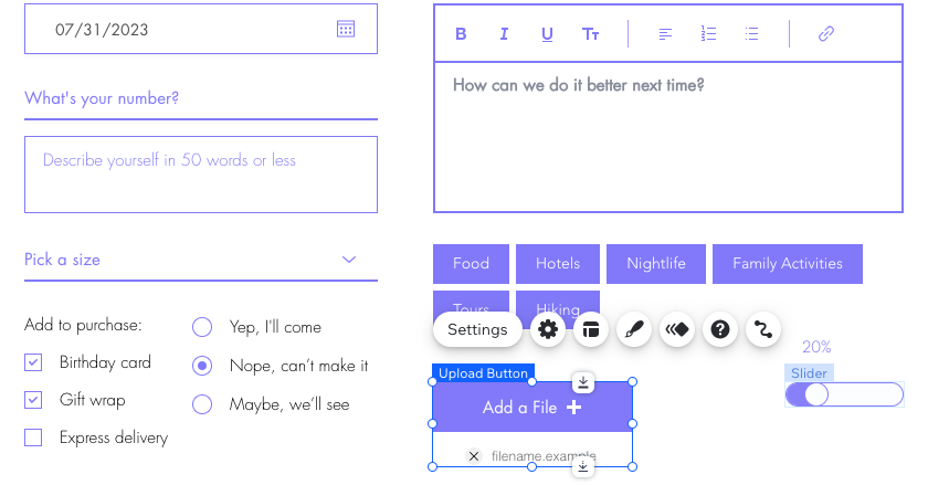
The table below lists the input elements, their uses, and the collection field types you can connect:
Input element | Description | Field types you can connect |
|---|---|---|
Text Input | Text Inputs are used to enter or edit small amounts of text or numbers. Learn more about Text Inputs. | Text, Number, URL |
Text Box | Text Boxes are used to enter or edit large amounts of text. Learn more about Text Inputs. | Text, Number, URL |
Rich Text | Rich Text inputs are used to enter, edit and format text. Learn more about Rich Text. | Rich Text |
Radio Buttons | Radio Buttons allow users to select a field to filter the content displayed, or to select an option and submit it to your collection. Learn more about Radio Buttons. | Filter content by: Text, Number, Tags, Reference Collect content: Text, Number, URL, Date and Time |
Checkbox | Checkboxes allow users to select a True/False Boolean value to filter content or submit content to your collection. Learn more about Checkboxes. | Boolean |
Multi-Checkboxes | Multi-Checkboxes allow visitors to filter content by multiple fields or submit multiple selections to your collection. Learn more about Multi-Checkboxes. | Filter content by: Text, Number, Tags, Reference Collect content: Tags |
Dropdown | Dropdown lists allow visitors to filter content on your live site or to submit content to your collection. Learn how to set up a custom form using Dropdown input elements. | Filter content by: Text, Number, Tags, Reference Collect content value: Text, Number, Reference Collect content list items: Text, Number |
Selection Tags | Selection Tags allow visitors to filter content or submit choices to your collection. Learn more about Selection Tags. | Filter content by: Text, Number, Tags, Reference Collect content value: Tags Collect content list items: Text, Number |
Date Picker | Date Pickers let visitors select a date from a calendar and submit it to your collection. Learn more about the date picker. | Date and Time |
Time Picker | Time Pickers let visitors enter a time and submit it to your collection. Learn more about the Time Picker. | Time, Date and Time |
Slider | Sliders let visitors select a value from a sliding handle on a track and submit it to your collection. Learn more about the Slider. | Number |
Range Slider | Range Sliders let visitors filter content by sliding handles to select a range of values on a scale. Learn more about the Range Slider. Note: This element is not yet available in the Studio Editor | Number |
Upload Button | Upload Buttons allow visitors to upload and submit a file to your collection. Learn more about the Upload Button. | Image, Video, Audio, Media Gallery, Document, Multi-Document |
Ratings Input | Ratings Inputs let visitors enter a rating and submit it to your collection. Learn more about the Ratings Input. | Number |
Ratings Display | Rating Display elements let you display values representing a rating and the number of ratings submitted. Learn more about the Ratings Display. | Number, Reference |
Address Input | Address Inputs let visitors enter an address and submit it to your collection. Learn more about the Address Input. | Address |
Switch | Switches let visitors toggle a switch to either filter content or submit a true/false Boolean value to your collection. Learn more about Switches. | Boolean |
Signature Input | Signature Inputs let visitors sign their name and submit an image of their signature to your collection. Learn more about the Signature Input. | Image |
Pagination Bar | Pagination Bars let visitors navigate through 'pages' or sets of items in a connected repeater or gallery. The 'Maximum items displayed' field in the dataset determines the amount in each 'page' of items. Learn more about the pagination bar. Note: This is not yet available in the Studio Editor. | n/a |
Progress Bar (Velo only) | Progress Bars display a 'progress' value and a 'target' value in a bar. Learn more about the progress bar. | Number, Reference |
reCAPTCHA (Velo only) | Add Google's reCAPTCHA tool to your site to help protect against potential spam and other types of automated abuse. Learn more about reCAPTCHA. | n/a |