

Wix Pro Gallery: Troubleshooting Issues on Mobile
8 min
In this article
- Gallery is too big / small
- Gallery images are cropped
- Double-tap on gallery items required to open them on mobile
- Gallery with a slideshow layout is cut off / not visible
- Gallery text design on mobile doesn't match the desktop
- Text / buttons are overlapping gallery items
- Gallery item titles / descriptions are cut off / not visible
- Video autoplay issues on mobile
- Multiple galleries on one page
Note:
This article refers to issues with pro gallery in the mobile editor. Learn about responsiveness and how to troubleshoot issues with pro gallery in the Studio Editor.
Read the information below to learn how to troubleshoot the most common pro gallery issues on mobile.
Gallery is too big / small
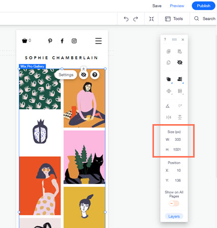
Your gallery may appear far too big or small on the mobile view of your site. You can adjust your gallery size from the mobile editor using the drag handles or the Editor Tool Bar.
To adjust your gallery size:
- Go to your editor.
- Click the Switch to mobile icon
 at the top of the editor.
 - Click the pro gallery element on your page.
- Click Tools on the top right.
- Select the checkbox beside Toolbar.
- Type your preferred width and height into the relevant (W and H) fields.
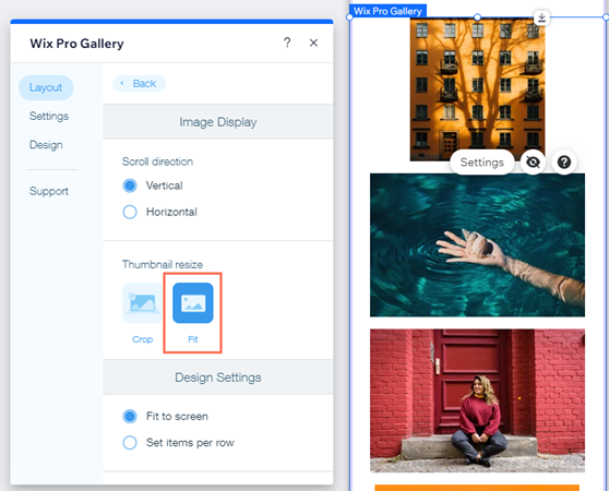
Gallery images are cropped
You may notice that your gallery images appear cropped on mobile, depending on the Custom layout you choose. This can happen when the orientation of the thumbnails in a layout is different from those of the images you upload.
For example, you select a Column layout, which displays all images in portrait (vertical) orientation, but upload images with a landscape (horizontal) orientation. This means part of your image may be cropped to ensure it fits within the thumbnail's boundaries.
To prevent your images from being cropped:
- Go to your editor.
- Click the Switch to mobile icon at the top of the editor.
- Click the pro gallery element on your page.
- Click Settings.
- Click the Layout tab.
- Select Fit below Thumbnail resize.
Additional options when keeping your images cropped:
- Adjust the focal point of your images to better control the parts of your images that may be cropped.
- Adjust the image ratio (16:9, 4:3, 1:1, 3:4 or 9:16) applied to your gallery to best match the ratio and orientation of your uploaded images.

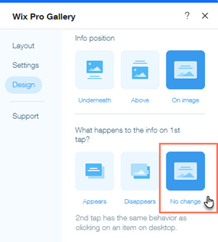
Double-tap on gallery items required to open them on mobile
The hover effect for titles and descriptions in the pro gallery does not apply to the mobile view. If you enabled this effect, visitors viewing your gallery from a mobile device will need to tap once to see the text, and tap a second time to open the full image or link.
To ensure gallery items open with a single tap:
- Go to your editor.
- Click the Switch to mobile icon at the top of the editor.
- Click the pro gallery element on your page.
- Click Settings.
- Click the Design tab.
- Click Texts.
- Select No Change under What happens to the info on 1st tap?
- Click Publish.
Alternative ways to ensure an item or link opens on first tap?
- Hide the gallery items' titles and descriptions on mobile. This will not affect the desktop version of your site.
- Place the text above / below or to the right or left of the image.
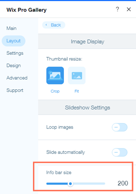
Gallery with a slideshow layout is cut off / not visible
You may find that your images are completely hidden by a color overlay. If that color is the same as your page or section background, it causes the gallery to appear invisible as just a blank space on your page.
If your images are still partially visible, you may notice just a gap or empty space that appears under your pro gallery. This is caused by the Text or Info bar being set too large. You can fix this by decreasing the info bar to an appropriate size for your images.
To decrease the info bar size under your gallery:
- Go to your editor.
- Click the Switch to mobile icon at the top of the editor.
- Click the pro gallery element on your page.
- Click Settings.
- Click the Layout tab.
- Click Customize Layout.
- Set the Info bar size to a lower number or to 0 to remove the empty space.
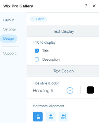
Gallery text design on mobile doesn't match the desktop
You may notice that your gallery's text design on mobile looks different to the text on the desktop version of your site. This is because your text on mobile needs to be set up in the mobile editor separately from the desktop.
To edit text on mobile:
- Go to your editor.
- Click the Switch to mobile icon at the top of the editor.
- Click the pro gallery element on your page.
- Click Settings.
- Click the Design tab.
- Click Texts.
- Customize the text using the available options.
Text / buttons are overlapping gallery items
We do not recommend adding separate text or button elements on top of your gallery. Elements render differently across various browsers and devices. This causes overlapping elements to not align in the exact same place on all your visitors' screens.
We recommend using the built-in Text and Custom Button features of the pro gallery, to avoid alignment issues.
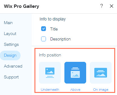
Gallery item titles / descriptions are cut off / not visible
It may happen that gallery item titles and / or descriptions are not visible / cut off on the mobile version of your site. This occurs in galleries with the Grid, Slider, Strip and Column layouts when the gallery's Text Box height is too low, and cannot sufficiently display all text.
There are a few ways to resolve this issue, depending on the Info position you choose (where you choose to display your gallery text).
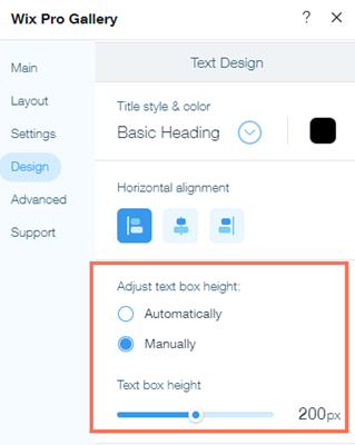
Text is placed under or above an image
- Decrease the title / description font size, or increase the size of the gallery images by adjusting the gallery's layout. For example, if you have a gallery with a grid layout, you can change the gallery's thumbnail size or adjust the number of images per row.
- Go to the desktop Editor and increase the Text Box Height. This change will also apply to your mobile site.
- The text's horizontal and vertical padding settings may cause text to be cut off on mobile. These settings are carried over from desktop. To adjust these settings, go to the desktop version of your site and change the text padding settings in the Texts tab of the Design panel.
Text is placed on an image:
Decrease the title / description font size, or increase the size of the gallery images by adjusting the gallery's layout. For example, if you have a gallery with a grid layout, you can change the gallery's thumbnail size or adjust the number of images per row.
Video autoplay issues on mobile
You may find that your music and videos do not play automatically on iPhones, Androids and tablets. This is because Apple and Chrome block the autoplay function to prevent additional data charges from the visitor's cellphone network. No data is loaded until the user taps the play button on the audio or video player.
Autoplay functions are also disabled if the visitor has enabled low-power mode on their iOS device.
For more information, please see Apple's Safari Developer Library and Google's Developers guidelines.
Multiple galleries on one page
Galleries are optimized to showcase multiple media files at once. We recommend having one gallery with several media items per page, as opposed to multiple galleries with less items.
Having too many individual elements on a single page (even if the elements are identical) can affect site performance.
Tips:
If you want to display single images or videos, we recommend adding an image or video element from the Add Panel. For displaying a portfolio of work requiring individual galleries, we recommend using Wix Portfolio or dynamic pages.
Still need help?
What information should I include if I need to reach out for assistance?
