- Wix Pro Gallery: Customizing the Gallery Design for Your Mobile Site
Wix Pro Gallery: Customizing the Gallery Design for Your Mobile Site
16 min
In this article
- Customizing the design of your gallery
- FAQs
Optimize how your pro gallery looks on mobile devices without affecting the desktop version of your site. This means you can customize the design of the gallery on your mobile / tablet site to look completely different to your desktop site.
Customizing the design of your gallery
You can customize the overlay, texts, item style and scroll animations of the pro gallery on mobile. Available customization options depend on the gallery layout you choose.
Wix Editor
Studio Editor
- Go to your editor.
- Click the Switch to mobile icon
 at the top of the editor.
 - Click the pro gallery element on your page.
- Click Settings.
- Click the Design tab.
- Customize your gallery using the options available:
Overlay & Icons
An overlay sits on top of an image, and adds an extra effect when you hover over an image with your mouse. You can customize this effect as well as any icons you have.
- Click Overlay & Icons.
- Choose between a Full or Partial overlay and customize using the options available:
- Full Overlay: The overlay covers the entire gallery item.
- Gradient: Click the toggle to enable a gradient overlay.
- Color & Opacity 1 and 2: Click the relevant color box to customize the gradient's colors. Then drag the slider to adjust the colors' opacity.
- Gradient Direction: Drag the slider to adjust the gradient's overlay direction.
- Icon Color: Click the color box to change the color of gallery icons that appear on hover.
- Color overlay: Click the color box to choose a color. Then drag the slider to change the transparency of the color overlay.
- Icon color: Click the color box and select a new color for your gallery icons.

- Gradient: Click the toggle to enable a gradient overlay.
- Partial Overlay: The overlay covers only a portion of the gallery item.
- Set size in: Manage your overlay's size in percentages or pixels.
- Size: Drag the slider or enter a value to choose an overlay size.
- Overlay starts from: Choose where your overlay is positioned.
- Padding: Drag the slider to adjust the amount of space between the gallery border and your overlay.
- Gradient: Click the toggle to enable a gradient overlay.
- Color & Opacity 1 and 2: Click the relevant color box to customize the gradient's colors. Then drag the slider to adjust the colors' opacity.
- Gradient Direction: Drag the slider to adjust the gradient's overlay direction.
- Icon Color: Click the color box to change the color of gallery icons that appear on hover.
- Color overlay: Click the color box to choose a color. Then drag the slider to change the transparency of the color overlay.
- Icon color: Click the color box and select a new color for your gallery icons.

- Full Overlay: The overlay covers the entire gallery item.
- Choose an overlay effect from the options available:
- No effect: The overlay does not apply any effect.
- Fade in: The overlay gradually appears on hover.
- Expand: The overlay expands on hover.
- Slide up: The overlay slides up on hover.
- Slide right: The overlay slides right on hover.
Texts
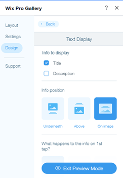
You can customize the design of the title and description text, provided that you chose to display them on the Design tab. If you don’t see the Texts options (step 1 below), go to the Design tab, click Texts and select the checkboxes next to Title and Description to display them.
Note: Available text design options depend on the layout you choose.
Note: Available text design options depend on the layout you choose.
- Click Texts.
- Customize the text using the options below:
- Title style and color: Select the font and color of the title text.
- Description font style and color: Select the font and color of the description text.
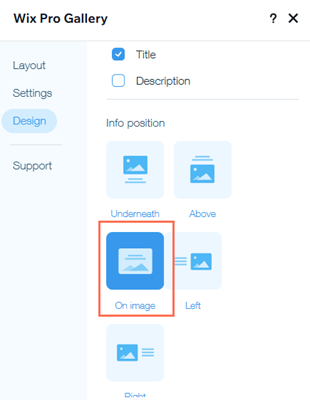
- Info position: Choose to display your gallery info above, underneath, or on your gallery items.
- What happens to the info on 1st tap?: Choose to have your info appear, disappear or not change on the first tap.
- Horizontal alignment: Choose to align the horizontal text either on the left, in the center, or on the right.
- Vertical alignment: Choose to align the vertical text either on the left, in the center, or on the right.
Notes:
- If the title or description is cut off on mobile, decrease its font size, adjust the gallery images to be bigger from the Layout panel.
- The text's horizontal and vertical padding settings may cause text to be cut off on mobile. These settings are carried over from desktop. To adjust these settings, go to the desktop version of your site and change the text padding settings in the Text tab of the Design panel.

- The hover effect for titles and descriptions in the pro gallery does not work in the mobile view. If you enabled this effect, visitors viewing your gallery from a mobile device will need to tap once to see the text, and tap a second time to open the full image or link. To ensure images open on the 1st tap follow these instructions.
Item Style
Each image or video in the gallery is an item. You can change the look of the items for both the regular and hover modes.
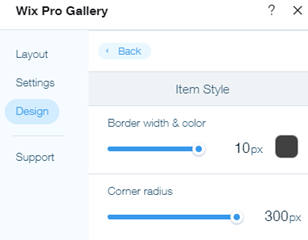
- Click Item Style.
- Customize the regular view of the item under Item Style:
- Border width and color: Drag the slider to change the border width and click the color box to select a color.
- Corner radius: Drag the slider to make the corners more round or square.
Note: The Border width & color and Corner radius options are only available when you choose to crop your thumbnails in your layout's settings.
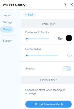
- Shadow: Click the toggle to enable or disable the shadow:
- Enabled: The gallery item has a shadow around it. Customize the opacity, color, blur, shadow direction and shadow size.
- Disabled: The gallery item does not have a shadow around it.
- Choose what happens when someone hovers over the gallery item with their mouse:
- No effect: No effect is applied to the hover.
- Zoom in: Zooms in on the image on hover.
- Blur: The image is blurred on hover.
- Grayscale: The image becomes black and white on hover.
- Shrink: The image gets smaller on hover.
- Invert: The image color is inverted on hover.
- Color in: The image turns from black and white to colorful on hover.
- Darken: The image becomes slightly darker on hover.
- Choose what happens while the image is loading:
- Blurred image:A blurred version of the image appears while loading.
- Color placeholder: A colored placeholder appears while the image is loading.
Buttons
This section will appear if you chose to show the Load More button in the Layout tab.
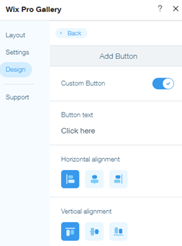
Here you can change the text, font, color, and border radius of the Load more button.
Here you can change the text, font, color, and border radius of the Load more button.
- Click Buttons.
- Customize the buttons using the options below:
- Button text: Enter the text that appears on the button.
- Font style & color: Select the font and color of the button.
- Button color & opacity: Drag the slider to change the button color and opacity and click the color box to select a color.
- Border width & color: Drag the slider to change the border width and click the color box to select a color.
- Corner Radius: Drag the slider to change the corner radius.
Scroll Animations
Add an animated effect that appears as visitors scroll through your gallery. You can further customize your chosen animation by adding a transition style and adjusting its duration.
Note:
Available animations depend on the gallery layout you choose.
Adding a scroll animation:
- Click Scroll Animations.
- Choose what happens when visitors scroll through your gallery:
- No effect: No effect is applied to the scroll.
- Fade in: Images gradually appear during the scroll.
- Grayscale: The image becomes black and white when scrolling.
- Slide up: The image slides up when scrolling.
- Expand: The image gets when larger scrolling.
- Shrink: The image gets smaller when scrolling.
- Zoom out: The image zooms out when scrolling.
- One color: A single color is applied to the images when scrolling.

Customizing your animation:
- Click Customize Animations
- Tailor your animation settings:
- Transition style: Click the drop-down to apply a motion effect to your gallery items. This effect is applied upon scrolling, as visitors move from one item to the next.
- Duration: Drag the slider to adjust how long your animation lasts.

Expand Mode
This section appears if you have chosen "Open in Expand Mode" in the Settings Panel of the pro gallery, when a user clicks a gallery item. From here you can customize the Expand Mode of your gallery to be in keeping with your site's design and brand.
- Click Expand Mode.
- Click Customize Expand Mode and personalize the expand mode of the gallery using the following options:
- What info is shown? Choose to show a title, description and/or link.
- Where does it appear? Choose where you want to position the info:
- Side: The information appears to the right of the gallery item.
- Bottom: The information appears below the gallery item.
- When does it show? Choose when the information shows:
- Always: The information is always shown.
- When clicking info icon: The information only appears when a visitor clicks the info icon in the top left corner of the Expand Mode.
- Allow full screen: Choose to allow visitors to view gallery items in full-screen mode.
- Background color: Click the color box to select a background color for the expand mode. Choose from your site colors or add a color.
- Icon color: Click the color box to select a color for the icons in the expand mode. Choose from your site colors or add a color.
- Title style:
- Click the drop-down menu to customize the font, style and size from the Font Picker.
- Click the color box to change the title's text color.
- Description style:
- Click the drop-down menu to customize the font, style and size from the Font Picker.
- Click the color box to change the description's text color.
- Text alignment: Choose the text's alignment: left, center or right.

FAQs
Click a question below to learn more about customizing the gallery design for your mobile site:
Why are the Overlay & Icons and Item Style design options missing from my gallery?
The Overlay & Icons and Item Style design options are only visible in the Grid (vertical orientation), Slider, Strip and Columns layouts if you select On Image as the info position in the Text tab of the Design panel.

How can I troubleshoot issues with my gallery on mobile?
Check out our troubleshooting guide for pro gallery on mobile and learn the solutions to the most common problems.
Did this help?
|


