Studio Editor: Pro Gallery Best Practices
4 min
In this article
- Finding the settings you need
- The Settings panel
- The Inspector panel
- Making your gallery responsive
- Check the gallery's responsive behavior
- Use different layouts per breakpoint
- Troubleshooting gap and spacing issues
Pro Gallery lets you display videos, images and text, all in one beautiful multimedia gallery. Read the guidelines in this article to make the most out of Pro Gallery in the Editor – discover the different ways you can customize your gallery and make it look great in any screen size.
Finding the settings you need
There are two main areas where you can adjust different gallery settings:
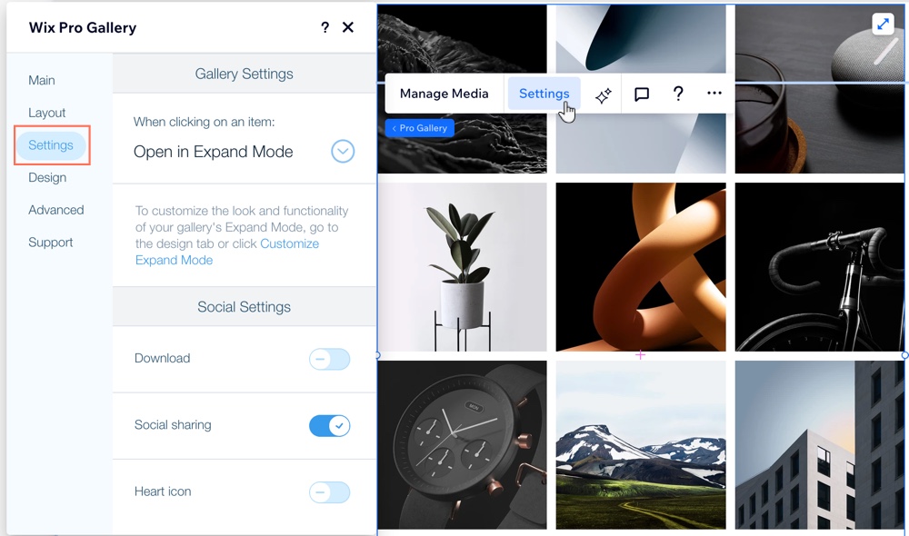
- The Wix Pro Gallery settings panel
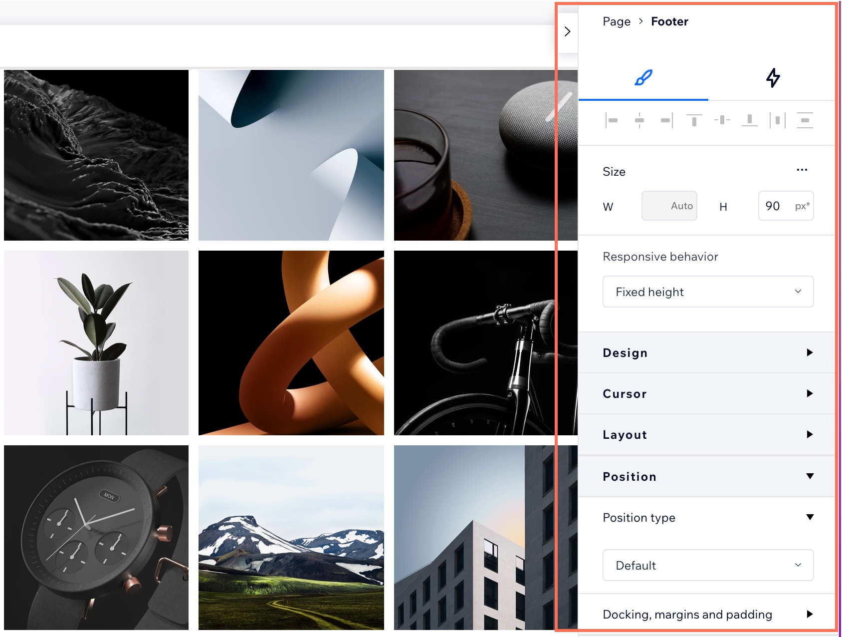
- The Inspector panel
The Settings panel
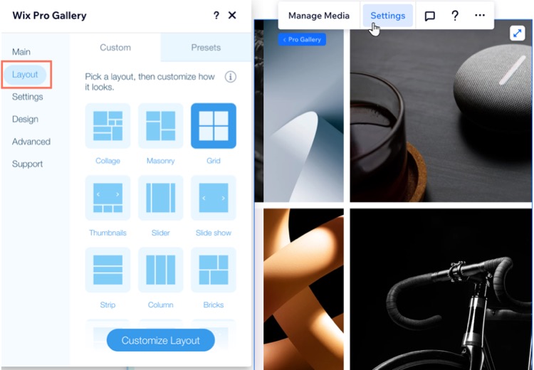
The Settings panel lets you adjust your gallery's design and functionality. You can choose a layout that suits your images, decide what happens when clicking on an item, or enable a variety of social sharing settings.
The Inspector panel
From the Inspector panel, you can adjust your gallery's size, position and behavior across breakpoints. These settings can help to ensure your gallery is responsive and looks great in every screen size.
The Design tab opens first by default. Click the Interactions tab  to create engaging animations.
 to create engaging animations.
Making your gallery responsive
There are many different ways to ensure your gallery is responsive to all screen sizes. Read below to choose the best method for your design needs.
Check the gallery's responsive behavior
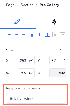
In the Inspector panel, you can see the gallery's size and the current responsive behavior. Make sure the gallery is set to either Relative width or Stretch to ensure it resizes automatically and in relation to each visitor's screen.
Tip:
It is not possible to adjust your gallery's height in the Inspector when:
- Your gallery is set to scroll vertically.
- Your gallery is horizontal with a fixed ratio.
You can change these settings from the Layout tab in the gallery's Settings panel.
Use different layouts per breakpoint
Pro Gallery offers different layout options. You can choose a layout for each of your breakpoints so the gallery always fits the screen. You can also save time by choosing a preset layout that is fixed where you only change the color, text and animations in the Design tab.
Troubleshooting gap and spacing issues
If you find that there is too much space above, below or between gallery images, try the steps below.
Reduce the spacing between images
Check the text box size
(Slide show layout) Check the info bar size
