

Studio Editor: Setting the Size of Your Elements
11 min
In this article
- Resizing an element
- Resizing media elements
- Setting the size in px*
- Choosing an element's responsive behavior
- Using advanced size measurements
- Setting the sizing preference
- FAQs
As you're designing a site, you want to make sure it looks great on every screen size. In the Studio Editor, you set the sizing in px* and the responsive behavior takes care of the rest.
Most elements come with a default behavior (e.g. scale proportionally) that controls the way it gets resized on other screens. You can always change the default behavior to one that better meets your needs.
px* is a fluid size unit, relative to the page's editing size.
Tip:
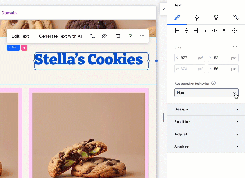
You can set the element's size and responsive behavior per breakpoint.
Resizing an element
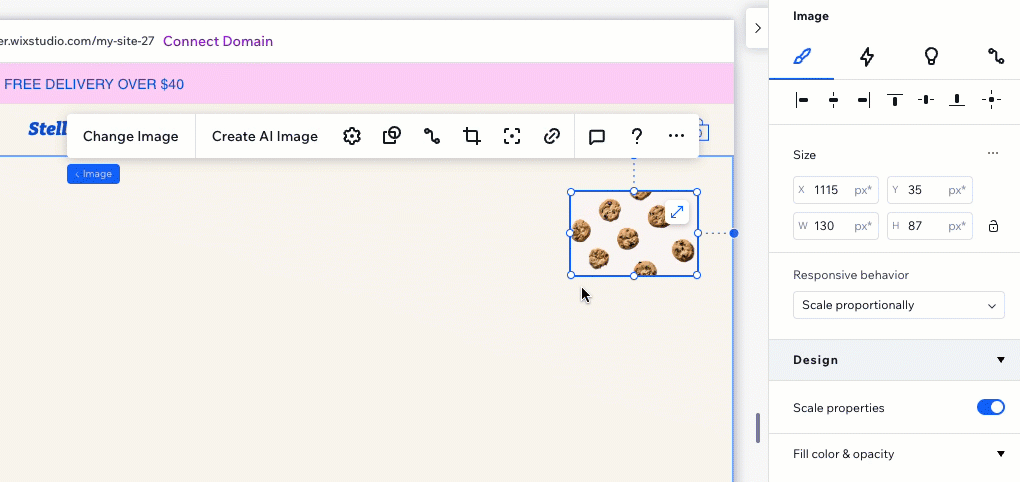
Select an element on the canvas and drag the side handles to make it smaller or bigger. This sets the way the element looks on the current breakpoint.
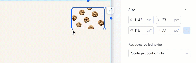
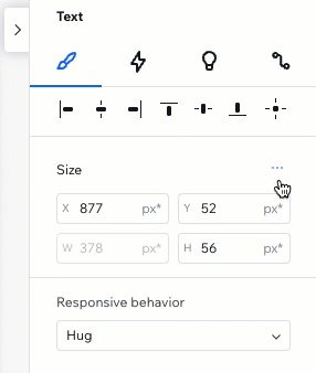
In the Inspector panel, you can check the element's exact width and height. If needed, you can enter your own width / height values.
Let the Inspector calculate for you:
For your convenience, you can use addition ( + ), subtraction ( - ), multiplication ( * ) and division ( / ) when typing size values. For example, make an element 3 times wider by adding *3 next to the current width.
Experiencing issues with resizing?
Check out this troubleshooting video to learn how to resolve issues with sections and containers that won't resize.
Resizing media elements
When resizing a media element, like an image or a video, you can lock the aspect ratio so the width and height always stay proportional to each other.
This means that when you change the width, the height automatically adjusts (and vice versa) to maintain the original shape of the element.
Which media elements include this option?
To lock the aspect ratio:
- Select the relevant media element.
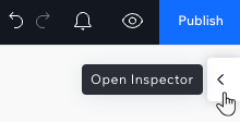
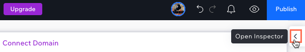
- Click the Open Inspector arrow
 at the top right.
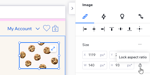
- Click the Lock aspect ratio icon
 under Size.
 - Resize the element by either:
- Entering the width / height value in the Inspector (the other value adjusts automatically).
- Dragging the handles around the element on the canvas.
Note:
This option is not available in the advanced settings mode.
Setting the size in px*
px* is a fluid unit of measure in the Studio Editor. It lets you edit sizing using a familiar measurement (pixels), while the actual measurement behind the scenes is responsive.
In other words, you design in pixels that represent the size on the canvas, and the element stays responsive. The specific values and size units depend on the responsive behavior you choose. Hover over px* to see the calculation, and the responsive size unit that is being used.
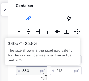
In the example below, the container's width on the current canvas is 330 px*. The actual unit is percentage so the width is relative (25.8% of every screen).
What's the difference between px* and px?
Both let you edit in pixels, however:
- px* means the size you see is relevant to the breakpoint you're currently working on.
- px means the size is fixed across breakpoints.
Choosing an element's responsive behavior
When you add an element to the page, it already comes with a built-in responsive behavior. This means you don't have to worry about how the element looks on different screens - the responsive behavior ensures that it gets resized.
However, you may want to switch the responsive behavior, if you see one that is more suitable for your design.
What's the difference between the available behaviors?
Note:
The responsive behavior you select affects the size units in use. For example, selecting the Fixed responsive behavior changes the measurement from px* to px.
To choose a different responsive behavior:
- Select the relevant breakpoint.
- Select the element.
- Click the Open Inspector icon at the top right of the editor.
- Select an option from the Responsive behavior drop-down.
Dealing with unwanted gaps on the live site?
Check out this troubleshooting video to learn how the responsive behavior can affect, and resolve, this issue.
Using advanced size measurements
The advanced settings in the Inspector allow deeper customization of the element's size per breakpoint. Instead of working with px* and choosing a responsive behavior, this mode lets you see the measurements we're using behind the scenes (e.g. px, %, vh) and adjust them to your needs.
What are the available measurements?
Enabling advanced settings applies to the specific element you select, on all breakpoints. The advanced settings mode stays enabled for that element, for easy access, but you can disable it at any time.
To access and edit advanced size settings:
- Go to your editor.
- Select the relevant element.
- Click the Open Inspector icon at the top right of the editor.
- Click the More Actions icon
 next to Size.
 - Enable the Advanced settings toggle.
- Edit the sizing as needed: Width, height, and min and max values.
Tip: Switch to a different unit (e.g. from px to %) by clicking it in the Inspector. This opens a list of the available measurements for the element.
Setting the section height:
We don't recommend setting the height in pixels, as this might cause elements to not display as intended. For example, they might overflow or appear cropped.
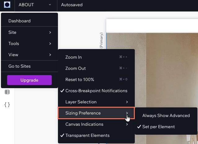
Setting the sizing preference
Choose your sizing preference for the site you're designing. If you like working with advanced CSS measurements, you can enable the advanced settings across the editor. Alternatively, if you prefer choosing the sizing mode per element, you can keep it that way.
To set the sizing preference for a site:
- Click the Wix Studio icon
 at the top left.
 - Hover over View.
- Hover over Sizing Preference.
- Choose your preference:
- Always Show Advanced: The sizing in the Inspector is always set to advanced.
Note: This mode disables the option to switch specific elements back from advanced settings. - Set per Element: You set the sizing preference for every element.
- Always Show Advanced: The sizing in the Inspector is always set to advanced.
FAQs
Click a question below to learn more about sizing.
When should I use the advanced settings?
Are all responsive behaviors available for elements related to Wix apps?
I set a section to scale proportionally but the elements don't scale. Why?
Why can’t I adjust the size of certain elements using the Inspector panel?
Why are images or videos not scaling correctly on different screen sizes?
How do I fix overlapping elements on mobile?
