
Studio Editor: Troubleshooting Responsiveness Issues
In this article
- Text that appears too small in certain breakpoints
- Misplaced elements across breakpoints
- Misaligned elements across breakpoints
- Overlapping elements across breakpoints
Experiencing issues with the way your client's site looks across breakpoints? The Studio Editor gives you the tools to tackle common responsiveness challenges, like overlapping, misplaced, or misaligned elements on different screen sizes. With the right adjustments, you can create a polished, professional site that looks great on any device.
Tip:
The
Responsive Checker helps you catch and prevent the issues covered in this article, saving you the hassle of checking each element individually. For example, it detects unnecessary margins, elements that need different docking, text without a defined minimum size, and more.
Text that appears too small in certain breakpoints
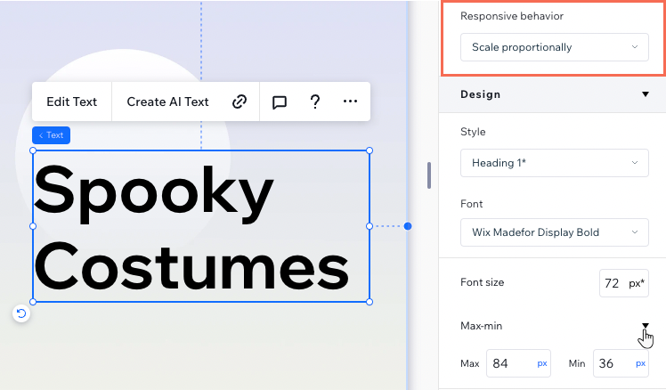
Does your text look too small when viewing your client's site on smaller screens? Using the scale proportionally
responsive behavior and the max-min setting, you can ensure your text always looks great on every screen size.
Select the text and open the Inspector panel. Firstly, set the
Responsive behavior to
Scale proportionally. Then, click
Max-min under
Design to set the minimum and maximum font sizes.
Tip:
The max-min setting automatically cascades down to smaller breakpoints, so no need to make changes on breakpoints other than desktop.
Misplaced elements across breakpoints
If an element on your client's site shifts position unexpectedly across different screen sizes, it’s likely due to its docking and margin settings. Follow these steps to resolve the issue and ensure your elements stay in their intended position.
Check the element's docking

Adjust the element's margins
(Fixed behavior section) Switch the elements' margins to pixels
Multiple elements moving around?
If they're all in the same parent container (e.g. section, cell, etc.), you can
stack them to ensure consistent spacing and alignment.
Misaligned elements across breakpoints
If elements on your section misalign or break their layout when the screen size changes, it’s often due to inconsistent docking or margin settings.
Follow these steps to identify and fix the issue, ensuring your elements align correctly across all screen sizes.
Ensure the elements are docked to the same side
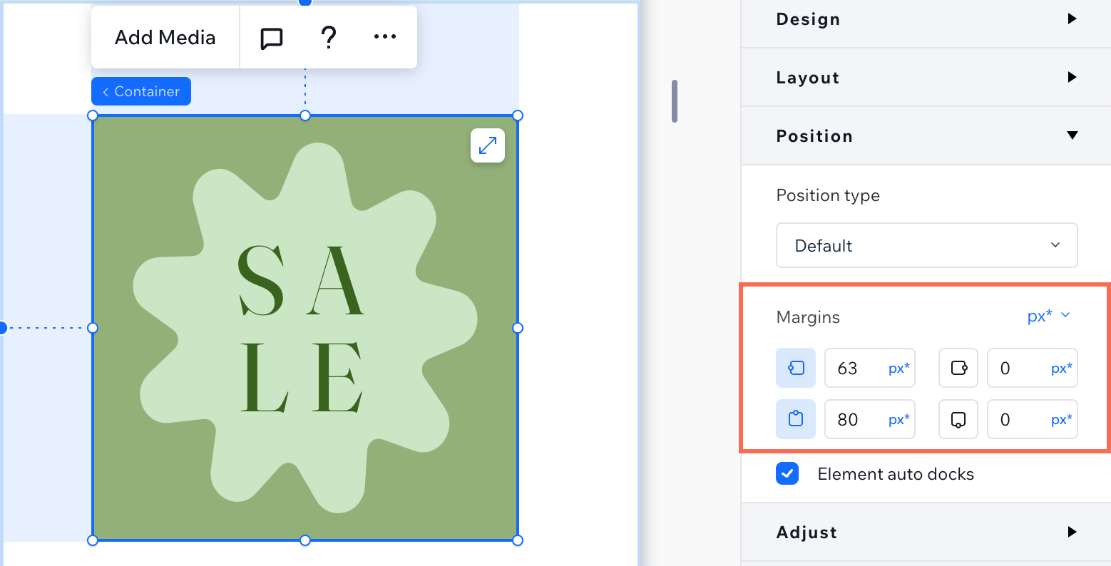
Standardize the margin units
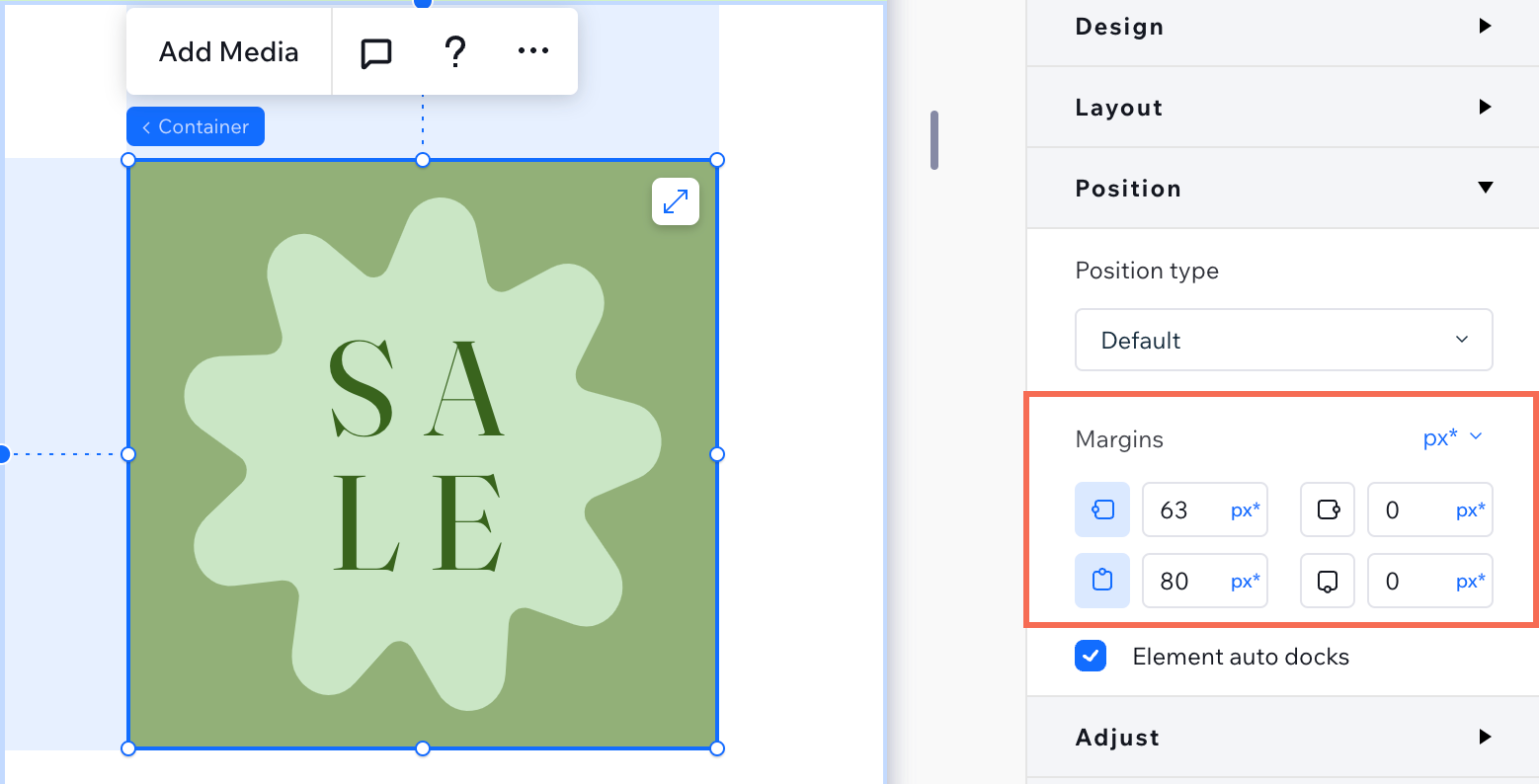
Check the relationship between the elements
Overlapping elements across breakpoints
When arranging elements, they could be spaced just right in the editor but overlap when you check the live site on different viewports. Overlap usually happens due to the way elements are positioned or their responsive behavior.
If elements on your client's site overlap on different screen sizes, follow these steps to identify and fix the issue.
Check the elements' positioning and docking
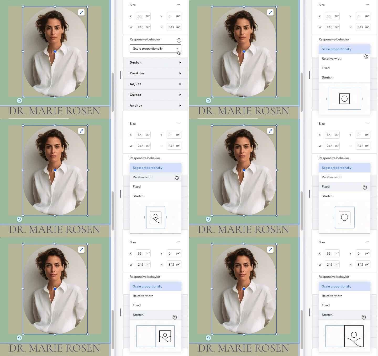
Adjust the elements' responsive behavior
Check the relationship between the elements