

Studio Editor: Building a Responsive Site
3 min
In this article
- Customize your designs per breakpoint
- Let AI make your sections responsive
- Automatic resizing across breakpoints
- Make the element's design match any screen
- Automatic and manual text scaling
The new Studio Editor is the ultimate destination for professionals to create fully responsive sites that look great on every screen and device. With its cutting-edge features, the platform empowers you to create responsive sites with speed and precision.
Within the Studio Editor, you'll find an array of tools carefully curated to streamline your design process, ensuring ease, efficiency, and remarkable results for your projects.
Go to our Wix Studio Academy to check out additional Wix Studio webinars, tutorials, and courses.
Customize your designs per breakpoint
The Studio Editor lets you tailor sites per breakpoint, so they always look great. Breakpoints are screen width ranges, representing the possible screens and devices that visitors tend to use (e.g. tablet, mobile).
The Studio Editor uses a cascading concept when it comes to designing across breakpoints. Changes you make on larger breakpoints trickle down to smaller breakpoints, but changes on smaller breakpoints don't affect larger breakpoints.

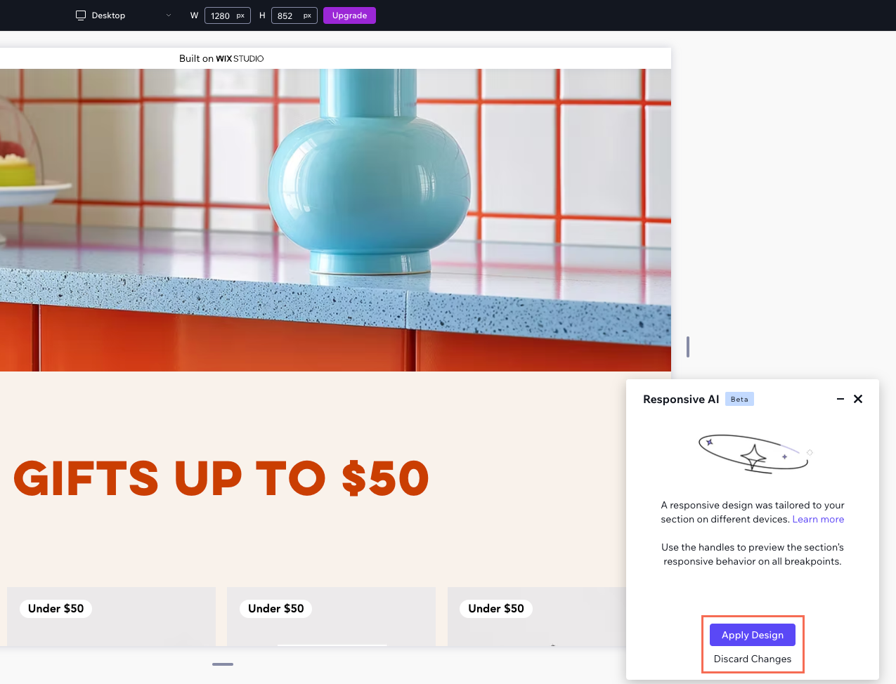
Let AI make your sections responsive
Make your section responsive on all screen sizes in just one click, using the power of AI. The responsive AI tool identifies groups of related elements and applies the ideal layout tool for each group (e.g. stack, grid).
Automatic resizing across breakpoints
As you're designing a site, you want to make sure the elements look great on every screen size. Edit the element's size in pixels and select a responsive behavior to take care of the rest.
What is px*?

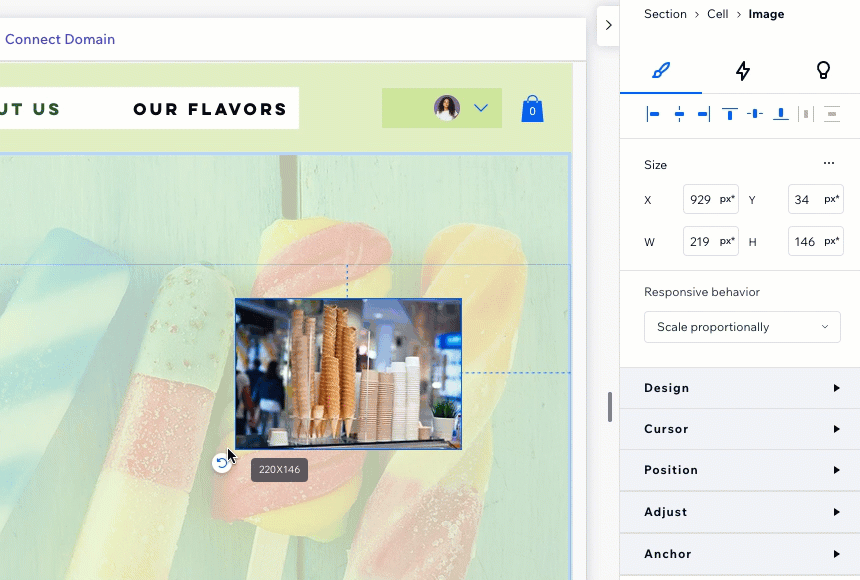
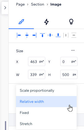
Every element comes with a default responsive behavior (e.g. Scale proportionally), which controls the way it gets resized on other screens. This truly accelerates the design process as you don't have to go through each and every breakpoint to set sizing.
From the Inspector panel, you can change an element's responsive behavior to one that better meets your needs.
Make the element's design match any screen
When you set an element to scale proportionally, you can ensure that its design looks ideal on every screen. Enable the Scale properties toggle in the Inspector to make it happen automatically.
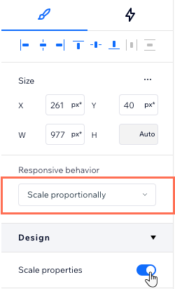
This is useful, for example, if your element has a defined border. The border might seem too thick and overbearing on small screens, or non-existent on large screens. With the toggle enabled, all you have to do is set the design you want on desktop.
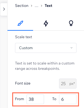
Automatic and manual text scaling
In the Studio Editor, text is set to automatically scale in proportion to the screen size. You choose the font size you want on desktop, we take care of the rest. You can set minimum and maximum values to make sure the text never gets too small or too big for your design.
If you need more precise control of the text scaling, select Custom instead. This lets you set the size range for each separate breakpoint.