

Studio Editor: About Cells and Grids
3 min
In this article
- Section grid
- Advanced CSS grid
- Frequently asked questions (FAQs)
Grids are a powerful tool when it comes to responsive design. The grid is made up of cells, and each element, or group of elements, gets its own cell. This keeps your layout in place on every screen size, ensuring that elements don't overlap.
You can add cells to organize a section, or apply an advanced CSS grid for more precise control. The CSS grid is also available for elements like containers and repeater items which cannot be split into cells.
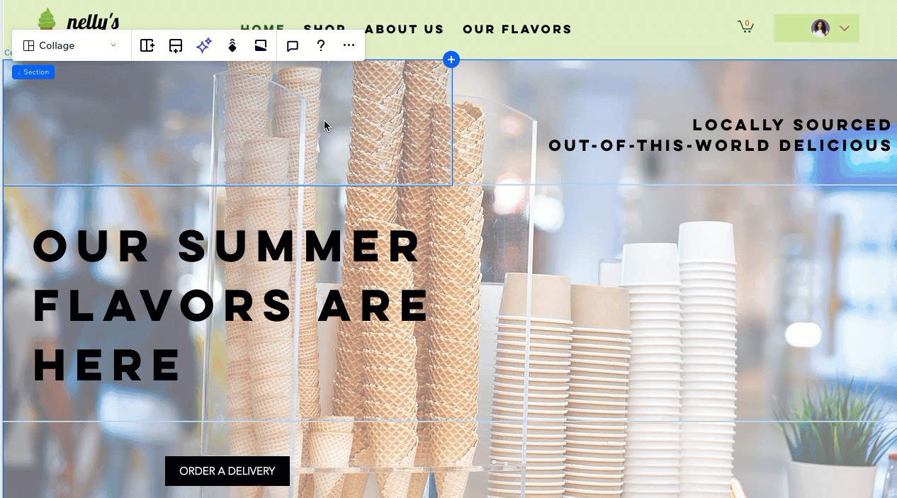
Section grid
In the Studio Editor, sections come with a built-in grid, containing a single cell (housing the entire section). Split the section layout into more cells to give a responsive structure to the content. There are various customizable layouts to choose from.

After choosing the relevant layout, refine it to your needs by adding new cells or splitting existing ones. To adjust the size of each cell, just drag the grid lines on the canvas.

Advanced CSS grid
Need more precise control of the section grid? Switch to an advanced CSS grid to adjust the rows, columns and their size with advanced measurements (e.g. fr, Min/max, %). You can tailor these settings per breakpoint so the grid makes sense on every screen size.
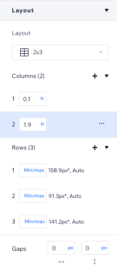
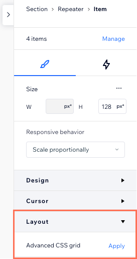
Apply an advanced CSS grid on an entire section, or just a specific cell. It's also a way to add a grid to elements other than sections, like a container or a repeater item. If the option is available, you can find it under the Layout section in the Inspector panel.
Frequently asked questions (FAQs)
Click a question below to learn more about grids in the Studio Editor.
How do I know which grid is right for the section?


Does switching to a CSS grid disrupt the existing layout?
Dealing with overlapping elements?
Review our troubleshooting video to learn what to check and how to resolve this issue.
