

Studio Editor: Working with an Advanced CSS Grid
8 min
In this article
- Switching from section grid to a CSS grid
- Applying a CSS grid on other elements
- Customizing a CSS grid
- Positioning elements in a grid
- Docking elements
- Moving elements between grid cells
- Table of grid units
In the Studio Editor, you can use an advanced CSS grid to organize the layout of elements and sections. You can choose the number of rows and columns you want, and set their size using responsive measurements (e.g. fr, Min/max, %).
Go to our Wix Studio Academy to check out additional Wix Studio webinars, tutorials, and courses.
Switching from section grid to a CSS grid
Sections in the editor come a built-in section grid. It's an easy-to-use version of the advanced grid, based on the same CSS logic. Switching to an advanced CSS grid gives you more precise control of the layout per breakpoint.
Note:
Once you make the switch, it is not possible to go back to a section grid. However, if you just performed the action, you can use the Undo button  at the top right of the editor.
at the top right of the editor.To switch from section grid to a CSS grid:
- Select the relevant section.
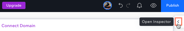
- Click the Open Inspector icon
 at the top right of the editor.
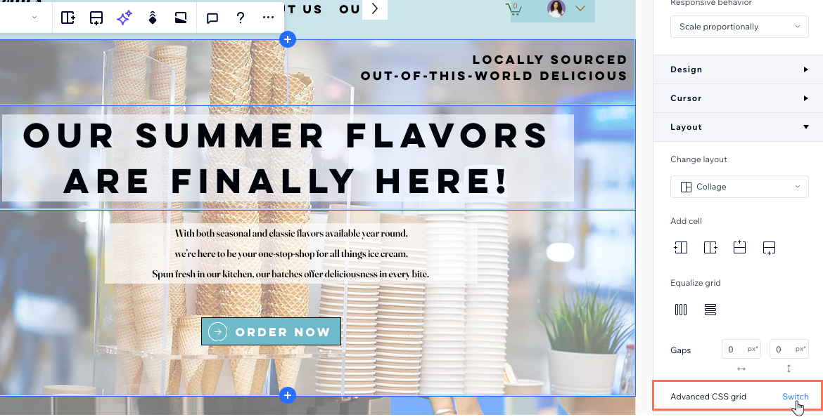
- Scroll down to Layout.
- Click Switch next to Advanced CSS grid.
- Click Switch to CSS Grid.
What's next?
Customize the rows, columns and spacing from the Inspector panel. You can also drag grid lines on the canvas to move them.
Applying a CSS grid on other elements
You can apply a CSS grid to container, popup, flexbox and repeater items. Specifically in the repeater element, once you apply a grid to one item, the rest update automatically.
To apply a CSS grid:
- Select the relevant element in the editor.
- Click the More Actions icon
 .
. - Click Apply Advanced CSS Grid.
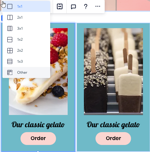
- Choose a layout from the 1x1 drop-down.
Tip: Select Other if you want to set your own number of rows and columns.
What's next?
Customize the rows, columns and spacing from the Inspector panel. You can also drag grid lines on the canvas to move them.
Customizing a CSS grid
Customize your grid to get the exact layout you want. You can change the number of rows and columns, adjust their size and the gaps between them.
To customize a CSS grid:
- Select the relevant element or section.
- Choose how you want to customize the grid:
Choose a different layout

Add more rows and columns
 .
.
 to see this option.
Change the size of your columns or rows


Delete a column or row
 next to an existing column or row.
Edit the size of the gaps
Note:
It is not possible to remove a CSS grid from a section. If you delete all of the rows / columns, the grid reverts to 1x1.
Working with breakpoints:
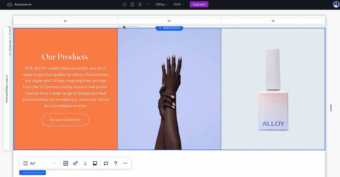
Your design cascades from desktop to the smaller breakpoints. We recommend tailoring the grid to each breakpoint to ensure the composition of your elements is flawless. In the example below, we set a different layout per breakpoint (3 columns on desktop vs. 3 rows on tablets).
Positioning elements in a grid
While adding elements to the grid, several tools can help you set their placement more accurately.
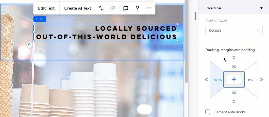
Docking elements
Docking elements to the gridlines ensures they're positioned exactly as you want. In the Studio Editor, all elements are automatically docked, but you can adjust the docking manually and add margins.
Moving elements between grid cells
Under the Position section in the Inspector, you can select an element and see the grid cell it's in. Click any grid cell to move the element there, without having to use drag-and-drop.
You can also enter the specific column and row numbers, which is useful when you need to place an element over multiple grid cells.
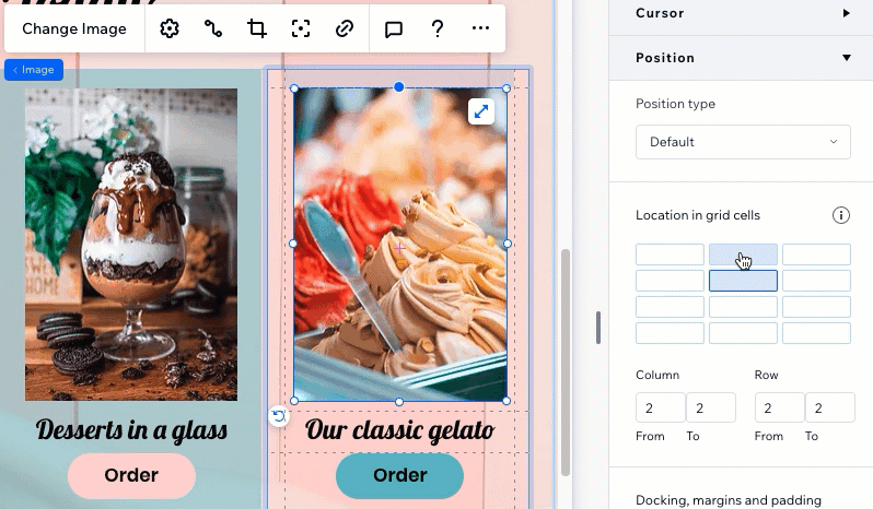
Table of grid units
Use the whole range of CSS units to create your grid. You can set the size of the columns and rows using percentages, fractions or pixels. Alternatively, set the minimum and maximum size of the columns and rows, or use calculations to create the grid you require.
Percentage (%)
Fraction (fr)
Auto
Pixels (px)
Viewport width and height (vw and vh)
Min and Max content
Min/max
Calculation
Dealing with overlapping elements?
Review our troubleshooting video to learn what to check and how to resolve this issue.
