Editor X: Setting the Size of Your Element
5 min read
Editor X is transitioning to Wix Studio, our new platform for agencies and freelancers.Learn more about Wix Studio
Using the options in the Inspector panel, you can set your element's size exactly how you want it. Enter fixed width and height values for pixel-perfect accuracy, or use fluid measurements so your element seamlessly adjusts to any screen size.
In this article, learn more about sizing your elements in Editor X:
Want to learn more?
Check out our lesson on sizing in the Editor X academy.
Structuring a responsive site
Before adding content to your site, it's important to create a structure and build your layers according to that logic. Your layers are organized in the parenting model, which means the top layer acts as the parent to the bottom layer.
Show me an example
The size of a parent element can affect its child elements as they resize relatively to the parent. To make sure your design stays responsive, define the sizing and positioning of your layers from top to bottom.
Working with breakpoints:
You can set different sizing options for your elements at each breakpoint.
Fixed vs. Fluid sizing
When sizing an element, you can choose whether to use fixed or fluid sizing from the Inspector panel:
- Fixed: This option keeps the width of the element the same across all viewports. It doesn't shrink or grow according to screen size.
- Fluid: This option adjusts the width - and sometimes the height - of elements depending on the screen size.
- Scale Proportionally: Select this checkbox so that your element's height and width maintain a ratio when resized. When this option is not selected, it means your element's width is adjusted according to screen size while its height stays the same.
Tip:
You can also drag the handles around your element to change its dimensions.
Available units of measure
In Editor X, you can use a variety of different CSS units of measure to size your elements. The type of measurements you want to use depends on how you want elements to resize as the viewport width changes.
Click below to learn about each unit of measure and when to use it:
Auto
Pixels (Px)
Percentage (%)
Viewport Width (Vw)
Viewport Height (Vh)
Min & max values
Max Content (max-c)
Using calculation to determine the size of your elements
Calculation is a handy tool when you need to accurately size an element while using fluid units of measure. Using mathematical principals, you can write a "formula" that determines an element's width or height. You can even combine different measurements in this calculation (e.g., vh and px).
Show me how
For instance, use calculation to design a header (100px) and a section that, together, take up the exact viewport height (100vh) in every screen size. You can set the section's height to (100vh - 100px), so the header is always taken into account in the calculation (100px).
Stretching an element
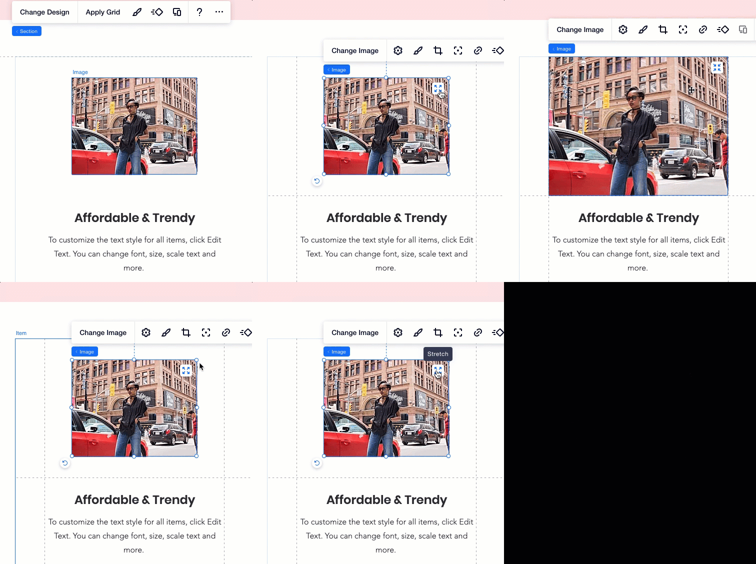
Stretch your element to cover the entire background of its parent container. When using grids, you can either stretch the element to cover a specific cell or the entire grid area.
Stretching an element sets its width and height to Auto so that the element and its container resize according to the viewport. Since the element is stretched, its width and height values would be the same as its parent container.

Learn more:
Read more about creating a responsive site using Editor X tools:


 at the top of Editor X.