Editor X: Using Grids
8 min read
Editor X is transitioning to Wix Studio, our new platform for agencies and freelancers.Learn more about Wix Studio
CSS grids are a great way to ensure your elements are organized in a structured manner. In Editor X, every container and section comes with a built-in grid. You can choose the number of rows and columns your composition requires, and adjust their size in many different measurements.
In this article, learn all about working with Grids in Editor X:

Want to learn more?
Check out our lesson on grids in the Editor X academy.
Adjusting an existing grid
Every section and container comes with a built-in 1x1 grid that you can adjust. Switch to a different layout in one click, or create your own grid by dragging the lines over your existing composition.
To adjust the grid:
- Click the relevant container or page section.
- Change the grid in one of the following ways:
Choose a layout

Customize grid on canvas
 .
.

Tip:

You can also add a section with a built-in grid, by clicking the Add Section icon  .
.
.Managing a grid from the Inspector panel
Customize your grid to get the exact layout you want. You can change the number of rows and columns, adjust their size and the gaps between them.
To manage a grid:
- Click the relevant grid.
- Click the Inspector icon
 at the top of Editor X.
 - Click the Layout tab
 and scroll down to Display.
 - Choose what you want to do:
- Choose a different layout: Click the Layout drop-down to select a different look that contains the same number of cells as the existing grid.
- Adjust your grid manually: Click below to learn how to:
Add more columns or rows
 next to Columns or Rows.
 next to an existing column or row and select an option:

Change the size of your columns or rows


Edit the size of the gaps
Delete a column or row


Working with breakpoints:
When designing a grid, it only appears on the specific breakpoint you're working on. You should create a grid for each and every screen size to ensure the composition of your elements is flawless.
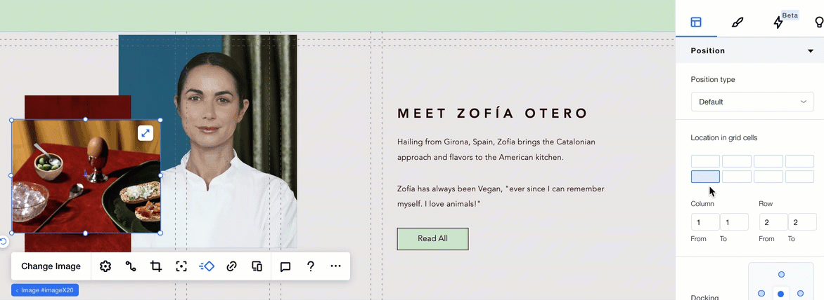
Positioning elements in a grid
While adding elements and placing them on your grid, there are various tools to help you create a responsive layout:
Docking elements
Docking elements to the gridlines ensures they're positioned exactly as you want. When you add an element to a grid cell, it's automatically docked to the closest vertical and horizontal gridlines. You can adjust the docking as needed from the Inspector panel.
Move elements to a different grid cell
Under the Position section in the Inspector, you can select an element and see the grid cell(s) it's positioned in. Click any grid cell to move the element there, without having to use drag-and-drop.
Stretching elements to fill a grid cell
Stretch elements to fill a grid cell in just a click. If an element is positioned over the gridlines of more than one cell, it is stretched over all the cells it is located in.
Table of grid units
Use the whole range of CSS units to create your grid. You can set the size of the columns and rows using percentages, pixels or fractions. You can also set the minimum and maximum size of the columns and rows, and even use calculations to create the grid you require.
Note:
You can set the size of your rows and columns in different units. By default, the units for rows are in pixels, and the units for columns are in fractions (fr).
Unit | Unit Type | Explanation |
|---|---|---|
Fraction (fr) | Fluid | Set the size of your columns/rows to be a fraction of the size of the page section/container. E.g. in a grid of 2 columns, if the left column is set to 2fr, and the right one is set to 1fr, the left column will take up 2/3 of the section/container. |
Auto | Fluid | The height and width of the rows and columns are automatically set to fit the content inside them. |
Percentage (%) | Fluid | Set the size of your columns/rows to be a percentage of the section/container. |
Pixels (px) | Fixed | Set the size of your columns/rows to be a fixed number of screen pixels of the section/container. 1px = 1/96th of 1inch. |
Viewport Width (vw) | Viewport | Set the size of your columns/rows to be a percentage of the width of the viewport (the browser window size). E.g. if the viewport is 50cm wide, 1vw = 0.5cm. |
Viewport Height (vh) | Viewport | Set the size of your columns/rows to be a percentage of the height of the viewport (the browser window size). E.g. if the viewport is 50cm high, 1vh = 0.5cm. |
Min/Max | Other | Set the size of your columns/rows to a minimum and maximum measurement. You can choose from any of the grid units when using the option. |
Min Content | Other | Set the size of your columns/rows to never get smaller than this minimum content. |
Max Content | Other | Set the size of your columns/rows to never get larger than this maximum content. |
Calculation | Other | Create a calculation using any of the grid units to set the size of the columns/rows. |
