Editor X: Working With Docking and Margins
5 min read
Editor X is transitioning to Wix Studio, our new platform for agencies and freelancers.Learn more about Wix Studio
In the ever-changing world of devices, it’s important to control the position of your elements so that they look just as you want on different screen sizes. You can do this using docking.
Docking determines the vertical and horizontal position of elements within the page section, container or grid cell when the screen is resized.
In this article, learn all about docking your elements:
Want to learn more?
Check out our lesson on docking and margins in the Editor X academy.
Automatic docking in Editor X
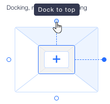
When you add an element to a page section, container or grid cell, it is automatically docked to the top or bottom corner – whichever is the closest.
The docking position is indicated by the dotted lines on the element. In the example below, the vector art is docked to top and left sides of the container:
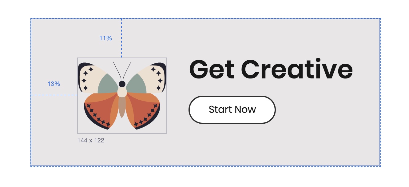
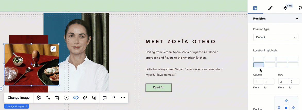
You can view the exact position of the element under Position in the Inspector panel:
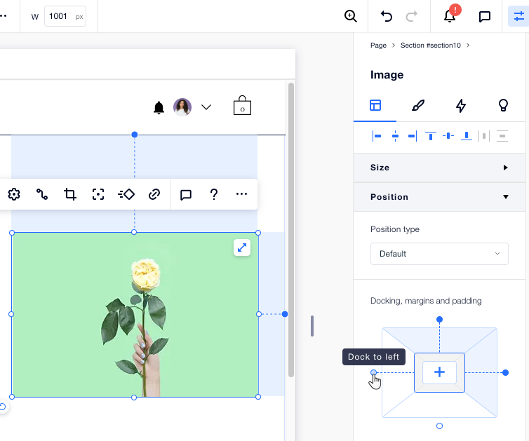
Adjusting the element's docking manually
You can override the automatic docking, and set the position manually from the Inspector.
Dock an element to any side; to the top, bottom, left, right or even to the center of the section, container, or grid cell they’re in.
To manually dock an element:
- Click the relevant element.
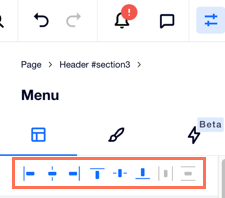
- Click the Inspector icon
 at the top of Editor X.
 - Scroll down to Position.
- Click the relevant docking points (top, bottom, right or left). You can also click the Align to center icon
 .
.
Tip:
It's usually a good idea to dock your elements to the top of the container, section or grid cell that they are in. This ensures that there is always a defined space between the element and the container/section when more content is added to your page.
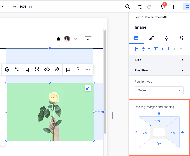
Using Margins when positioning elements
Use margins to maintain a set distance between the element and the edges of the section, container or grid cell that it’s docked to.
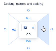
Margin units:
Margins can be set in pixels (px), percentage (%), viewport height (vh) and viewport width (vw). Each unit has a different outcome when the screen is resized. See the difference in the behavior of the units by dragging your canvas to resize it.
To create a margin:
- Click the relevant element.
- Click the Inspector icon at the top of Editor X.
- Scroll down to Position.
- Under Docking, margins and padding, select a side (top, bottom, left or right).
- Enter a value for the margin.
Tip: Click the measurement (e.g. px, %) to change it. - (Optional) Click the Edit all sides icon
 to set the same margin on all sides.
Tips:
- You can create margins on the sides of an element that aren't docked. This acts like a buffer between the element and the container, and prevents overlapping.
- We often recommend to use percentage (%) to position your elements consistently on every screen size.
Preventing elements from overlapping
When positioning elements, it's important to make sure they don't overlap on smaller breakpoints. To prevent this from happening, check out our tips below.
Aligning elements
Using the alignment options in the Inspector panel, you can center elements and align them to the left, middle or right.
Docking to the top
It's usually a good idea to dock your elements to the top of the container, section or grid cell that they are in. This ensures that there is always a defined space between the element and the container/section when more content is added to your page.
Applying a Grid
For more complex layouts, apply a CSS grid to your section/container and dock the elements to the grid lines. Place elements inside their own grid cells and dock them to a grid line so they're positioned perfectly in every screen size.
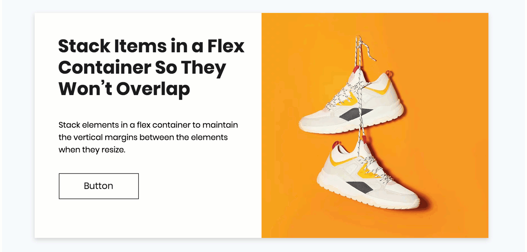
Applying a Stack
If you have a group of elements that are positioned in a vertical order, the Stack feature can ensure they never overlap. Stacking puts the elements inside a flex container that automatically adjusts to different screen sizes, so you can maintain a responsive layout.
Scan your page for overlapping elements:
Use the Site Checker, a free tool offered by Editor X, to look for this issue automatically on each and every page.
