Editor X: About Responsive Design
3 min read
Editor X is transitioning to Wix Studio, our new platform for agencies and freelancers.Learn more about Wix Studio
Think about how many devices you use to browse the web, and how many devices there are on the market. Now think about all the different resolutions that these devices have. That's a lot of possibilities...
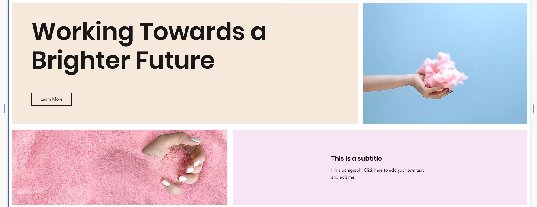
Editor X lets you build fully responsive websites that automatically adjust to the screen or device they are being viewed on to deliver the best user experience every time. Using the latest design technology like flexible grids and layouts, fluid sizing and breakpoint customization, you can ensure that your site looks exactly how you want from wherever it’s viewed.
In this article, we’ll review the Editor X features that can help you build a responsive site.
Fluid and Relative Sizing
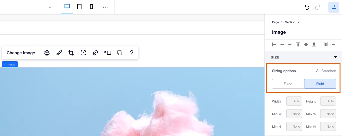
Fluid sizing and relative units of measure can help to create a design that seamlessly adjusts to any viewport. When designing in the Inspector panel, you can choose between Fixed and Fluid sizing options. Fixed means the element’s size stays the same regardless of the viewport, while Fluid means your element automatically resizes according to the breakpoint and your preferences.
Your layers are structured according to the parenting model, where the top layer acts as a parent to the bottom layer (i.e., the child). To make sure your elements don’t overlap and look great in every screen size, set the sizing of your layers from top to bottom.
Using relative measurements like the percentage (%), you can make child elements resize in relation to their parent elements. For example, set a section to take up 50% of the page’s width regardless of the screen size. You can do the same with any element or container within the section to make your page as responsive as possible.
Designing for Individual Breakpoints
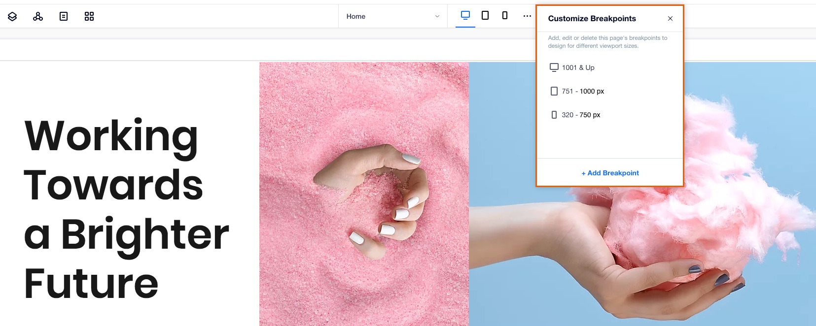
Breakpoints are the points at which your content changes so that your visitors always see the best possible version of your site, regardless of the device that they are viewing it from.
Your Editor X workspace already includes the most common breakpoints (desktop, tablet and mobile), but you can add up to three custom breakpoints (to a total of six breakpoints). These allow you to tailor your site to individual screen sizes by defining design overrides. Rearrange your layouts, choose what to show or hide, and customize the design at every viewport size.
CSS Grid Layouts
CSS Grids are an advanced layouting tool that lets you precisely position your elements inside any container or section.
Using grids, you never have to worry about elements overlapping in different screen sizes. Once you add an element to the one of the cells, it's automatically docked to the nearest corners so it always stays in position. If needed, you can override the automatic docking and adjust it manually.
You can create individual grids for each breakpoint, which gives you complete freedom to design different layouts for every screen size.
Learn More:

Flexbox Technology
Flexbox is a CSS container created around elements to ensure they're automatically arranged depending on screen size. It's a helpful tool in responsive design that prevents things from getting messy, like when elements overlap or change their order.
Use our advanced Flexbox technology tools such as Layouters or Repeaters to automatically adjust your content to every screen size without even thinking about breakpoints. You can also stack any group of elements together to create a flex container around them. By default, the container is transparent but you can design it as needed.