

Studio Editor: About Page Structure (Parent, Child and Sibling Elements)
4 min
In this article
- Parent-child relationships between elements
- Creating the page structure
- Layers on a page
- Re-parenting elements
- Finding an element's place in the hierarchy
- Structuring sibling elements
- Structural changes across breakpoints
When structuring site pages, you are essentially nesting elements within sections and / or containers and layout tools. For example, placing text inside a container box creates a relationship between the text and container, derived from Modern HTML and CSS concepts.
Use this article to learn more about page structure, including parent-child relationships between elements, page layers, and more.
Parent-child relationships between elements
When you place an element inside a container or layout tool (e.g. grid, stack), it attaches to that tool or container. This creates a parent-child relationship. For example, adding a logo to a header makes the logo the 'child', and the header the 'parent'.
Similarly to CSS, the design (i.e. size, position, padding, etc.) of a parent container influences its child elements. Adding padding to a container, for example, makes the child elements smaller in order to accommodate the change. Learn more about sizing elements
Did you know?
- New elements you add are automatically docked to the top and the left / right of the parent element. You can adjust the child element's position manually by disabling auto docking.
- When you stack elements, they're placed inside a flexbox which acts as the parent.
Creating the page structure
When planning the design of a site, it's important to begin by creating a layered structure. We recommend creating the parent containers first, then adding child elements by dragging and dropping them in the right place.
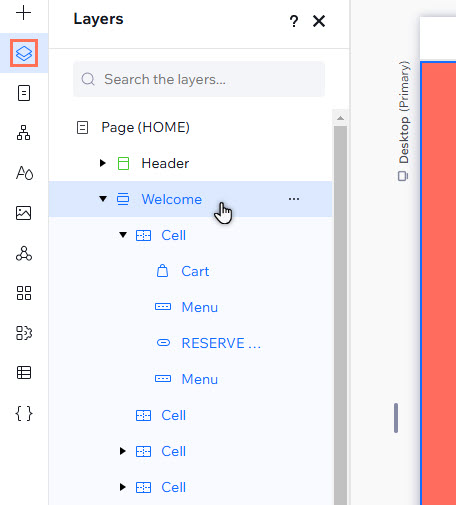
Layers on a page
In the Studio Editor, the structure you create is reflected the Layers panel. The following layers make up the structure of the site:
- Page: From the Layers panel, you can edit the page's background color and add padding. Click the More Actions icon
 next to the page name to control these settings.
 - Sections: Every page is made up of at least one section, and you can create as many as your client needs. Most sections contain layout tools and containers (e.g. cells, stacks, etc.).
- Containers and layout tools: Nest elements within parent containers to ensure they maintain position and spacing across all screen sizes. Add containers, or layout tools such as repeaters and flexboxes.
- Elements: These are the elements you add from the Add Elements panel (e.g. text, buttons, media, etc.). Dock single elements, or stack multiple elements to ensure consistent order and spacing across screen sizes.
Re-parenting elements
Moving a child element into a new parent element is referred to as "re-parenting". To re-parent an element, simply drag and drop it inside the new parent.
Finding an element's place in the hierarchy
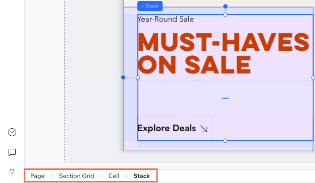
When selecting an element on the canvas, a breadcrumbs bar at the bottom left corner shows its hierarchy. This lets you see the element's parent, grandparent and so on, helping you navigate through the page's layers and understand their structure.
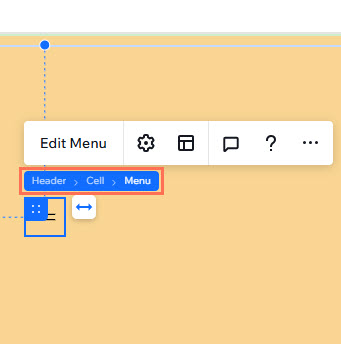
Hovering over an element's blue label on the canvas also shows its hierarchy. In the example below, hovering over the Menu label reveals that it's nested under a cell within a header section.
Structuring sibling elements
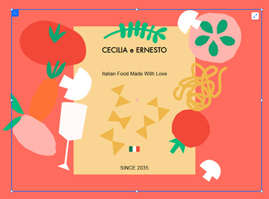
Siblings are elements sharing the same direct parent. For example, the text and vector art in the below image are siblings, with the container as their parent:
If sibling elements are in certain layout tools (e.g. container, repeater, etc.), they may affect each other's size and position. Designing this relationship can be useful in creating a responsive site, as you can prevent elements from overlapping in smaller screen sizes.
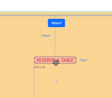
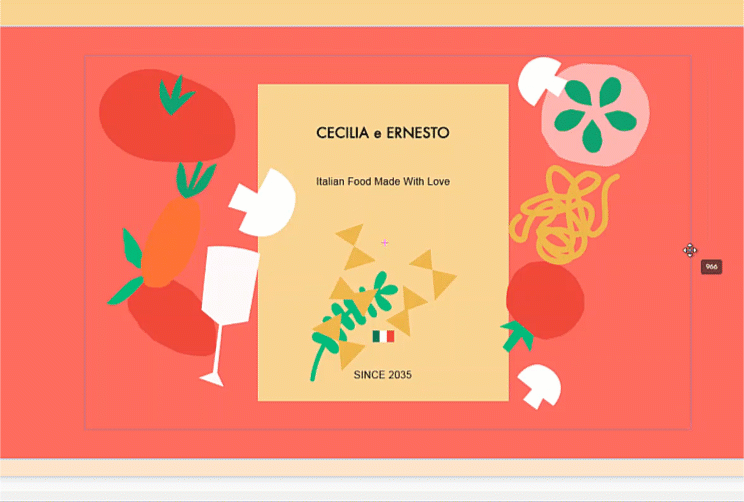
In the example below, you can see the margins that are automatically created between sibling elements:
Structural changes across breakpoints
The Layers panel shows you the hierarchy of a page's content (sections, containers / layout tools, and elements) and allows you to adjust them as needed.
The page hierarchy is part of the HTML structure of the site, which means changes you make to it are reflected across all breakpoints. For example, when you separate a parent and a child (e.g. text and its container), that separation applies to all breakpoints. Learn more about designing across breakpoints
