

Studio Editor: Adding and Setting Up Flexboxes
2 min
In this article
- Step 1 | Add a flexbox
- Step 2 | Add items to your flexbox
- Step 3 | Add elements to your flexbox
Use flexboxes to streamline the way you showcase content. These advanced layout tools are made up of responsive containers that adapt seamlessly to any screen size. Choose from a variety of display types, like Columns, Mosaic, and Slider, to elevate the style and functionality of your client's site.
Step 1 | Add a flexbox
To get started, head over to the Add Elements panel, select a flexbox preset and drag it onto your page. You can change the number of items and the way they're displayed later on.
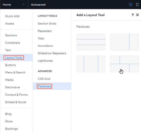
To add a flexbox:
- Click Add Elements
 on the left side of the editor.
 - Click Layout Tools.
- Click Flexboxes.
- Drag and drop your chosen flexbox onto the page.
See how it works:
Drag the handles on your canvas to see how the content of the flexbox seamlessly reorganizes across breakpoints.
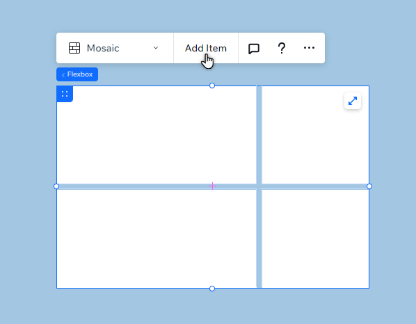
Step 2 | Add items to your flexbox
A flexbox is made up of several items that are responsive containers. You can change the number of items in a flexbox and it will automatically resize the items to fit the available space.
To add a new item, you can click Add Item or use the Manage Items panel in the Inspector.
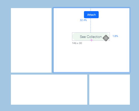
Step 3 | Add elements to your flexbox
Choose what you want to display in your flexbox by adding elements to the items. You can hide or show elements on different breakpoints to create a unique experience for visitors, no matter the device.
To add elements to an item:
- Click Add Elements on the left side of the editor.
- Select the element type you want to add.
- Click your chosen element to add it to your page.
- Drag the element to the flexbox item, and drop it when you see Attach.
What's next?
Customize and manage your flexbox to display the content you want, how you want.
