

Studio Editor: Using Containers
5 min
In this article
- Adding containers to a site
- Designing containers
- Attaching elements to containers
- Setting a container's responsive behavior
- Applying a grid to a container
Containers are responsive layout tools that help you streamline and structure site content. You can customize them to complement the site's design, and attach elements such as text, media, and buttons.
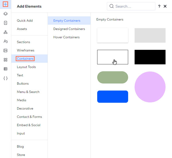
Adding containers to a site
Get started by adding a container to suit the client's design and content needs. You can choose from a range of pre-designed and hover containers, or start from scratch with a blank design.
To add a container:
- Click Add Elements
 on the left side of the editor.
 - Select Containers.
- Choose a container style (Empty, Designed, or Hover).
- Click and drag your chosen container to add it to the page.
Designing containers
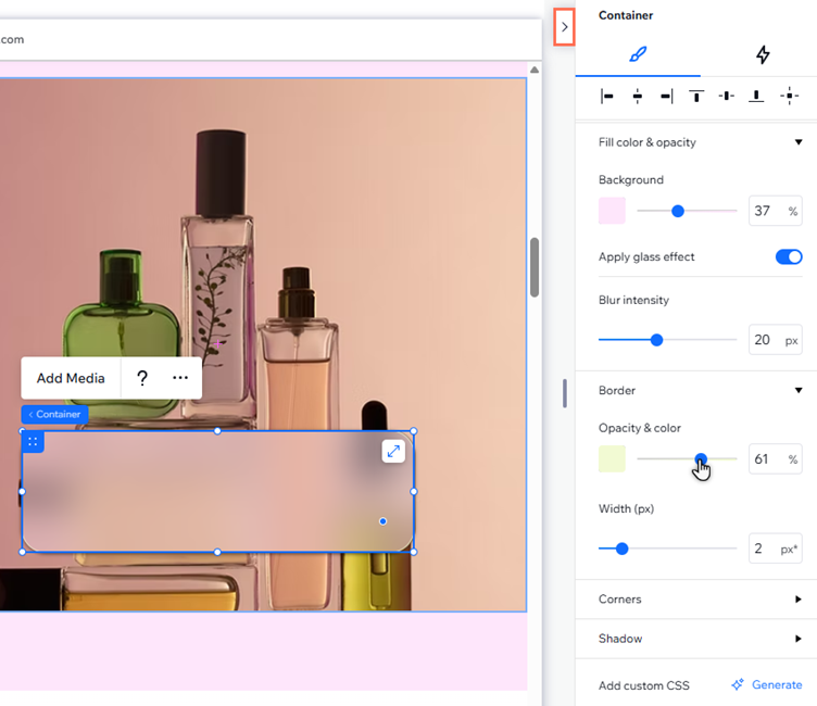
Customize the container's design to complement the site's aesthetic. You can change the background color, set the radius, and more.
To design a container:
- Select the relevant container.
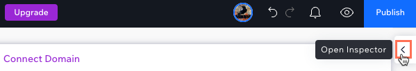
- Click the Open Inspector icon
 at the top right of the editor.
- Choose how you want to customize the container under Design:
- Background: Set the background and make it more or less visible:
- Color: Select from the site's theme colors, or your own custom shade.
- Gradient: Apply a gradient or linear gradient to the container. You can choose the colors, angles, and more.
- Glass effect: Apply a frosted glass effect to the container and set the intensity of the blur.
- Border: Add a border to the container and use the options to set its size, color, and opacity.
- Corners: Adjust the radius of the container's corners (in px) to make them more round or square.
- Shadow: Add and customize a shadow effect on the container.
- Background: Set the background and make it more or less visible:
Tip: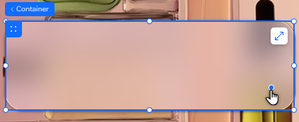
You can also adjust the corners of the container by dragging the radius handle on the canvas.
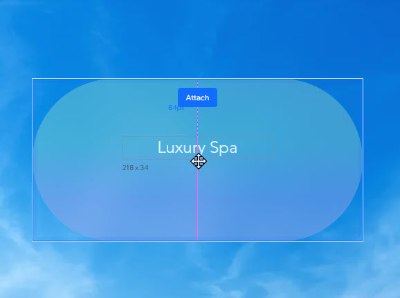
Attaching elements to containers
When you place elements inside a container, they are automatically attached. This means you can drag the container and its attached elements as whole, and view them together in the Layers panel.
To attach an element to a container:
- Click the relevant element.
- Drag it to its desire position in the container.
- Drop the element when you see the Attach message.
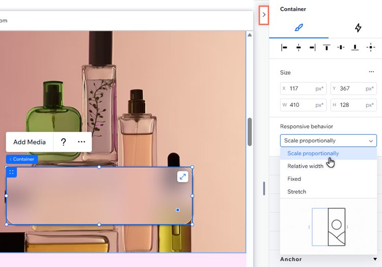
Setting a container's responsive behavior
When you add a container to the page, it already comes with a built-in responsive behavior. This means you don't have to worry about how the element looks on different screens - the responsive behavior ensures that it gets resized.
However, you may want to switch the responsive behavior, if you see one that is more suitable for your design.
To set the responsive behavior of a container:
- Select the relevant container.
- Click the Open Inspector icon at the top right of the editor.
- Click the drop-down under Responsive behavior and select the desired behavior:
- Scale proportionally: The container's proportions (width and height) keep the same aspect ratio on all screens.
- Relative width: The container's width changes automatically, in relation to its parent element.
- Fixed: The container's width and height always stay the same, they don't adjust based on screen size.
- Stretch: The container stretches to fit its parent (e.g. cell, section) on every breakpoint.
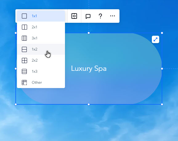
Applying a grid to a container
Apply an advanced CSS grid to the container to structure its layout. You can choose the number of rows and columns you want, and set their size using responsive measurements (e.g. fr, Min/max, %)
To apply a grid to a container:
- Select the relevant container.
- Click the More Actions icon
 .
. - Click Apply Advanced CSS Grid.
- Choose a layout from the 1x1 drop-down.
Tip: Select Other if you want to set your own number of rows and columns.