Editor X: About Stack
3 min read
Editor X is transitioning to Wix Studio, our new platform for agencies and freelancers.Learn more about Wix Studio
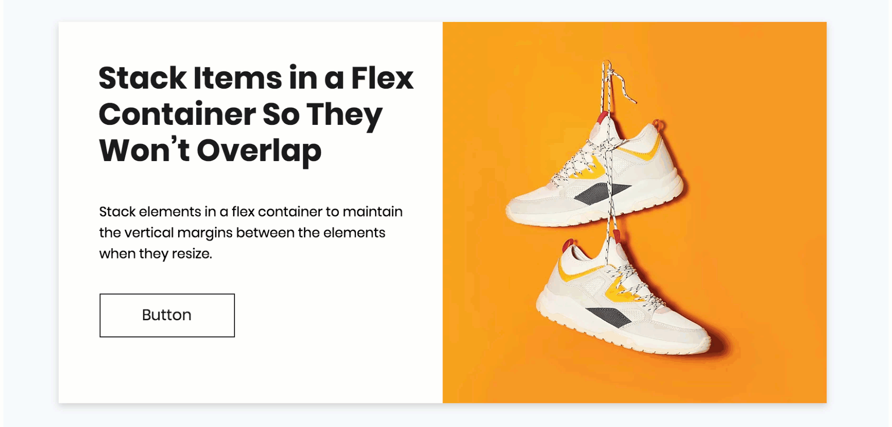
Stacking is a helpful tool in responsive design – without it, elements placed above and below each other could overlap on smaller screens. When you stack elements, it puts them inside a flex container with margins you can control.
Show me how to create a Stack

Working with breakpoints:
Stacking and unstacking elements affect your site on all breakpoints. Learn more about changes that apply to all breakpoints
Maintaining a responsive layout
Responsive websites often contain elements that resize and change position depending on screen size. This can cause them to overlap, or the spacing between them might change on smaller viewports.
Stack puts your elements in a container that automatically adjusts to different screen sizes, so you can maintain a responsive layout.
This is an example of what happens to elements that ARE NOT stacked when the screen resizes:

Tip:
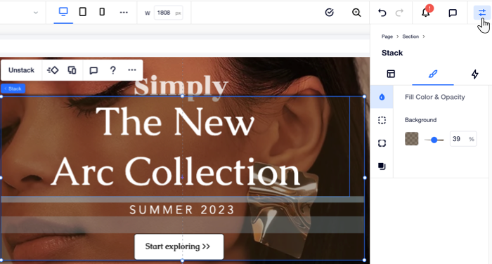
When placing elements in a Stack, the flex container becomes their parent element. Head over to the Layers panel  to see the relationship between all elements.
to see the relationship between all elements. Customizing the flex container
Stacking creates a flex container around your elements, which ensures that they always stay in the right spacing and order. The container is transparent by default, but you can design it to match your style, setting the fill color, borders, corners and shadow.
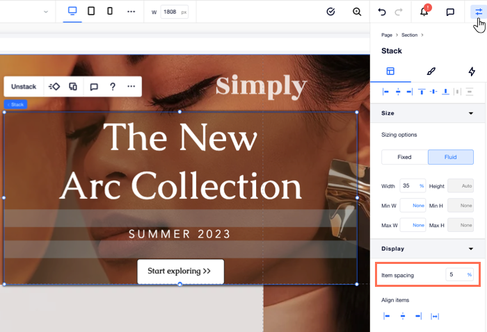
Controling the spacing between elements
Elements in a Stack are separated by vertical margins. To see the strips indicating the current margins, hover over or select the Stack. Double-click on elements inside the Stack and move them around to change the spacing between them.
Another option is making all margins equal in height from the Inspector panel, entering a value (px or %) next to Item spacing.
Tip:
From the same panel, you can also align all Stack elements in a certain direction: left, center, right or justify.
