Editor X: Units of Measure
3 min read
Editor X is transitioning to Wix Studio, our new platform for agencies and freelancers.Learn more about Wix Studio
In responsive design, you are no longer confined to the pixel. You can use a variety of different units of measure to set the width and height of elements. Understanding when to use each measurement allows you set your element's size in a way that meets your exact needs.
In this article, learn about units of measure offered by Editor X:
Want to learn more?
Check out our lesson on measurements in the Editor X academy.
Calculation
Calculation is a handy tool when you need to accurately size an element while using fluid units of measure. Using mathematical principals, you can write a "formula" that determines an element's width or height. You can even combine different measurements in this calculation (e.g., vh and px).
For instance, use calculation to design a header (100px) and a section that, together, take up the exact viewport height (100vh) in every screen size. You can set the section's height to (100vh - 100px), so the header is always taken into account in the calculation (100px).
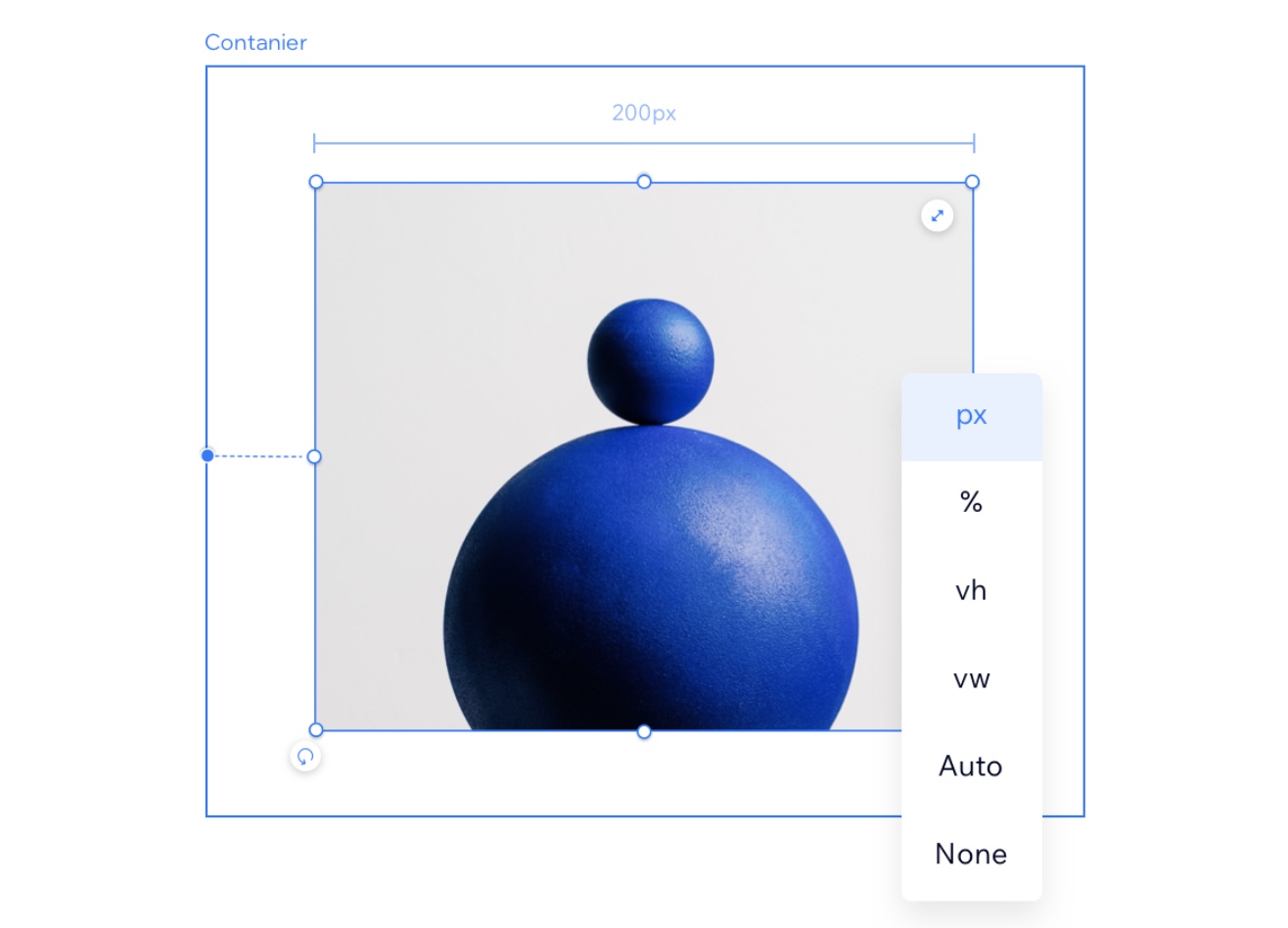
Pixel (px)
Pixels (px) are the most commonly used unit of measure. They make sure that an element's size is always the same regardless of the screen size.
Percentage (%)
The percentage unit is a very useful fluid unit that's popular in responsive design. When setting width in %, the size is determined by a percentage of the parent element's width. If the height is set to %, the size is taken from the parent element's height.
Viewport Width (vw) and Viewport Height (vh)
Viewport is the size of the browser in which the site is displayed. Vw and vh are relative to the width and height of the viewport.
- 1vw is the same as 1% of the viewport’s width. Setting the width of an element to 100vw means that it fills the full width of the viewport.
- 1vh is the same as 1% of the viewport's height.
Minimum & Maximum
While using fluid units of measure you can set a minimum or maximum value to the width and/or height. For example, setting an element’s minimum width of 400px, means that the element is never displayed smaller than that.
Auto
When an element is set to Auto size, it is determined by other factors, and the results may vary. For example, the height and width of a stretched image is always set to auto, as it fills up the available space, on any screensize.
Max Content (max-c)
Max Content is an advanced sizing unit that sets an element's width. You can apply this unit to Flexbox elements (i.e., Containers, Layouters, Repeaters), as well as vertical sections, text elements and buttons.
When using Max Content to define the width of an element, it's actually determined by the size of its children elements – no matter how big the content is or how many words it contains. The parent element fits itself to the children's maximum content size.
Show me an example

