

Creating Responsive Sites With Wix
6 min
In this article
- Using responsive features in the Wix Editor
- The mobile editor
- Full width elements
- Building a responsive site on Wix Studio
Whether you're using the Wix Editor or the Studio Editor, Wix offers a variety of tools to help you build a site that looks great on every screen.
With the Wix Editor, you can take advantage of full-width sections, strips and elements as they adjust to the visitor's screen size. In the Studio Editor, advanced options like breakpoint customization, scaling properties and responsive AI give you the precision to craft responsive, client-ready designs.
In this article, we'll discover how to create a responsive site in both editors.
Using responsive features in the Wix Editor
Wix sites built in the Wix Editor are becoming more and more responsive as we continue to add new and exciting features.
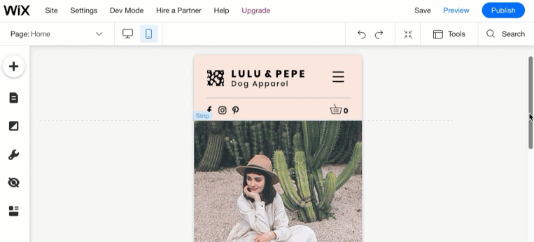
The mobile editor
Wix automatically creates a mobile-friendly version of your site using the content from your desktop site. Use the mobile editor to customize your mobile site's design, content, and enhance the experience for visitors.
You should know:
The desktop and mobile versions of your site represent different viewing modes of the same site; they are not separate sites. Changes to your desktop site affect your mobile site, while changes to your mobile site do not affect your desktop site.
Full width elements
The Wix Editor offers a variety of elements that can expand to fill the entire width of the screen, and adjust to the visitor's screen size (on desktop).
The following elements are responsive when stretched to full width:
Sections and strips
Full-width slideshows

Galleries

Horizontal menus and lines

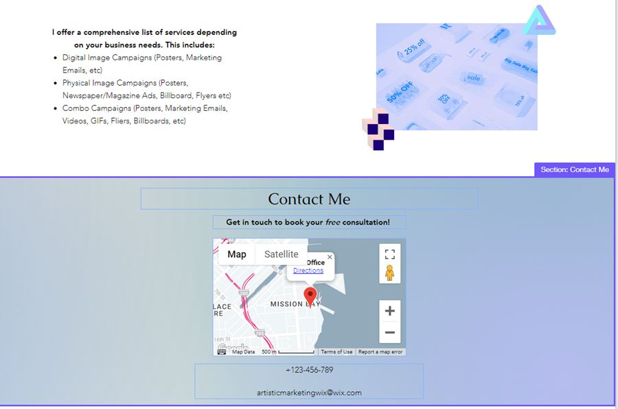
Wix app elements and Google Maps

If the element has a Stretch icon  , it means you can stretch it to full width and make it responsive.
, it means you can stretch it to full width and make it responsive.
Note:
When using elements that can’t be stretched to full width (e.g. text boxes, images), make sure to keep them within the vertical gridlines so that your elements appear correctly on most screen sizes.
Building a responsive site on Wix Studio
You can build fully responsive, beautifully designed sites for your clients in the Studio Editor. With its cutting-edge features, the platform empowers you to create responsive sites with speed and precision.
Within the editor, you'll find an array of tools carefully curated to streamline your design process, ensuring ease, efficiency, and remarkable results for your projects.
Click below to learn about these tools and features.
Customization per breakpoint

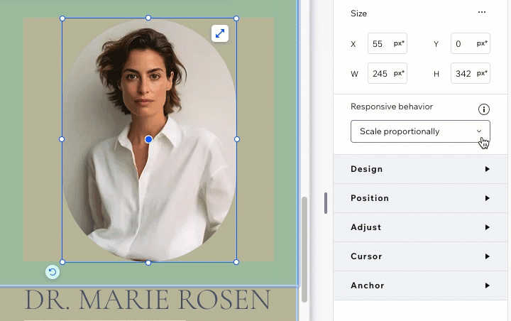
Responsive behaviors for elements
Scaling design properties

Responsive AI tool for sections


