

Wix Editor: Getting Started With the Mobile Editor
5 min
In this article
- Accessing the mobile editor
- Working with elements in the mobile editor
- Customizing your mobile site
- Using mobile tools
- FAQs
Wix automatically creates a mobile-friendly version of your site using the content from your desktop site. Use the mobile editor to customize your mobile site's design, content, and enhance the experience for visitors.
You should know:
The desktop and mobile versions of your site represent different viewing modes of the same site; they are not separate sites. Changes to your desktop site affect your mobile site, while changes to your mobile site do not affect your desktop site.
Accessing the mobile editor
The mobile editor has unique tools and elements to help you create you mobile site. You can add mobile-only content, or optimize your existing content for mobile devices. Learn more about the mobile editor
To get started, click the Switch to mobile icon  at the top of your desktop editor.
at the top of your desktop editor.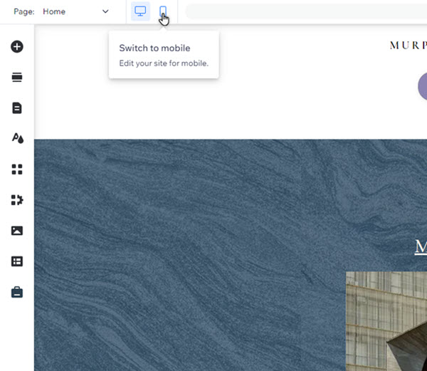
Want to go back to the desktop editor?
You can switch back to editing the desktop view by clicking the Switch to desktop icon  . You can also press Ctrl-J (or Cmd-J for Mac users) to switch between views.
. You can also press Ctrl-J (or Cmd-J for Mac users) to switch between views. Working with elements in the mobile editor
Like your desktop site, the mobile version of your site is made up of elements (e.g. text, images, buttons). The ways you can customize an element depend on its source - desktop, or mobile:
- Desktop elements: Elements you add in the desktop editor automatically appear on your mobile site.
- Mobile-only elements: Elements that are optimized for mobile and don't appear on your desktop view. You can add them directly from the Add to mobile panel.
Select an option to learn more about customizing elements on your mobile site:
Desktop elements

Mobile-only elements
Note:
The available customization options for desktop elements vary based on the specific element.
Customizing your mobile site
Customize important content on your mobile site to create a unique experience for visitors.
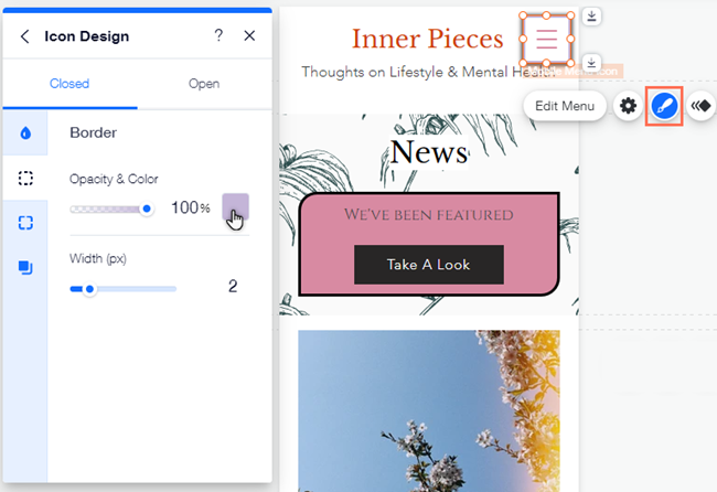
For example, you can design every aspect of your site menu on mobile; from the icon to the container and items. You can also change the colors and text, and add more elements to make it your own.
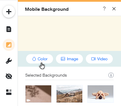
You can also change your mobile site background without affecting your desktop site. Choose a different color, a video or an image to better suit the mobile experience you're creating.
Using mobile tools
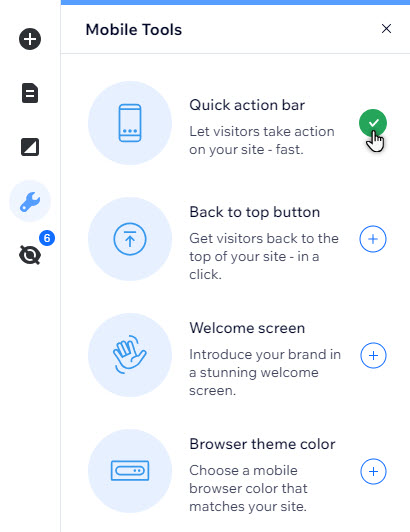
From the Mobile Tools panel  , you can add features that increase engagement and make navigation even easier for your visitors.
, you can add features that increase engagement and make navigation even easier for your visitors. For example, create a Welcome screen to greet visitors on their mobile devices, or add a Back to top button for pages with more content. Learn more about tools available in the mobile Editor
FAQs
Select a question to learn more about the mobile editor.
Is all of my site's content carried over from the desktop editor?
 in the left menu of your editor.
Are there any features that are unavailable on Wix mobile sites?
What kind of mobile-only elements can I add?
Do changes I make in the mobile Editor affect the desktop site?
What else can I do in the mobile Editor?
