Wix Editor: Strips and Columns on Your Mobile Site
6 min
In this article
- Adjusting strips on your mobile site
- Customizing columns on your mobile site
When using strips or columns on your desktop site, they are displayed differently on your mobile site. Instead of being arranged horizontally, strips and columns are displayed vertically in order for them to fit and suit mobile screens.
You can adjust the way the strips and columns look on mobile by changing their spacing, order, and size. You can also hide strips and columns if they're not necessary for mobile.
Learn how to adjust and customize:

Did you know?
Wix automatically creates your mobile-friendly site using the content from your desktop site, so you don't have to start from scratch.
Adjusting strips on your mobile site
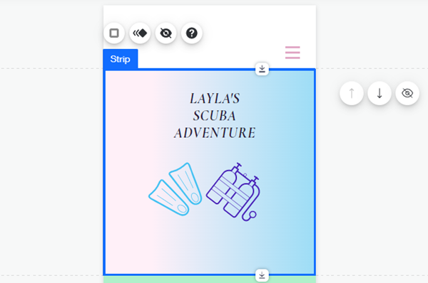
Change the size and order of strips to suit your mobile site's alignment. You can also hide a strip if it's not relevant to the content of your mobile site, and add a cool scroll or animation effect.
To adjust strips for mobile:
- Open your site in the mobile editor.
- Click the relevant strip.
- Choose how you want to adjust the strip:
Resize your strip
Reorder your strips
Hide a strip
Add an effect to your strip

Customizing columns on your mobile site
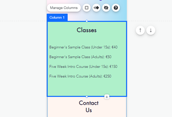
Customize columns on your mobile site to keep your content clear and engaging. You can adjust settings such as the size, spacing, and order.
To adjust columns for mobile:
- Access the mobile editor.
- Click the relevant strip.
- Choose how you want to adjust your columns:
Resize your columns
Hide a column
Reorder your columns
Adjust the background space
Change the spacing of your columns
Add an effect to your columns


 .
.


 .
.
 .
.

