Wix Editor: About Buttons
7 min
In this article
- Find a button for your needs
- Link your buttons to wherever you want
- Design your buttons to match your site
- Use buttons for advanced capabilities
Buttons are elements your visitors use to interact with your site. You can link them to a variety of locations such as your site pages, external sites, or even documents. Depending on the button type you choose, there are also a range of customization options available.
Start creating your buttons to make clear call to actions, and encourage your site visitors to explore what you or your brand has to offer.

Find a button for your needs
In the editor, there are a variety of button types available for all of your site and business needs, so you can create a smooth interactive experience for your visitors.
The buttons have a range of different uses and customization options to ensure that you can build a functional, sophisticated site without compromising on design.
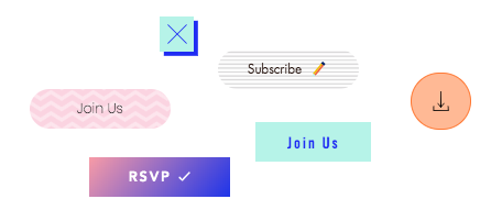
You can add the following buttons in the editor:
Text & icon buttons
Icon buttons
Image buttons
Document buttons
iTunes buttons
Payment buttons
PayPal buttons
Link your buttons to wherever you want
Add a link to your button to direct your site visitors to the relevant location. You can link to a variety different places and options, depending on your button type and site needs. The types of links you can add to a button are:
- Page: Direct your visitors to a different page on your site.
- Web address: Link your button to an external URL to bring visitors to another site.
- Anchor: Link the button to an anchor on your site. When visitors click it, they are brought to the relevant page and anchor.
- Top / bottom of page: When a visitor clicks this, they are brought to the top or bottom of the page they are currently on.
- Document: Link the button to a file you've uploaded to your site.
- Email: Connect the button to your email address, so visitors can contact you directly from their browser or device.
- Phone number: Link a button to your phone number to allow mobile or tablet visitors to call you instantly. Desktop visitors are taken to a calling app, such as FaceTime.
- Popup: Link the button to your chosen popup on your site.
Note:
Depending on the button type, you may not see the option to add a link. For example, document buttons can only be connected to files on your site.

Ready to get started?
Design your buttons to match your site
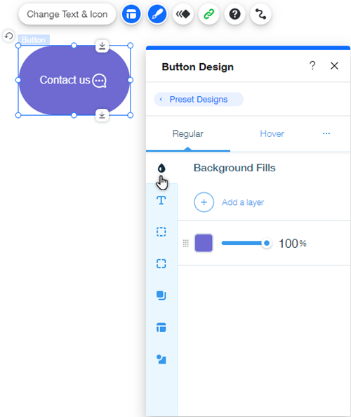
Customize your button in the editor by clicking the Design icon  to change the button's appearance, and the Layout icon
  to change its alignment or structure.
Depending on the button type you choose, you may be able to change the color and opacity of the button, as well as setting the alignment and spacing. You can edit as many or as little aspects as you like, so you have comprehensive control over designing a button that fits your brand and theme.

If you want to further personalize your button, you can also add an animation effect to create a unique interaction for your visitors.
Note:
The Design / Layout panels are only available on certain buttons in the editor.
Use buttons for advanced capabilities
With features such as Velo Dev Mode and the CMS, you can use buttons for advanced functions across your site, and create an upgraded, custom experience for your visitors.
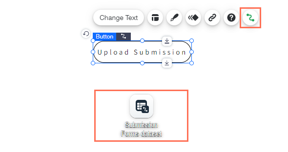
By connecting buttons to collections in the CMS, you can define what happens when visitors click the button. One popular use of this is to set up buttons that collect input and information from visitors, such as files or text input.

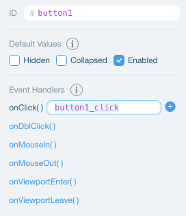
Enabling Velo Dev Mode on your site allows you to determine a button's behavior with code. For example, you can hide your button from the page until the visitor completes another action on your site, or set custom events. Learn more about working with events and properties


