

Wix Editor: Customizing the Design of Your Buttons
7 min
In this article
- Designing your button
- Design glossary
- Button design options
- Text formatting options
- Icon design options
Create beautiful, eye-catching buttons that match your site and attract your visitors to interact.
Click the Design icon  on your button to start customizing.
on your button to start customizing.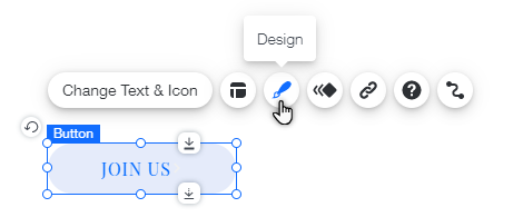
Note:
The options for button states differ depending on the type of button selected.
Designing your button
There are a variety of customization options available. Depending on the button type, you can adjust the background, text, and icon. Choose the colors, fills, corners, shadows and more.
Customize each button state individually to create eye-catching effects as visitors navigate your site. Use vibrant, distinct colors for the default, hover, and active states of each button to enhance engagement and make each one stand out.
What's the difference between the button states?
Note:
The customization options available depend on what you choose to display on your button (text, icon or both).
To design your button:
- Go to your editor.
- Click the button type you want to customize from the options below:
Customize a Text & Icon button
 to customize them separately.
Customize an Icon button

Learn more about customizing other types of buttons:
Design glossary
Button design options
Option | Explanation | How to use |
|---|---|---|
Background Fills | Add different fills such as colors, images, patterns and gradients to create stunning and colorful effects on your button. |
|
Borders | Customize the button's border to make it stand out. Customize all sides of the button together, or each side separately, by clicking the Lock and Unlock icons. |
|
Corners | Change the corners of your button to make them more rounded or square. Change the size of all the corners together, or customize each corner separately, by clicking the Lock and Unlock icons. | Click the pixel field on a corner and enter the number of pixels you want to apply to it. |
Shadows | Add layers of shadows to your button, and customize the color, size and more. |
If using an Upload button:
|
Layout | Change the layout of your button. |
|
Text formatting options
Option | Explanation | How to use |
|---|---|---|
Show Text | Show or hide text on your button. | Click the toggle to show or hide text on your button. |
Theme | Select the theme for your button text. | Select a text theme from the drop-down menu. |
Fonts | Choose the font for your button text. | Click the drop-down menu and select a font. |
Font Size | Change the size of the text on your button. | Drag the slider to increase or decrease the font size, or enter a value. |
Text Formatting | Apply formatting to your text. |
|
Character Spacing | Change the spacing between the text characters. | Drag the slider to increase or decrease spacing, or enter a value. |
Shadows | Create shadows for your text. You can have more than one shadow. | Click Add a shadow to add a new one. Click the Customize Shadow icon to design it. |
Icon design options
Option | Explanation | How to use |
|---|---|---|
Show icon | Show or hide an icon on your button. | Click the toggle to show or hide the icon on your button. |
Size | Change the size of your icon. | Drag the slider to increase or decrease the size of your icon, or enter a value. |
Color | Change the color of the icon. | Click the color box and select a color. |
Rotation | Adjust the rotation of the icon. | Drag the handle to customize the rotation of the icon, or enter the degrees in the text box. |
