

Studio Editor: Troubleshooting Differences Between the Editor and the Live Site
5 min
In this article
- Match the breakpoint and viewport sizes
- Align margin units
- Align responsive behaviors
- Check element visibility
When viewing the published version of a Studio Editor site, you may notice it looks different than in your editor. These differences are usually minimal, but can cause elements to look misaligned or cut off.
Generally, these differences are caused by some of the element's settings (sizing, position, and behaviors) on viewports. Use the suggestions in this article to find potential resolutions, and maintain consistency across screen sizes.
Edited the site recently?
We recommend checking that you have published all of your changes and that you're viewing the latest version of the site. You can also use browser tools to check different viewports from a single device.
Match the breakpoint and viewport sizes
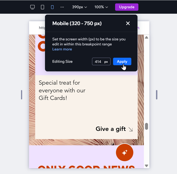
If the live site looks different to what you see in your editor, it may be related to breakpoints and the editing size.
Breakpoints are screen size ranges you use to design a site for different devices (i.e. viewports). You can set a specific editing size within this range — e.g. in a 320-750px breakpoint, you can set the editing size as 500px.
Viewports that fall outside of your defined ranges are not optimized, and may have alignment and layout issues. If you notice an issue with a specific viewport, we recommend setting the editing size to match it and make adjustments.
To set your editing size:
- Go to the relevant page and breakpoint in the editor.
- Click the current editing size at the top.
- Enter the new value next to Editing Size.
- Click Apply.
- (Optional) Adjust the site to look how you want.
Experiencing other issues across breakpoints?
Use our guide to troubleshoot misaligned elements, text sizing, and more.
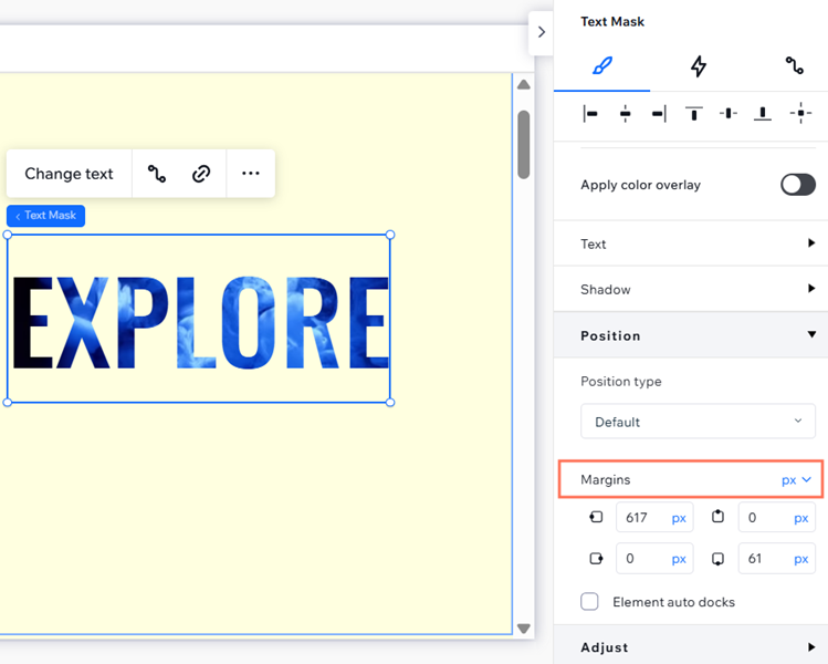
Align margin units
Using different margin units across sibling elements (elements that share a parent section / container) can cause the content to become misaligned or distorted. We advise using the same margin units (%, px, px*, etc.) for all sibling elements in a single container or section.
To change an element's margin units:
- Select the relevant element.
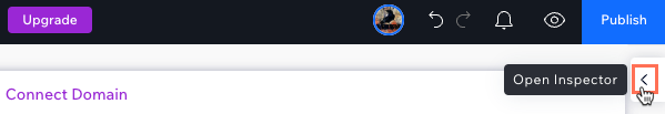
- Click the Open Inspector icon
 at the top right of the editor.
- Scroll down to Position.
- Click the dropdown next to Margins.
- Select the relevant unit.
Align responsive behaviors
Parent and child elements with contradicting responsive behaviors may cause issues with the content on the live site.
Let's imagine a button attached to a container. The button's responsive behavior is Fixed, and the container is set to Scale proportionally. Since the button is fixed, it doesn't resize with its parent container, potentially leading to gaps, overlapping elements, and cut off elements on the live site. This may also happen when one of the elements has the Mixed responsive behavior.
In order to resolve this issue, we recommend aligning the responsive behaviors of the elements.
To change an element's responsive behavior:
- Select the relevant breakpoint.
- Select the element.
- Click the Open Inspector icon at the top right of the editor.
- Select an option from the Responsive behavior dropdown that aligns with the parent or child element.

Note:
These differences can also affect the height of elements, resulting in unwanted gaps on the site. Learn more about troubleshooting gaps.
Check element visibility
You may notice that you can see an element on some screen sizes, but not others. This is generally because the element has been hidden from certain breakpoints. You can use the Layers panel to locate the element, and show it on the viewports you want.
To check an element's visibility:
- Go to your editor and open the relevant page.
- Select a breakpoint from the top of your editor.
- Click Layers
 on the left side.
 - Locate the hidden element on the list.
- (Optional) Click the Show icon
 .
.

Note:
Changes such as deleting an element or moving it to a different section/container apply to all breakpoints—no matter which one you’re working on. If you only want to show an element on certain breakpoints, you can hide it via the right-click menu.
