Studio Editor: Troubleshooting Unwanted Gaps in a Section
3 min
In this article
- Removing the gap
- Video tutorial
- FAQs
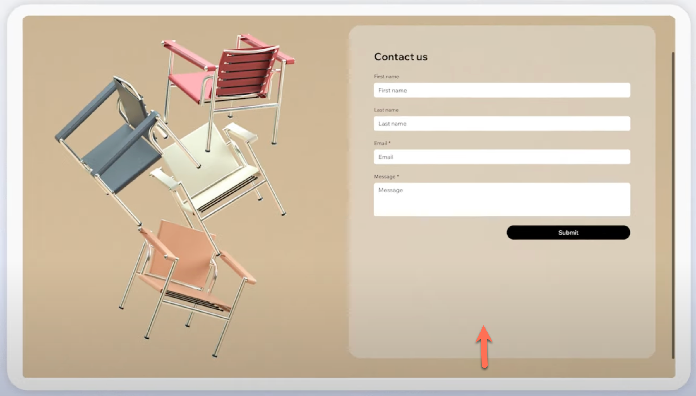
If you notice unwanted gaps appearing in a section on your live site, it is often caused by the way responsive behavior is set for your section and its elements. When a section and its elements have conflicting responsive settings, gaps can appear as the screen size changes.

In the example above, the form’s responsive behavior is set to relative width, meaning its width adjusts based on the size of its parent container (e.g., a grid cell), but its height remains fixed. The section, however, is set to scale proportionally, so both its width and height adjust proportionally as the screen size changes. This creates a large gap on bigger screens as the section gets taller, but the form doesn't.
Learn more about the different responsive behaviors.
Removing the gap
First you need to check the responsive behavior of the element and the section to see if they are aligned. If the responsive behaviors are not aligned, change them as instructed below.
To remove the gap:
- Select the element in the section.
- Click the Open Inspector icon
 at the top right of the editor.
 - Select Relative width from the Responsive behavior drop-down.
- Select the relevant section.
- Click the Open Inspector icon
 at the top right of the editor.
 - Select Fixed height from the Responsive behavior drop-down.
After adjusting the responsive behavior, test your design to ensure no gaps appear on larger screens by resizing the canvas.
Video tutorial
Watch a live demo resolving this issue.
FAQs
Click a question below to learn more.
What does the 'fixed height' responsive behavior actually mean?
Can I use 'scale proportionally' for the section?
How do I test my site on different screen sizes?
What if I have multiple elements in the section?
Do grids help prevent gaps?


