Wix Editor: About the Mobile Editor
10 min
In this article
- Using the mobile editor
- Hidden desktop elements
- Customizing your mobile view
- Adding mobile-only elements
- Mobile tools
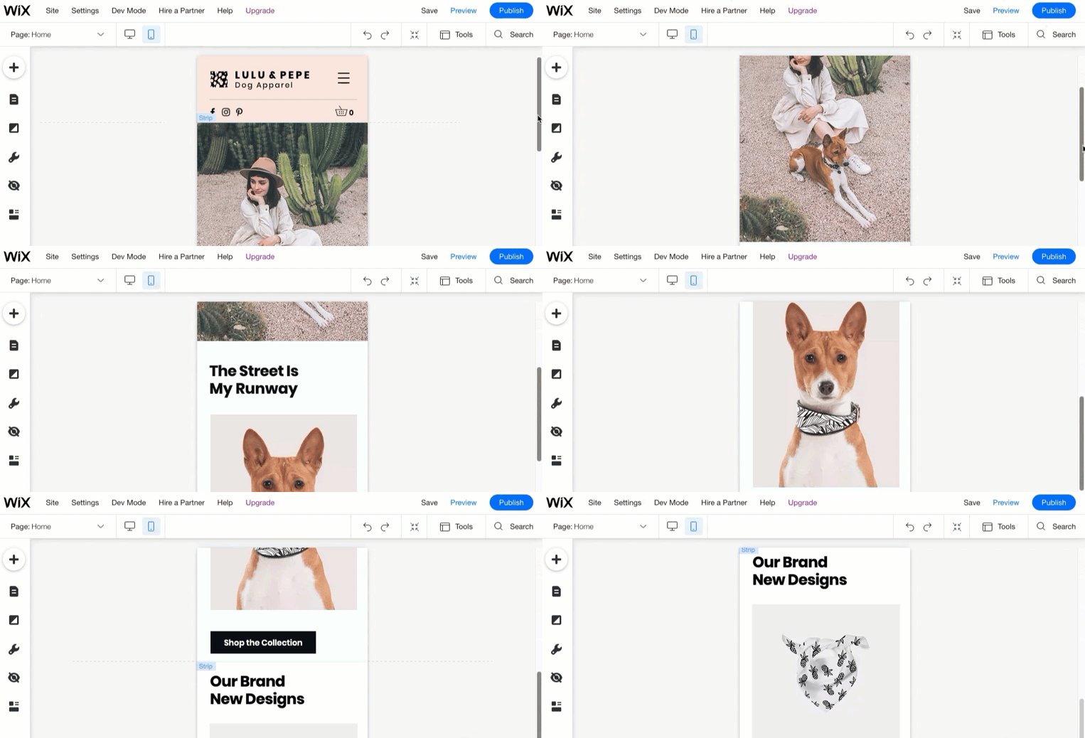
Want your site to look amazing on mobile? Use the mobile editor to create a mobile view that's fully functional and professional-looking.
Change the background, hide desktop content and replace it with mobile-only elements. To enhance the experience even further, you can add elements like a Back to Top button and a Quick Action bar.
Important:
View a list of compatible mobile devices and browsers.
Using the mobile editor
You can access the mobile editor anytime by clicking the Mobile icon  on the top of the editor.
 on the top of the editor.
Your mobile view is a reflection of your desktop view, which means it displays all the same elements and content. Your fonts, images and elements are automatically resized for optimal view, which gives you time to make the mobile experience truly unique.
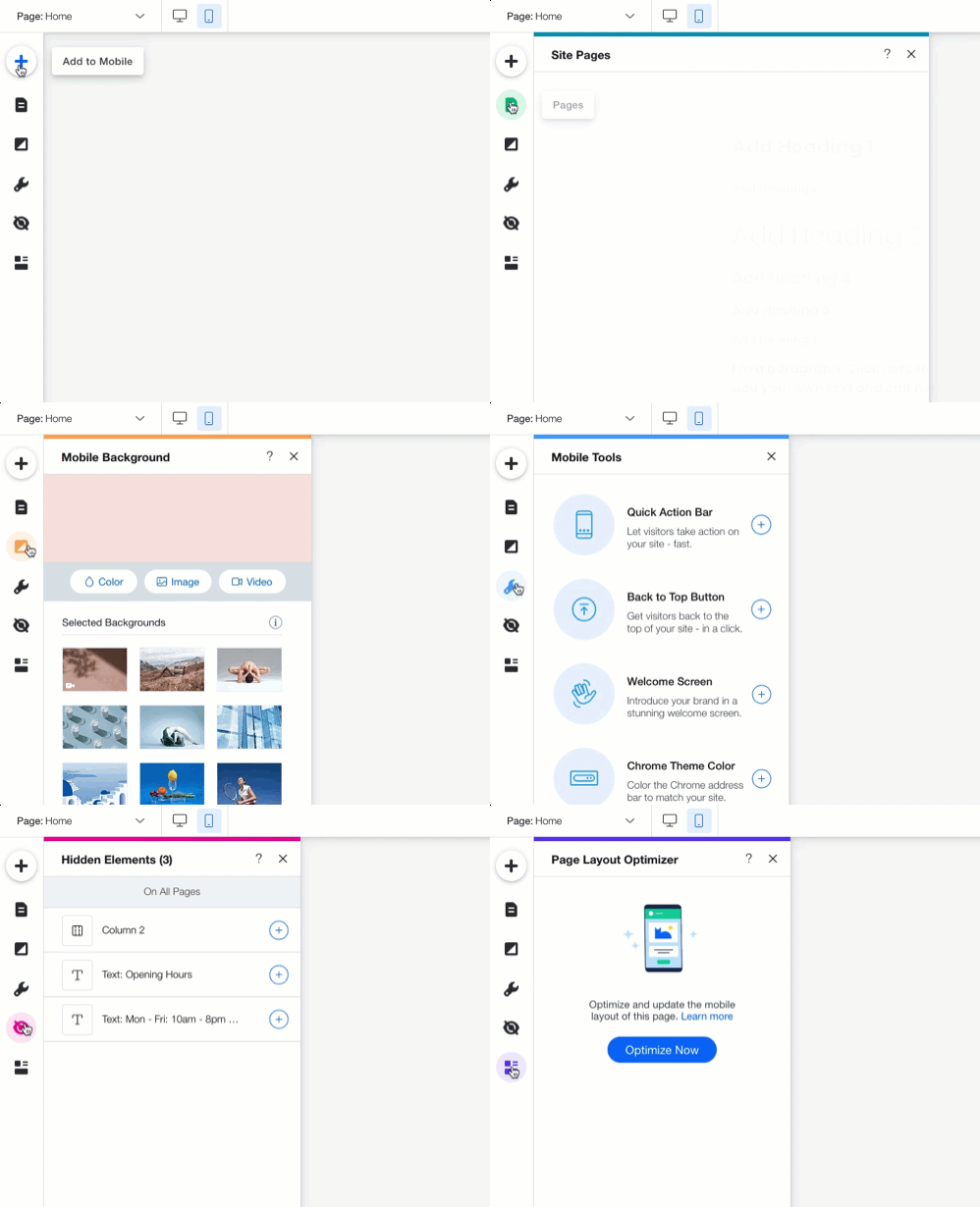
The left-side menu
On the left side of the editor, you'll find the tools you need to customize your mobile-friendly view. Add new elements, navigate between site pages, even access hidden desktop elements.
Hidden desktop elements
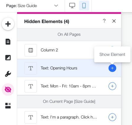
For your convenience, Wix automatically creates a mobile-friendly version of your site using the content from your desktop site. In this process, elements that aren't optimized for mobile are automatically hidden (e.g., hover interactions, third-party apps and more).
Click the Hidden Elements icon  on the left side of the editor to see these elements. If there are additional elements you don't want to display on mobile, you can hide and unhide them as you wish.
 on the left side of the editor to see these elements. If there are additional elements you don't want to display on mobile, you can hide and unhide them as you wish.
Show me how
Customizing your mobile view
The mobile Editor gives you full creative freedom while adjusting your site to mobile. You can make small adjustments and keep the same feel, or create a different look just for mobile. The design changes you make on mobile don't affect your desktop version.
Click below to learn how to:
Resize your mobile text
Add animation to an element
Customize your mobile menu
Re-order your page sections
Change a page's background
Adding mobile-only elements
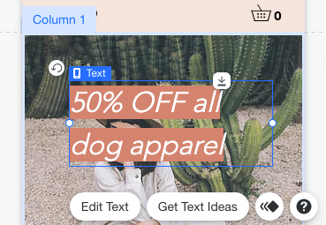
The mobile editor lets you add as many elements as you need to your mobile view. These elements are completely optimized for mobile so you don't have to worry about sizing. You can add text, images, buttons, embeds and more directly from the Add panel.
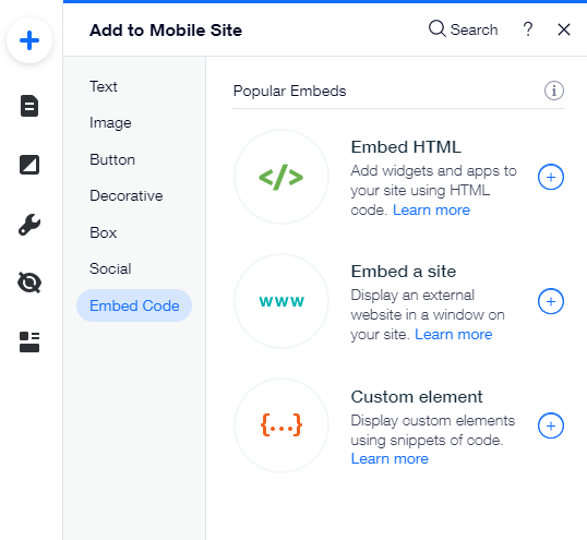
Elements that you add on mobile don't appear on the desktop version of your site. Mobile-only elements are marked with an icon  so you can easily understand what appears where.
 so you can easily understand what appears where.
Tip:
Mobile-only elements cannot be pasted to the desktop editor. You can add elements to the desktop editor with the Add panel.
Mobile tools
The Mobile Tools panel provides useful features that increase engagement and make site navigation much easier on mobile.
Add a welcome screen to greet your visitors, a Quick Action bar to drive them to action, and a Back to Top button at the bottom of long pages. For visitors who are using Chrome on Android, you can also make the browser's theme color change once they enter your site.
Show me how
Prefer keeping the desktop version?
You can always disable the mobile-friendly view of your site.


 .
. next to the element you want to show.
 .
.
 .
.
 icon to adjust the design or choose a different preset. You can design the icon differently for when the menu is Open or Closed.
  to freeze it. This pins the icon to the page so it always stays at the top.
  to change the way your menu opens: On the right, on the left or full screen.
 and Move Down
  icons next to the relevant section.
 on the left of the mobile editor.
 on the left side of the mobile editor.
 next to the element you want to add.