

- Wix Pro Gallery: Choosing a Layout for Your Mobile Site (Custom vs. Presets)
Wix Pro Gallery: Choosing a Layout for Your Mobile Site (Custom vs. Presets)
12 min
In this article
- Custom layouts
- Preset layouts
- Customizable layout features
- FAQs
The layout of your pro gallery on your mobile site is responsive, meaning it automatically adjusts to fit different screen sizes and devices. You can choose a completely different layout for your pro gallery so that it looks ideal on mobile / tablet.
Select a preset layout with built-in features or a custom layout if you prefer customizing the layout on your own. Whichever layout option you choose, you can always customize the gallery's design.
Custom layouts
These gallery layouts allow you to design and customize your pro gallery from scratch. You can choose from a wide range of customizable layouts to best present your media on mobile devices.
Wix Editor
Studio Editor
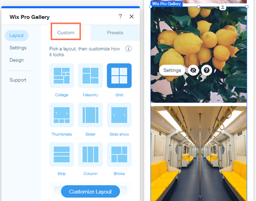
- Go to your mobile editor.
- Click the pro gallery element on your page.
- Click Settings.
- Select a layout for your gallery.
- Click Customize Layout to change the layout to look exactly as you want (see Customizable Layout Features below).
Note:
There are no navigation arrows in the expanded view. Instead, visitors swipe the screen to view the next gallery item.
Preset layouts
Preset templates include a range of built-in layout features. These ready-made gallery layouts allow you to speed up the process of showcasing your images on your site. While the layouts themselves are not customizable, you can personalize the gallery's design.
Wix Editor
Studio Editor
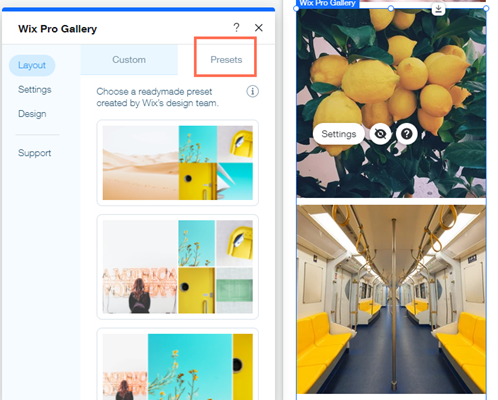
- Go to your mobile editor.
- Click the pro gallery element on your page.
- Click Settings.
- Click the Presets tab.
- Select a layout for your gallery.
Customizable layout features
Each customizable layout offers a range of settings you can personalize, including scroll direction, gallery direction and image orientation.
Click an option below for more details on that layout:
Collage
Use the Collage Layout when you want to show images of different orientation (both vertical and horizontal) placed randomly within the gallery.
Firstly, choose a Scroll Direction – vertical or horizontal. Then, adjust the available settings.
Vertical scroll:
- Gallery orientation: Choose whether photos will be shown vertically or horizontally.
- Thumbnail size: Choose how big images in the gallery are.
- Spacing: Choose how much space to have between the images.
- Collage density: Choose how many images will be shown at a time in the gallery.
- Load More button: Enable the toggle to show a button that loads more images.
- How many more images load: Choose to display all images or one more section. Note: Choosing One more section adds another section of the same size as the original gallery.
Horizontal scroll:
- Gallery orientation: Choose whether photos will be shown vertically or horizontally.
- Slide automatically: Enable the toggle to display your items in a continuous slideshow:
- Intervals: Your gallery slides to the next item after your chosen amount of time. Drag the Time between images slider to choose how much time passes before the slide changes.
Note: If you want to change the transition effect, go to the Slide Animation tab in the Design settings. - Continuous: Your gallery slides automatically. Drag the Slideshow speed slider to adjust how fast your gallery slides.
- Pause on hover: Click the toggle to enable or disable that the slideshow pauses when a visitor hovers over a gallery item.
- Intervals: Your gallery slides to the next item after your chosen amount of time. Drag the Time between images slider to choose how much time passes before the slide changes.
- Thumbnail size: Choose how big images in the gallery are.
- Spacing: Choose how much space to have between the images.
- Collage density: Choose how many images will be shown at a time in the gallery.
Masonry
Use the Masonry layout when you want to show images of different orientation placed in columns or rows.
Firstly, choose a Gallery orientation – horizontal or vertical. Then, adjust the available settings.
Horizontal orientation:
- Thumbnail size: Choose how big images in the gallery are.
- Spacing: Choose how much space to have between the images.
- Load More button: Enable the toggle to show a button that loads more images.
- How many more images load: Choose to display all images or one more section. Note: Choosing One more section adds another section of the same size as the original gallery.
Vertical orientation:
- Fit to screen: Let the gallery automatically optimize the number of images, based on the visitor's screen.
- Thumbnail size: Choose how big images in the gallery are.
- Set items per row: Manually set the amount of images to show in each row.
- Images per row: Choose how many images appear in each row.
- Spacing: Choose how much space to have between the images.
- Load More button: Enable the toggle to show a button that loads more images.
- How many more images load: Choose to display all images or one more section. Note: Choosing One more section adds another section of the same size as the original gallery.
Grid
Use the Grid layout when you want your images to be shown within a grid.
Firstly, choose a Scroll direction – horizontal or vertical. Then, adjust the available settings.
Vertical scroll:
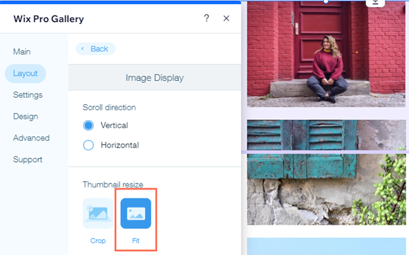
- Thumbnail resize: Choose how the image thumbnails look:
- Crop: Your images are cropped to the image ratio you select.
Note: The Border width & color and Corner radius design options are only available when selecting this option. - Fit: Your images adapt to fit the size of the thumbnail.
- Crop: Your images are cropped to the image ratio you select.
- Fit to screen: Let the gallery automatically optimize the number of images, based on the visitor's screen.
- Thumbnail size: Choose how big images in the gallery are.
- Set items per row: Manually set the amount of images to show in each row.
- Images per row: Choose how many images appear in each row.
- Spacing: Choose how much space to have between the images.
- Load More button: Enable the toggle to show a button that loads more images.
- How many more images load: Choose to display all images or one more section. Note: Choosing One more section adds another section of the same size as the original gallery.
Horizontal scroll:
- Gallery ratio: Choose a manual or fixed gallery ratio.
- Manual: Drag the gallery to a custom height and width and included media automatically resize to fit within it.
- Fixed: Choose a fixed ratio to apply to the gallery that stays consistent when you drag to resize it.
- Thumbnail resize: Choose how the image thumbnails look:
- Crop: Your images are cropped to the image ratio you select.
Note: The Border width & color and Corner radius design options are only available when selecting this option. - Fit: Your images adapt to fit the size of the thumbnail.
- Crop: Your images are cropped to the image ratio you select.
- Slide automatically: Enable the toggle to display your items in a continuous slideshow:
- Intervals: Your gallery slides to the next item after your chosen amount of time. Drag the Time between images slider to choose how much time passes before the slide changes.
Note: If you want to change the transition effect, go to the Scroll Animations tab in the Design settings. - Continuous: Your gallery slides automatically. Drag the Slideshow speed slider to adjust how fast your gallery slides.
- Pause on hover: Click the toggle to enable or disable that the slideshow pauses when a visitor hovers over a gallery item.
- Intervals: Your gallery slides to the next item after your chosen amount of time. Drag the Time between images slider to choose how much time passes before the slide changes.
- Images per column: Choose how many images are shown per column.
- Spacing: Choose how much space to have between the images.
Thumbnails
Use the Thumbnails layout when you want to show multiple thumbnails next to the selected image.
- Gallery ratio: Choose a manual or fixed gallery ratio.
- Manual: Drag the gallery to a custom height and width and included media automatically resize to fit within it.
- Fixed: Choose a fixed ratio to apply to the gallery that stays consistent when you drag to resize it.
- Thumbnail resize: Choose how the image thumbnails look:
- Crop: Your images are cropped to the image ratio you select.
Note: The Border width & color and Corner radius design options are only available when selecting this option. - Fit: Your images adapt to fit the size of the thumbnail.
- Crop: Your images are cropped to the image ratio you select.
- Thumbnail placement: Choose where you want thumbnails to appear on the screen (below, left above or right of the current image on display).
- Thumbnails size: Drag the slider to choose how big images in the gallery are.
Note: If you have only a few images and there is an empty space under the main image, you need to increase the thumbnail size. - Slide automatically: Enable the toggle to display your items in a continuous slideshow:
- Intervals: Your gallery slides to the next item after your chosen amount of time. Drag the Time between images slider to choose how much time passes before the slide changes.
Note: If you want to change the transition effect, go to the Slide Animation tab in the Design settings. - Continuous: Your gallery slides automatically. Drag the Slideshow speed slider to adjust how fast your gallery slides.
- Pause on hover: Click the toggle to enable or disable that the slideshow pauses when a visitor hovers over a gallery item.
- Intervals: Your gallery slides to the next item after your chosen amount of time. Drag the Time between images slider to choose how much time passes before the slide changes.
- Thumbnail Spacing: Drag the slider to choose how much space is between the images.
Note: Currently, it is not possible to adjust the alignment of your thumbnails. If this is something you'd like to see in the future, vote for that feature.
Slider
Use the Slider layout if you want to show multiple images with a horizontal scroll.
Note: the number of images shown at a time in this layout depends on the gallery size. If some images look cut you need to change the size of the gallery. Another solution is to choose Crop and Responsive in the layout settings.
- Gallery ratio: Choose a manual or fixed gallery ratio.
- Manual: Drag the gallery to a custom height and width and included media automatically resize to fit within it.
- Fixed: Choose a fixed ratio to apply to the gallery that stays consistent when you drag to resize it.
- Thumbnail resize: Choose how the image thumbnails look:
- Crop: Your images are cropped to the image ratio you select.
Note: The Border width & color and Corner radius design options are only available when selecting this option. - Fit: Your images adapt to fit the size of the thumbnail.
- Crop: Your images are cropped to the image ratio you select.
- Image ratio: Decide whether or not the image ratio changes based on screen size:
- Responsive: The image size will adjust automatically depending on the viewer's device.
- Fixed: Choose from the image ratio options available e.g. (4:3, 1:1). Images will appear in this ratio across all devices.
- Slide automatically: Enable the toggle to display your items in a continuous slideshow:
- Intervals: Your gallery slides to the next item after your chosen amount of time. Drag the Time between images slider to choose how much time passes before the slide changes.
Note: If you want to change the transition effect, go to the Scroll Animations tab in the Design settings. - Continuous: Your gallery slides automatically. Drag the Slideshow speed slider to adjust how fast your gallery slides.
- Pause on hover: Click the toggle to enable or disable that the slideshow pauses when a visitor hovers over a gallery item.
- Intervals: Your gallery slides to the next item after your chosen amount of time. Drag the Time between images slider to choose how much time passes before the slide changes.
- Number of displayed items: When choosing Responsive as the image ratio, you can adjust how many images are shown at a time.
- Spacing: Choose how much space to have between the images.
Slide Show
Use the Slide Show layout if you want to show one image at a time with horizontal scroll.
- Gallery ratio: Choose a manual or fixed gallery ratio.
- Manual: Drag the gallery to a custom height and width and included media automatically resize to fit within it.
- Fixed: Choose a fixed ratio to apply to the gallery that stays consistent when you drag to resize it.
- Thumbnail resize: Choose how the image thumbnails look:
- Crop: Your images are cropped to the image ratio you select.
Note: The Border width & color and Corner radius design options are only available when selecting this option. - Fit: Your images adapt to fit the size of the thumbnail.
- Crop: Your images are cropped to the image ratio you select.
- Slide automatically: Enable the toggle to display your items in a continuous slideshow:
- Intervals: Your gallery slides to the next item after your chosen amount of time. Drag the Time between images slider to choose how much time passes before the slide changes.
Note: If you want to change the transition effect, go to the Slide Animation tab in the Design settings. - Continuous: Your gallery slides automatically. Drag the Slideshow speed slider to adjust how fast your gallery slides.
- Pause on hover: Click the toggle to enable or disable that the slideshow pauses when a visitor hovers over a gallery item.
- Intervals: Your gallery slides to the next item after your chosen amount of time. Drag the Time between images slider to choose how much time passes before the slide changes.
- Info bar size: Adds space for icons, title and description under the gallery.
Strip
Use the Strip layout if you want to show multiple images in one column.
- Spacing: Choose how much space to have between the items in your gallery.
- Load More button: Enable the toggle to show a button that loads more images.
- How many more images load: Choose to display all images or one more section.
Note: Choosing One more section adds another section of the same size as the original gallery.
- How many more images load: Choose to display all images or one more section.
Column
Use the Column layout if you want to show multiple images at a time in one row.
- Gallery ratio: Choose a manual or fixed gallery ratio.
- Manual: Drag the gallery to a custom height and width and included media automatically resize to fit within it.
- Fixed: Choose a fixed ratio to apply to the gallery that stays consistent when you drag to resize it.
- Slide automatically: Enable the toggle to display your items in a continuous slideshow:
- Intervals: Your gallery slides to the next item after your chosen amount of time. Drag the Time between images slider to choose how much time passes before the slide changes.
Note: If you want to change the transition effect, go to the Slide Animation tab in the Design settings. - Continuous: Your gallery slides automatically. Drag the Slideshow speed slider to adjust how fast your gallery slides.
- Pause on hover: Click the toggle to enable or disable that the slideshow pauses when a visitor hovers over a gallery item.
- Intervals: Your gallery slides to the next item after your chosen amount of time. Drag the Time between images slider to choose how much time passes before the slide changes.
- Spacing: Choose how much space to have between the images.
Bricks, Mix and Alternate
Use these layouts to display gallery items of different sizes and orientation side by side.
- Spacing: Choose how much space to have between the images.
- Load More button: Enable the toggle to show a button that loads more images.
- How many more images load: Choose to display all images or one more section. Note: Choosing One more section adds another section of the same size as the original gallery.
Magic
This layout allows you to change the layout to another one in one click. Simply click Create Magic Layout to randomize your gallery layout.
FAQs
Click a question below to learn more about layouts in the pro gallery:
Is the pro gallery responsive?
In the Wix Editor, your pro gallery behaves responsively when you choose certain layouts and set it to Full Width. This means that the position of your gallery items and their size may change when the browser window is resized across all devices. Learn more about responsiveness in the Wix Pro Gallery in the Wix Editor.
In the Studio Editor, there are many different ways to ensure your gallery is responsive to all screen sizes. Learn more about responsiveness in the Wix Pro Gallery in the Studio Editor.
In the Studio Editor, there are many different ways to ensure your gallery is responsive to all screen sizes. Learn more about responsiveness in the Wix Pro Gallery in the Studio Editor.
Why are some of my images cropped when added to the pro gallery?
You may notice that your gallery images appear cropped, depending on the Custom layout you choose. This can happen when the orientation of the thumbnails in a layout is different from those of the images you upload.
For example, you select a Column layout, which displays all images in portrait (vertical) orientation, but upload images with a landscape (horizontal) orientation. This means part of your image may be cropped to ensure it fits within the thumbnail's boundaries.
To prevent your images from being cropped:
- Click the pro gallery element on your page.
- Click Settings.
- Click the Layout tab.
- Click Customize Layout.
- Select Fit below Thumbnail resize.
Additional options when keeping your images cropped:
- Adjust the focal point of your images to better control the parts of your images that may be cropped.
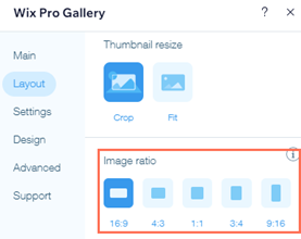
- Adjust the image ratio (16:9, 4:3, 1:1, 3:4 or 9:16) applied to your gallery to best match the ratio and orientation of your uploaded images.
Having issues with the pro gallery on mobile?
Check out our troubleshooting guide for pro gallery on mobile and learn solutions to the most common problems.
Did this help?
|
