Editor X: Using Containers
5 min read
Editor X is transitioning to Wix Studio, our new platform for agencies and freelancers.Learn more about Wix Studio
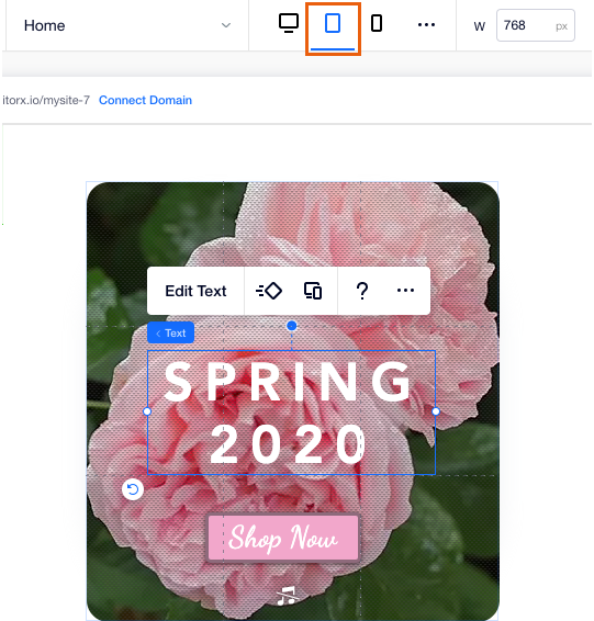
Create a responsive and structured layout for your page using container boxes. After attaching elements like text, images and buttons to a container, you can easily ensure their arrangement stays the same in every screen size.
In this article, learn how to:

Adding a container
Choose from a variety of container boxes and drag the one you like to your page. You can either add empty containers or containers with grids to easily organize your content.
To add a container:
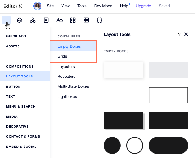
- Click Add Elements
 at the top of Editor X.
 - Click Layout Tools.
- Choose which kind of container you want to add:
- Empty Boxes: Pre-designed container boxes in many different styles and shapes.
- Grids: These container boxes include a grid that you can adjust later.
- Drag a container onto your page.
- Add elements by dragging them into your container.
- (Optional, from the Inspector panel
 ) Click the Design tab
  to customize your container's design.
Tell me more
Attaching elements to a container
When placing elements inside a container, they are automatically attached to the container and become its children elements. You can view all of the attached elements in the Layers panel.
This makes your container responsive to different viewports; when the screen size changes, the attached elements resize in the same manner and in direct relation to their container.
Tip:
You can add an image or a video to the background of your container. Place the element inside the container to attach it, then click the Stretch icon  at the top right.
at the top right.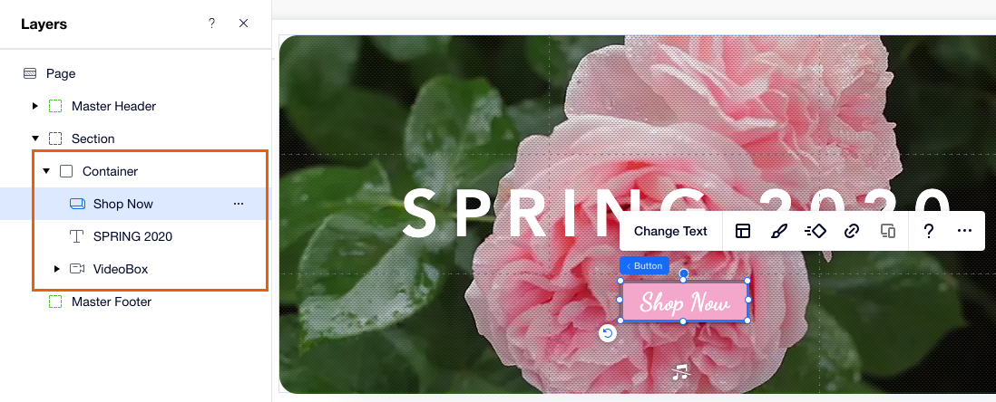
Applying a grid on a container
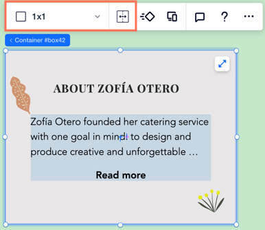
In Editor X, a container comes with a responsive, built-in CSS grid that has a single cell (1x1 layout). You can apply a grid with more rows and columns to organize the elements in your container.
To apply a grid on a container:
- Click the container in Editor X.
- Change the grid in one of the following ways:
- Choose a preset grid: Click the 1x1 drop-down and choose a different grid (e.g. 2x2, 2x1)
- Customize the grid on the page:
- Click the Customize grid on canvas icon
 .
. - Drag from the left or upper edges of the grid to add new lines.
- Click the Customize grid on canvas icon
Customizing a container per breakpoint
Customize your container to different breakpoints so that it looks and behaves exactly as you want in every viewport.
- Attach elements to your container for a specific breakpoint if they should only appear in that range of screen sizes.
- Design and reposition the elements in your container to adjust them to a certain breakpoint.
- Define content overflow per breakpoint to ensure your elements don't overlap when the screen gets smaller.
- Apply a grid to arrange your elements for a specific breakpoint. Learn More
Working with breakpoints:
- Changes that you make to a certain breakpoint cascade down to smaller breakpoints. However, these changes don't affect larger breakpoints.
- Attaching or detaching elements from their parent container applies to all breakpoints.
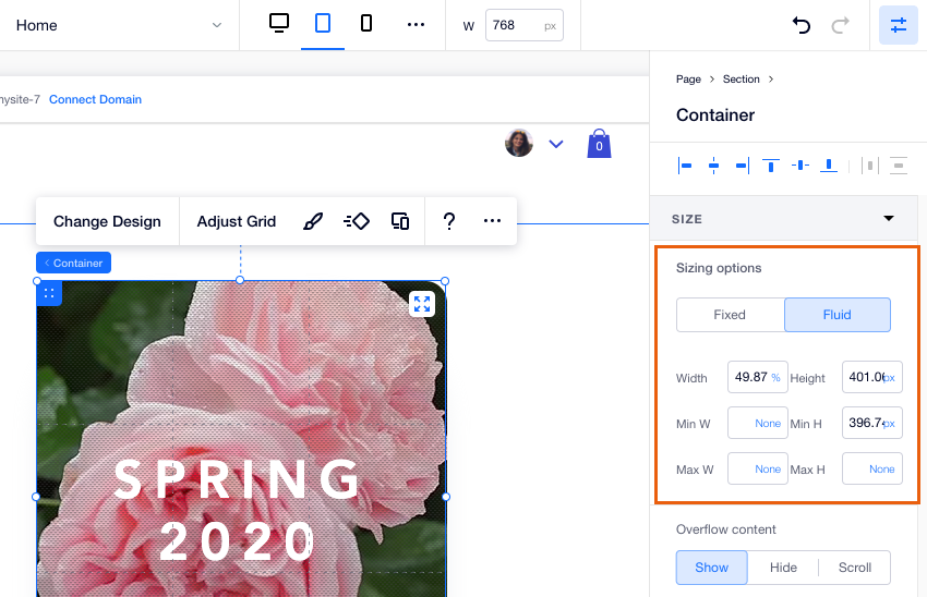
Setting the size of a container
Control the way your container and its elements resize in relation to each other, and to changes in screen size. Click the Inspector icon  at the top right to open the panel, then adjust the sizing under Sizing options.
at the top right to open the panel, then adjust the sizing under Sizing options. You can set fixed dimensions for your container so that it stays the same in every screen size, or use fluid measurements to make it responsive. Learn More