

Wix Harmony Editor: Adding and Managing Menus
15 min
In this article
- Adding a menu
- Adding and managing menu items
- Adding dropdowns to your menu
- Changing the menu's layout
- Designing vertical and horizontal menus
- Working with menus on mobile
- FAQs
Menus make it easy for visitors to explore your site and discover what you offer. Choose the pages, and links that matter most to you. You decide how your menu looks and works, so navigation always feels natural — no matter what device your visitors are using.

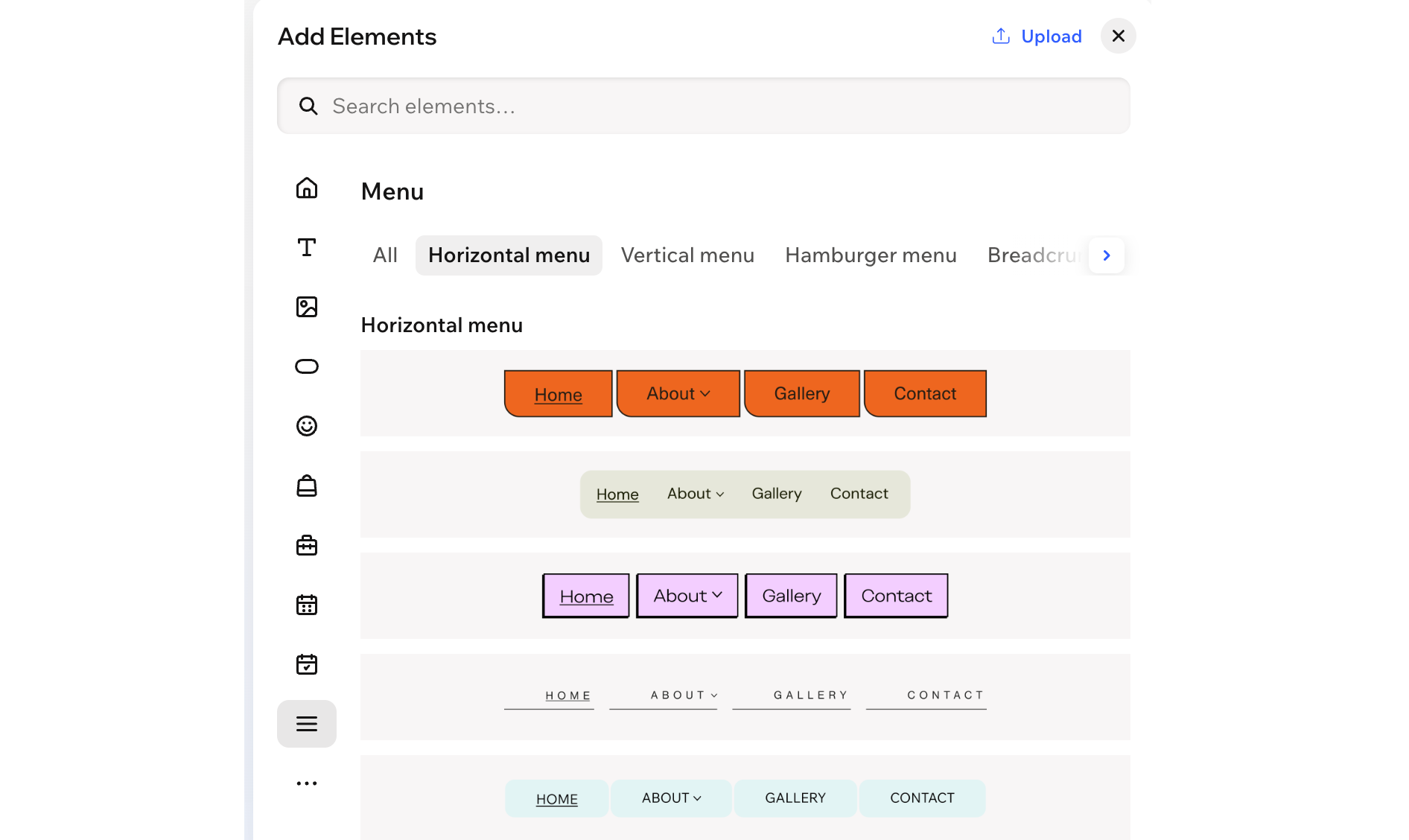
Adding a menu
Menus help visitors move between pages on your site. In the Menu category of the Add Elements panel, the Horizontal, Vertical and Hamburger options all add a site menu that is connected to your site pages (i.e. new pages automatically appear on this menu).
You can also add a separate custom menu for specific areas and choose whether it appears as a horizontal, vertical or hamburger menu. For example, create a custom menu for your site's footer or for a specific page that needs its own navigation.
To add a menu:
- Go to your editor.
- Click + Add at the top left of the editor.
- Select the Menu category.
Tip: Click the Arrow icon next to the categories to browse through the list.
 - Depending on the type of menu you want to add, follow the steps below:
Site menu
 next to a menu item to rename or remove it.
 Custom menu
Did you know?
If you add a menu bar to your header, it automatically becomes a hamburger menu on mobile. This keeps the navigation on your site clean and tidy on smaller screens.
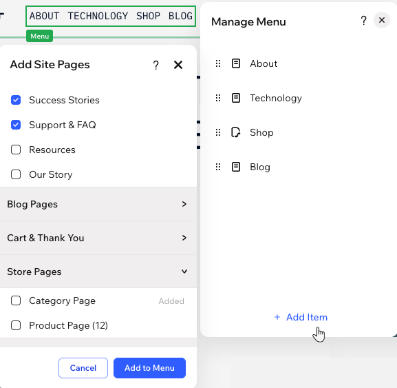
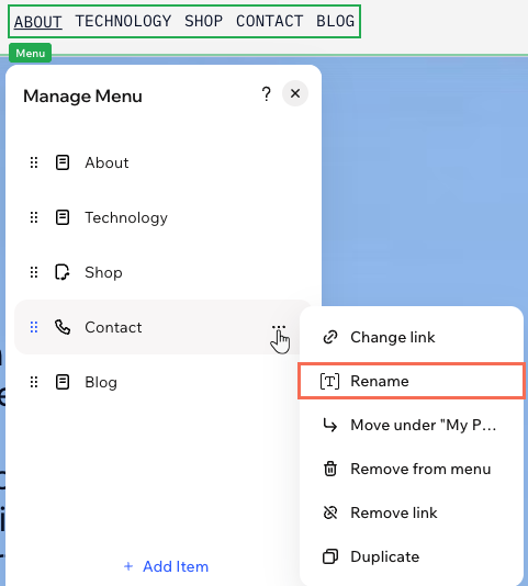
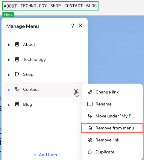
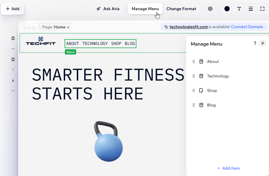
Adding and managing menu items
Once you've added the menu, choose the items you want to display. Select regular site pages, collections of app and CMS pages, or specific pages within a collection. You can also add dropdown containers and links to truly tailor the experience for your client's needs.
You can always adjust an existing menu and the items it shows. Add more items, remove ones that are irrelevant, or change the order to keep the content fresh.
To manage a menu:
- Go to your editor.
- Click the menu.
- Click Manage Menu.
- Choose what to do next:
Add more menu items
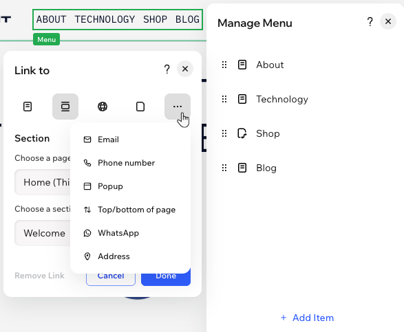
Change a menu item's link
Rename a menu item
Remove an item from the menu
Reorder menu items
 next to an item and drag it to the desired position.
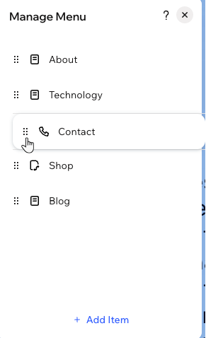
Adding dropdowns to your menu
Use dropdowns to group related pages under a single menu item and keep your navigation easy to scan. Choose a parent item, whether it's a page or a link, and nest other pages beneath it to create the dropdown.
To add and set up a dropdown:
- Go to your editor.
- Click the menu.
- Click Manage Menu.
- Decide which menu item should be the dropdown title.
- Move the first menu item to the dropdown:
- Drag the relevant menu item below the dropdown title.
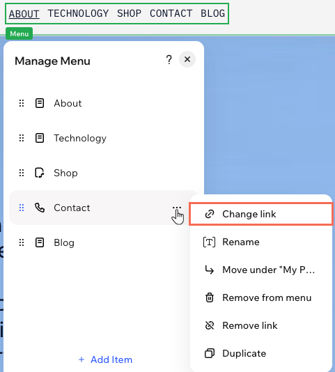
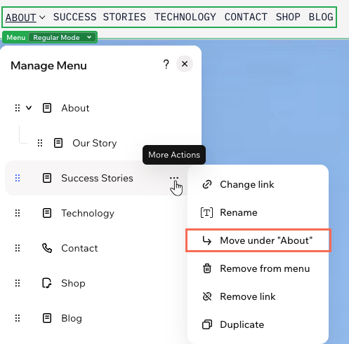
- Hover over the item you dragged and click the More Actions icon
 .
. - Select Move under "Page Name".
- Repeat step 5 for all other items you want to move to the dropdown.
Drag with your mouse instead:
Want a quicker way to turn pages into dropdown items? Drag a page up or down, then slightly to the right until it "tucks" under another page. The GIF below shows how it should look.
Changing the menu's layout
A clear menu layout helps visitors quickly see where to go next. Choose a menu bar when you want all your items visible in a line or column, with extra control over what happens when a horizontal menu runs out of space. If you prefer a compact icon to open your navigation, choose a hamburger menu – ideal for clean, minimal layouts or when space is limited.
To change the menu's layout:
- Go to your editor.
- Click the menu.
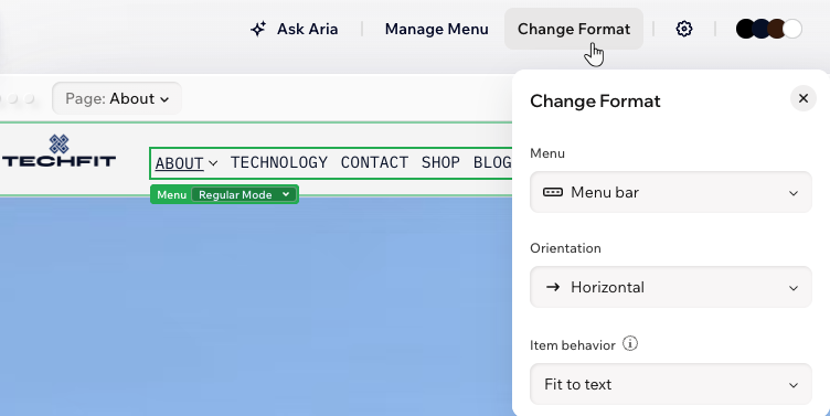
- Click Change Format on the action bar.
- Choose the relevant option under Menu:
- Menu bar: Menu items are displayed in a navigation bar. Under Orientation, choose whether the bar is horizontal or vertical.
Tip: For horizontal menus, you can also choose the Item behavior when there isn’t enough room for the items on your visitor's screen — either let the menu expand (Fit to text) or add a button to scroll through the extra items (Fit to scroll). - Hamburger: Visitors see an icon that they click to open the menu. This is a great option for clean, minimalistic layouts.
- Menu bar: Menu items are displayed in a navigation bar. Under Orientation, choose whether the bar is horizontal or vertical.
Designing vertical and horizontal menus
Make your menus stand out by customizing every detail, from colors and borders to text, corners, and layout. Whether your menu is horizontal or vertical, you can control how the menu bar and its items look, design dropdowns, and adjust spacing so everything feels just right for your visitors.
Designing a hamburger menu?
Read our article about hamburger menus to learn more. You can design every bit, from the button to the container.
To design a vertical or horizontal menu:
- Go to your editor.
- Click the menu.
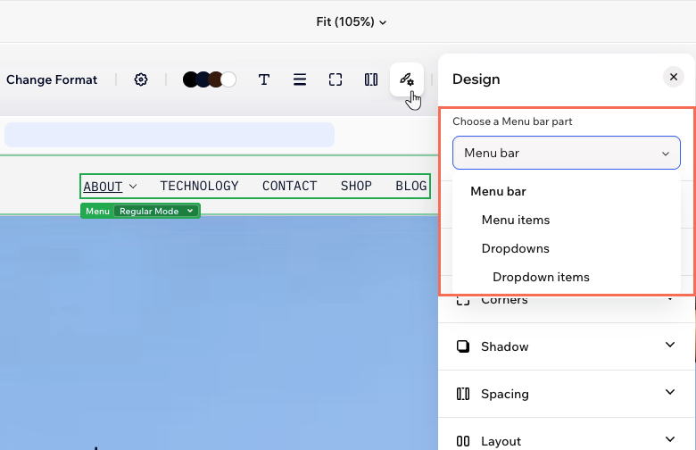
- Click the All design options icon
 on the action bar.
 - Select the relevant part of the menu under Choose a Menu bar part.
Menu bar and menu items
 : Change the color of your menu, choosing one of your brand colors or a custom color.
 : Define the borders of your menu so it stands out, choosing a color, width and style. Click the Edit individual borders icon
  to design each side of the border.
 : Design the menu items by changing the font, color, formatting, alignment, character spacing and more.
 : Make the corners of your menu more square or round by dragging the slider under Radius. Click the Edit individual corners icon
  : Apply inner and outer shadow to give the menu an interesting 3D effect, setting the position, blurriness, color and more.
 : Add breathing room to your content – add padding and adjust the spacing between items items.
 : Decide whether or not to apply the site direction (left-to-right or right-to-left) to this menu. For vertical menus, you can also choose the menu items' width and whether dropdowns appear as open or closed.
Dropdowns and dropdown items
Working with menus on mobile
When viewing your site on a phone, your header transforms to create a smooth, clutter-free experience. Elements on your desktop header (e.g. navigation links, social icons) move into a compact hamburger menu, leaving just the essentials at the top. You can move elements inside the mobile menu or take them out as needed.
To adjust the header menu on mobile:
- Go to your editor.
- Click the Mobile icon
 at the top right of the page.
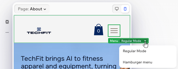
 - Click the hamburger menu icon.
- Click the Regular Mode dropdown and select Hamburger Menu.
- Choose what to do next:
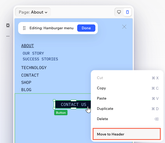
- Reposition elements inside the container: Drag elements to move them around the container of the hamburger menu.
- Add elements to the container: Use the Add Elements panel to add more elements to the hamburger menu's container. These elements are mobile-only, which means they don't appear on desktop.
- Move an element back to the header: Right-click the element and select Move to Header.
FAQs
Click a question below to learn more.
Can I resize the menu bar?
Can I add multiple menus to the header?
Does removing a page from the menu delete it from my site?
Do I have to show all of my site pages on the menu?
