

Wix Harmony Editor: Designing Elements
5 min
In this article
- Selecting colors
- Working with gradients
- Designing parts of elements
- Design glossary
The Design panel lets you bring your creative vision to life, one detail at a time. Whether you want to update colors, customize parts of an element, or set unique styles for different states, you have the flexibility to shape each part of your site’s look and feel.
Since every element has its own style options, you’ll see different settings depending on what you’re editing.
How do I get started?
Click an element, then click the All design options icon  on the action bar.
on the action bar.Selecting colors
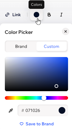
Whenever you click a color circle to choose a color, you get to the Color Picker. This is where you can see your site's brand colors, in addition to any custom color you're using. There are 3 ways to pick a new color:
- Move the dots on the color scheme to find your color
- Enter the color's code (e.g. #000000 for black)
- Click the Eyedropper icon
 to get a color from an element on the page
Working with gradients
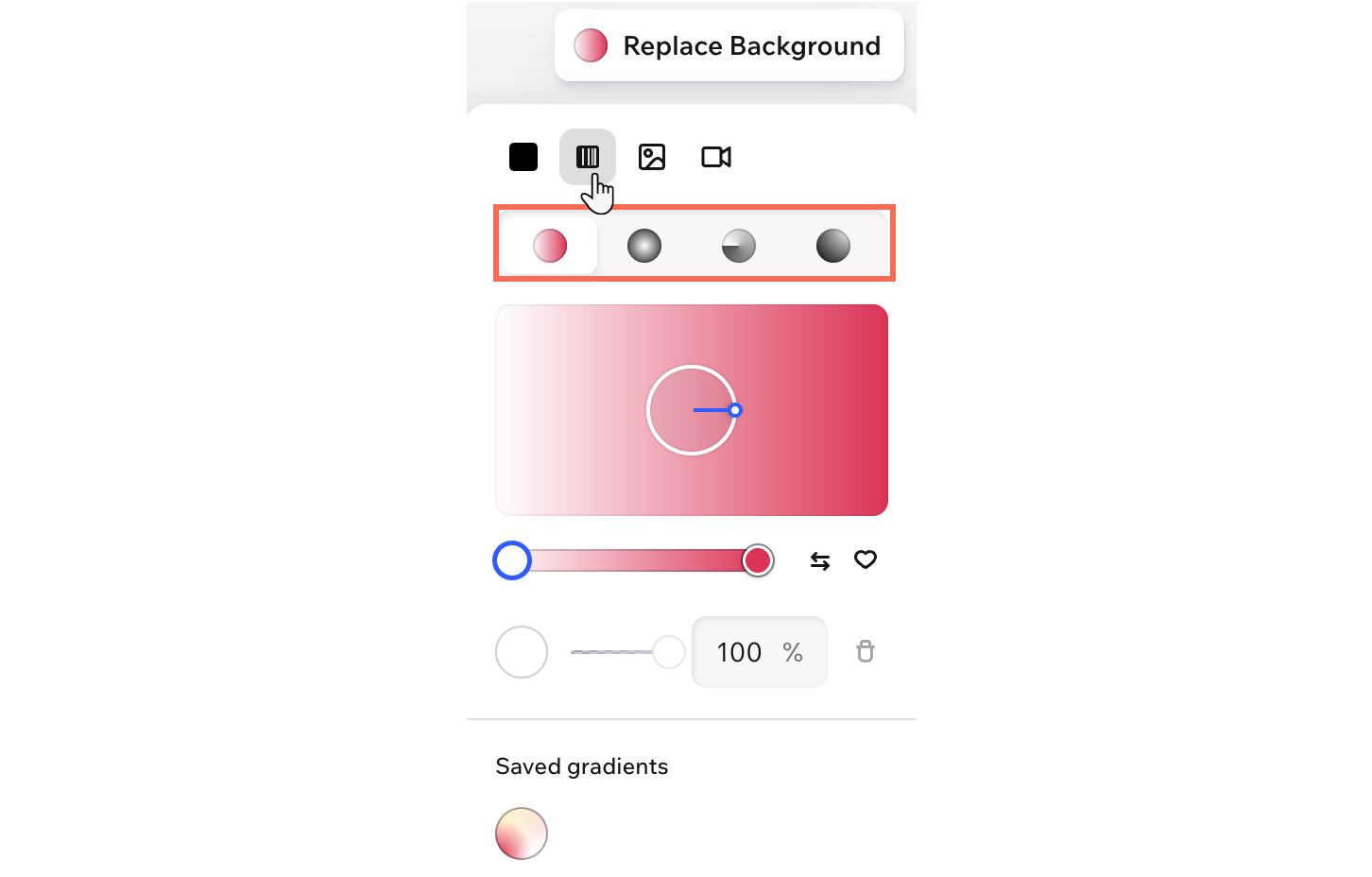
Gradients blend 2 or more colors together and let them flow into each other, giving your background more movement than a solid color.
Choose from Linear, Radial, Conic, and Fluid gradients. Linear, Radial, and Conic gradients create more defined color transitions, while Fluid gradients create a softer, mesh-like blend. You can add more colors to the gradient, adjust each color’s opacity, and save gradients to your brand to use again later.
Tip:
Gradient backgrounds are available for sections, cells within sections, headers, footers, buttons and boxes.
Designing parts of elements
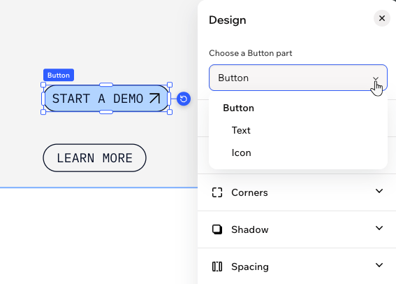
Some elements in the editor offer detailed design options, letting you style individual parts separately. For example, when working with buttons, you can choose to customize the button itself, its icon, or the text—so you can fine-tune every detail and make it fit your unique style. Use the dropdown to select which part you want to personalize.
Design glossary
Check out the table below to learn about every design setting – what it means and how it elevates your design.
| Setting | What is it? |
|---|---|
Background / Fill colors  | Add a fill color to complement the content of your element. Click the circle next to Color to choose one of your brand or custom colors. Containers and sections: click Replace Background in the action bar to change the background color. You can also click the Opacity icon  to make the background more or less visible, and apply a glass effect. to make the background more or less visible, and apply a glass effect. |
Border  | Define the borders of your element so it stands out. You can choose the color, width and style of the entire border, or click the Edit individual borders icon  to design each side separately. to design each side separately. |
Corners  | Make the corners of your element more square or round by dragging the slider under Radius. Click the Edit individual corners icon to design each corner separately. |
Shadow  | Apply shadow to give the element an interesting 3D effect. You can add shadow inside the element (Inner) and make the element cast a shadow as well (Drop). Decide on the shadow's position, blurriness, size, color and opacity. |
Spacing  | Add breathing room to your content by adjusting the padding around the element or its selected area. Depending on what you're editing, you may see options to adjust individual sides, add vertical and horizontal spacing and more. |
Layout  | Arrange the element just the way you want by adjusting its layout settings. Depending on what you’re editing, you may see options to flip, align, set direction, or fine-tune the size and position. |
Control the look and feel of any text by customizing its font, weight, size, color and formatting. Depending on what you're editing, you may be able to click More text options. This reveals additional settings like line spacing, capitalization and more. |

Create with Wix Harmony:
Experience the next generation of website creation with Wix Harmony. Flow freely between prompting your AI agent and precise drag and drop, so creating feels as natural as thinking.
