

Wix Harmony Editor: Adjusting Your Site for Mobile
5 min
In this article
- The connection between desktop and mobile
- Adding mobile-only elements
- Hiding elements from mobile
- Previewing your mobile site
- FAQs
This article refers to the new Wix Harmony Editor, released in January 2026. If you're unsure whether you’re using the Wix Harmony Editor or the Wix Editor, view more information here.
With so many visitors browsing on their phones, your site’s mobile look matters more than ever. In the Wix Harmony Editor, the hard part is handled for you — your design on desktop is automatically adjusted to fit all screens.
Access the mobile view to see how your site looks on your visitors' phones. You have the freedom to adjust the design to create the best experience possible, no matter the device.
Ready to get started?
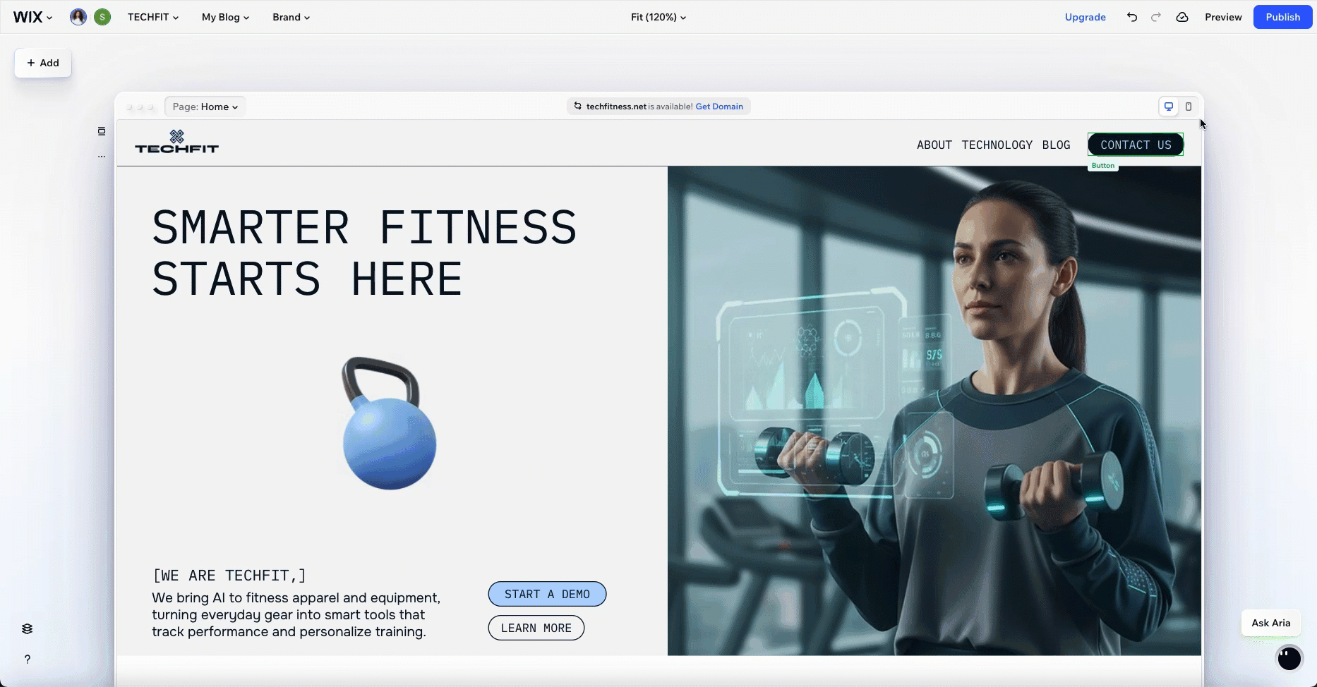
Click the Mobile icon  in the top right corner of the page.
in the top right corner of the page.The connection between desktop and mobile
When you build your site, you create your layout and style on desktop first. Changes at the desktop level automatically flow down to mobile and other screens, keeping everything in sync. This means you only need to design once, and your site is ready for phones, tablets, and computers right away.
Want your site to look just right on mobile? You can fine-tune it by changing the size, color, or placement of elements, without affecting the desktop version at all.

Keep in mind:
Some actions, like moving elements between sections or containers, are disabled on the mobile view. This is to help keep your site tidy and easy to manage across all devices. If you want to make those bigger moves, switch back to desktop and keep building with confidence.
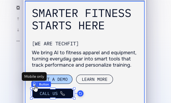
Adding mobile-only elements
Make your site's mobile experience truly unique by adding mobile-only elements. Once you switch to the mobile view, anything you add from the Add Elements panel is a mobile-only element.
As these elements don't appear on your desktop site, you can design them and adjust their layout as you wish. This is especially handy when you want to replace desktop elements that are less suitable for smaller screens.
Did you know?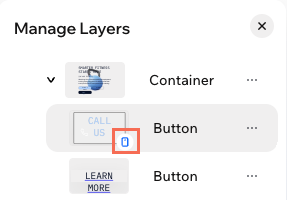
In the Layers panel, you can see an icon  next to mobile-only elements.
next to mobile-only elements.Hiding elements from mobile
You can always hide elements from desktop that you prefer not showing on mobile. Switch to the mobile view and open the Layers panel. Then, click the More Actions icon  next to an element or section and select Hide so it only appears on desktop.
next to an element or section and select Hide so it only appears on desktop. 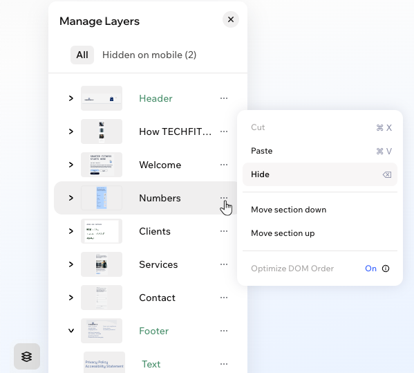
Still in the Layers panel, click Hidden on mobile at the top to see the full list of hidden elements. If you ever change your mind about an element, click the Show on mobile icon  to make it visible again.
to make it visible again. 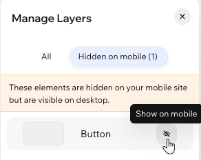
Previewing your mobile site
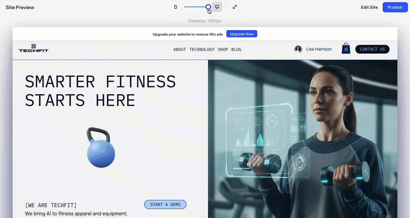
As you're making adjustments, it's important to make sure the design looks good before going live. Click Preview at the top right of the editor. Then, drag the slider at the top to make the screen smaller and see your design adjusting live - not just for mobile but for tablets as well.
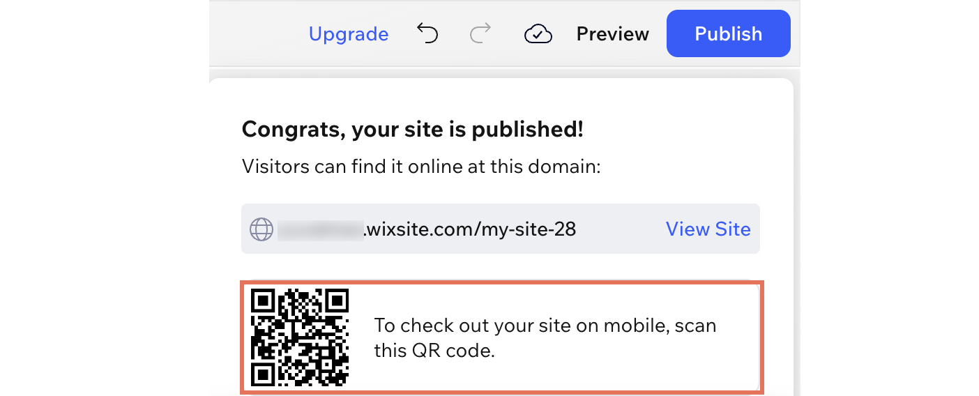
Once you publish, scan the QR code that appears in the editor to see your site directly on your device.
FAQs
Click a question below to learn more.
Why can't I drag elements between containers on mobile?
Why did some elements move from my header into the hamburger menu on mobile?
Why does my text wrap differently on mobile even though I didn’t change it?
Some elements look too small on mobile, what can I do?
