

Studio Editor: Designing Dropdowns in a Menu
9 min
In this article
- Adjusting the layout of dropdowns
- Customizing the the design of dropdowns
- (Horizontal menus) Designing dropdowns individually
After adding and setting up a dropdown, you can tailor its design to look how you want. Change the look and alignment of both the container and menu to create a custom look for clients, and reinforce their brand.
Before you begin:
Dropdowns can only be added from new menus in the Studio Editor. If you have the previous menu experience, you can create submenus and add mega menus.
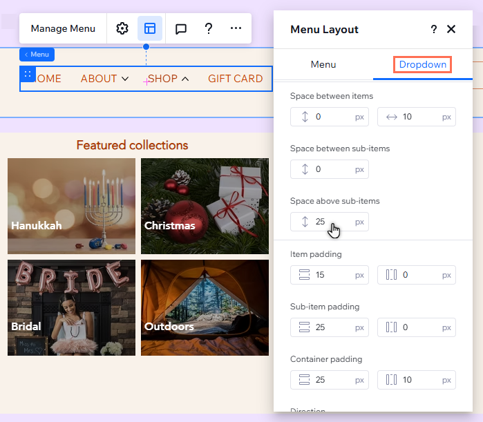
Adjusting the layout of dropdowns
Depending on your menu type (navigation bar, hamburger, etc.), different settings are displayed in the Layout panel. You can also tailor the spacing and alignment to fit the look of the main menu.
To adjust the layout of dropdowns:
- Go to your editor.
- Click the menu bar / hamburger menu icon.
- (Hamburger menus) Click Edit Menu to open hamburger editing mode, and select the menu.
- Click the Layout icon
.
- Select the Dropdown tab.
- Use the options to adjust the layout:
Container width
Item display and number of columns
Spacing
Padding, direction, and alignment
Note:
The available options depend on the menu type (navigation bar or hamburger), and the orientation (horizontal or vertical) you choose.
Customizing the the design of dropdowns
You can design each part of a dropdown to complement the main menu's look and feel - from the container to the items and sub-items. Choose the background fill and text to reinforce your clients' branding, and add borders to make dropdowns stand out on the page.
You can also customize the design of items and sub-items for separate states (e.g. hover, current page).
To customize the design of dropdowns:
- Go to your editor.
- Click the menu bar / hamburger menu icon.
- (Hamburger menus) Click Edit Menu to open hamburger editing mode, and select the menu.
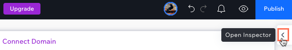
- Click the Open Inspector icon
 at the top right of the editor.
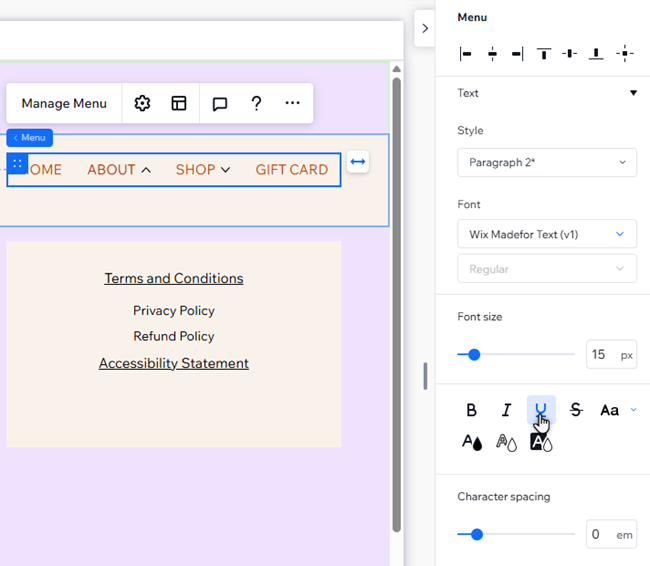
- Select the element you want to design:
- Dropdown container
- Dropdown menu container
- Dropdown items
- Dropdown sub-items
- (Dropdown items / dropdown sub-items) Select the relevant state: Regular, Hover, or Current page.
- Design the dropdown using the available options:
- Background fills: Change the background color of of the dropdown, or add an eye-catching gradient. You can adjust the opacity, and add multiple layers to suit your design needs.
- Borders: Adjust the width and color of the dropdown container's borders.
- Corners: Make the corners of the dropdown more round or rectangular by adjusting the radius.
- Text: Adjust the style and formatting of the dropdown items and sub-items.
- Shadow: Add shadows to the dropdown, and customize its angle, color, distance and more.
What's the difference between containers?
- Dropdown container: This displays all of the elements and menus you have added to the dropdown item.
- Dropdown menu container: This displays dropdown menu items only. It's nested within the dropdown container.
(Horizontal menus) Designing dropdowns individually
The changes you make to a dropdown are applied to all dropdowns in that menu. Want to create something more unique? You can 'detach' dropdowns you've added to horizontal navigation menus for full design control.
Note:
This option is not available on hamburger menus or vertical navigation bar menus.
To detach and customize individual dropdowns in horizontal menus:
- Click the horizontal menu in your editor.
- Click Manage Menu.
- Hover over the relevant dropdown and click Edit.
- Choose how you want to design the dropdown:
Adjust the layout of the container

Adjust the layout of the dropdown menu

Customize the design of the container


Customize the design of the menu

Note:
The Edit this dropdown only toggles in the Inspector and the Layout panel are connected. When you disable / enable the toggle in one of these panels, it automatically disables / enables in the other panel.
