

CMS: About Validation Settings for Input Elements
5 min
In this article
- Ensure data integrity with required fields
- Control the type of information collected
- Limit the length of input values
- Set maximum and minimum values for numbers
- Validate patterns with regular expressions
- Restrict dates and times visitors can select
- FAQs
Wix's Content Management System (CMS) allows you to create custom forms with input elements that submit to your collection. Using the validation settings in your input elements helps ensure that the data you collect from visitors meets your specific requirements. You can also set validations for the collection fields that store the submitted input values.
Using validation settings for input elements in your Wix CMS ensures that the data collected is accurate, complete, and meets your specific requirements. This improves the overall quality of your data and enhances the user experience on your site.
Ensure data integrity with required fields
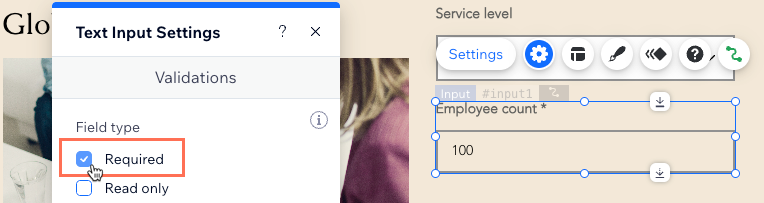
Most input elements can be set as "Required." When an input element is required, the form will not submit if the field is empty. This prevents incomplete submissions and ensures that all necessary information is collected. If you set the connected collection field to "Required," users will see an error message if they attempt to submit the form with empty values. Note that switches do not have a "Required" option, but checkboxes do.
Control the type of information collected
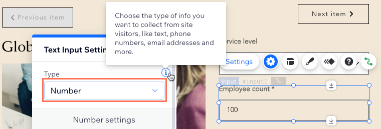
You can configure text input elements to accept specific types of information, such as text, numbers, or email addresses. Each type performs a specific validation to ensure that the entered value matches the required format.
Text Input Type | Validation | Additional Validations |
|---|---|---|
Text | None | Limit length, pattern |
Password | None | Limit length, pattern |
Number | Value is a number | Maximum value, minimum value, pattern |
Email | Value is an email address | Pattern |
URL | Value is a URL that starts with "http" or "https" | Pattern |
Phone Number | Value is a phone number | Pattern |
Limit the length of input values
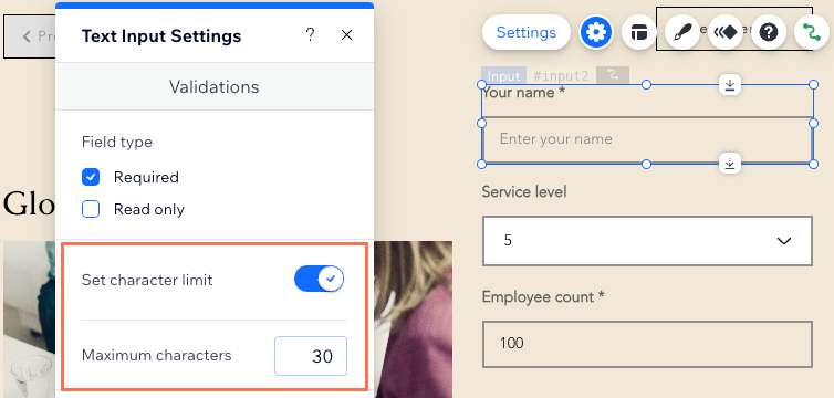
You can add character limits for input elements that are set to collect text. This ensures that the form does not submit if the entered value exceeds the specified length. This is useful for fields like usernames or descriptions where you want to control the amount of text entered.
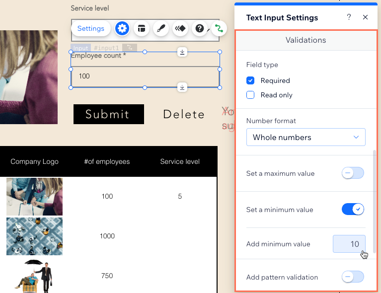
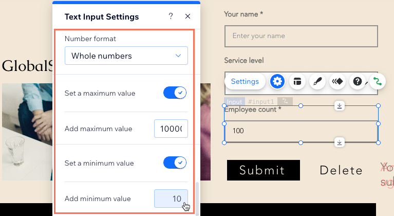
Set maximum and minimum values for numbers
For input elements that collect numbers, you can specify the maximum and minimum values they can submit. This ensures that the submitted number falls within the acceptable range you define, preventing invalid data entries.
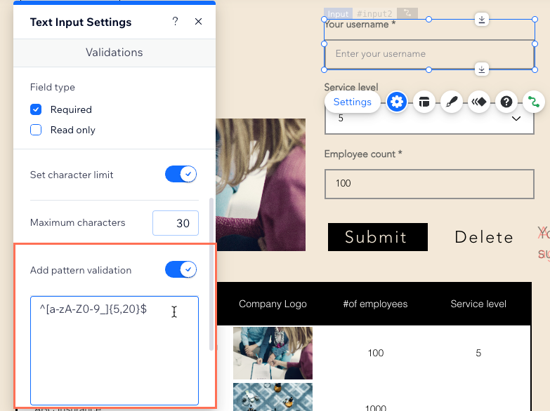
Validate patterns with regular expressions
Some input elements allow for additional pattern validation using regular expressions. For example, you can enforce a specific format for usernames using a regular expression like ^[a-zA-Z0-9_]{5,20}$. This ensures that the username consists of 5 to 20 alphanumeric characters or underscores.
The following is a regular expression you could add to your input element so that it only accepts valid usernames:
1^[a-zA-Z0-9_]{5,20}$In this expression, the ^ and $ represent the beginning and end of the string, respectively. Inside of those symbols are two sections, one enclosed in square brackets [] and the other in curly brackets {}. The section enclosed in square brackets [a-zA-Z0-9_] matches lowercase letters a-z, uppercase letters A-Z, numbers 0-9, or underscores _. The section enclosed in curly brackets {5,20} means you want between 5 and 20 characters that match the section that immediately preceded it, namely [a-zA-Z0-9_].
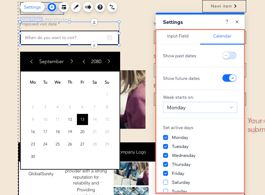
Restrict dates and times visitors can select
Date picker input elements allow you to control which dates users can select. You can restrict users from choosing past dates, future dates, or specific days of the week, such as weekends. Additionally, you can choose from four different date formats: MM/DD/YYYY, DD/MM/YYYY, YYYY/MM/DD or YYYY/M/D).
Time picker input elements let you define the available and unavailable hours users can select. You can choose between a 12-hour or a 24-hour time format and set the time increments in which users can select.
FAQs
Click below for answers to common questions about the validation settings in input elements.
Do all input elements have their own validation settings?
How do field validations apply to collection content?
What happens if I disable the table layout in my collection?
Can I set default values for fields?
