

Wix Forms: Designing Your Site Forms
6 min
In this article
- Designing your site forms on desktop
- Designing your site forms on mobile
- FAQs
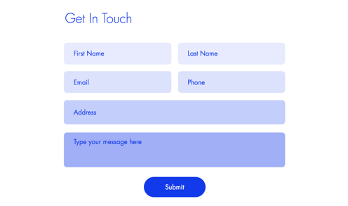
Design your form to add a splash of individuality to your visitors' experience. Customize the background color, change button text or adjust shadows and borders to bring the form to life.
How do I know if I'm using old Wix Forms or new Wix Forms?
This article will help you understand the differences between old and new Wix Forms.
Designing your site forms on desktop
Design the way your form looks on desktop with advanced styling options at your fingertips.
To design your site forms on desktop:
New Forms
Old Forms
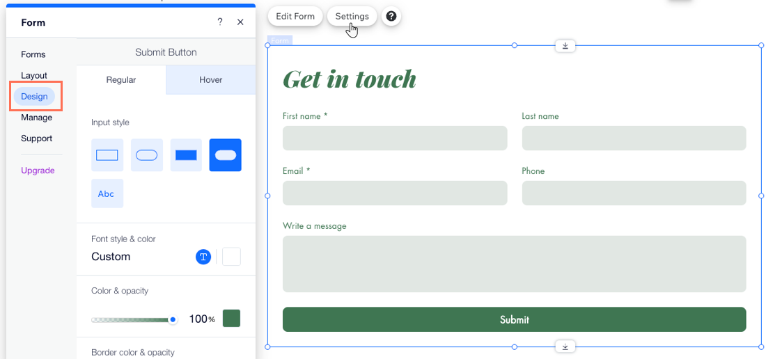
- Go to your editor.
- Click the relevant form on your page.
- Click Settings.
- Click the Design tab.
- Customize the form design using the available options:
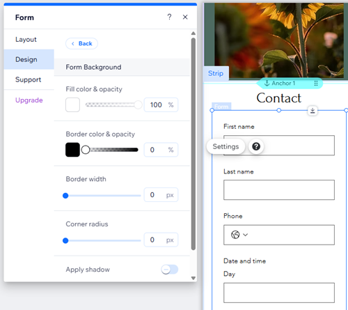
- Form Background: Choose the form background color, as well as the border color and width.
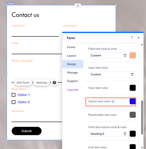
- Form Fields: Select a form field style and customize the color, opacity, font, etc.
Tip: You can design how fields appear in different states: Regular, Hover, and Error. - Header and Paragraph: Choose a font and color for the form text.
- Buttons: Design the form buttons including how they appear on hover (e.g. submit button, back button, etc.)
Note:
The color of drop-down menus and calendar drop-down fields matches the field color set in your form’s design settings. The opacity for these drop-downs is always 100% and cannot be changed.
Designing your site forms on mobile
Design your forms for mobile screens to make sure they look great and work perfectly.
To design your site forms on mobile:
New Forms
Old Forms
- Go to the mobile editor (Wix Editor) or the mobile breakpoint (Studio Editor).
- Click the relevant form.
- Click Settings.
- Click Design.
- Customize the form design using the available options:
- Form Background: Choose the form background color, as well as the border color and width.
- Form Fields: Select a form field style and customize the opacity, font, font size, etc.
Tip: You can design how fields appear in different states: Regular, Hover, and Error. - Header and Paragraph: Choose a font and color for the form text.
- Buttons: Design the form buttons including how they appear on hover (e.g. submit button, back button, etc.)
Tip:
You can edit field position for mobile devices using the form builder.
What's next?
Choose who gets notified after a visitor fills out a form. Set form submissions to go directly to your email inbox and more.
FAQs
Click a question below to learn more.
What can I customize in the thank you message?
Can I change the color of input and option text?
Can I design form fields for different states?
Can I split my form into sections?
