

Testing Your Site on Different Screen Resolutions
2 min
To experience your site's functionality on various screen resolutions, we recommend using the actual devices you'd like to test, rather than third-party tools. If you don't have access to certain devices you'd like to view your site on, you can use Google Chrome's DevTools to simulate them.
Important:
DevTools and other third-party tools are emulators and should be used only as guidelines for viewing your site in other devices. We do not support third-party emulators, as they may not accurately represent your site's full browsing experience.
To test your site using DevTools:
- Open the Google Chrome browser. Learn how to download Chrome.
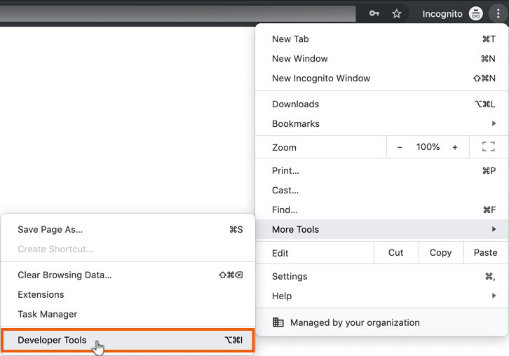
- Click the Customize and control icon
 at the top right.
 - Hover over More Tools and click Developer Tools.
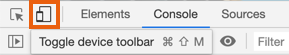
- Click the Toggle device toolbar icon
 .
.
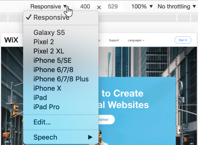
- Click the Responsive drop-down and select a device to emulate.
Note: Select Edit to emulate an unlisted device.
- Press F5 or Ctrl + R on your keyboard to reload the page (press Cmd + R on Mac).
Check out Wix Studio:
Wix Studio is the ultimate platform for freelancers and agencies. This flexible, end-to-end solution includes smart design capabilities and flexible dev tools that let you deliver exceptional results for clients in any industry.
Learn more about Wix Studio:
- Take our guided tour introducing the Studio Editor.
- Take the Wix Studio Essentials course and watch loads of videos and webinars on demand in the Wix Studio Academy.
- Join our community forum to ask and discuss anything related to Studio.
- Browse through the Wix Studio help center for all the instructions and explanations you need.
