Studio Editor: Adding and Customizing a Table
5 min
In this article
- Adding and setting up a table
- Customizing the table settings
- Designing a table
- Adjusting the table layout
Using the CMS (Content Management System) to maintain collections and datasets? Add a table to show a dataset in a convenient view. From defining the behavior to personalizing the layout and design, you can tailor the table to perfectly match your client's site.
Before you begin:
Add and set up the content collection you want to display in the table.
Adding and setting up a table
Add a table to your client's site from the Add Elements panel. There are several pre-designed tables to choose from, which you can fully customize to your needs. You can then choose the dataset you want to display in the Inspector panel.
To add and set up a table:
- Click Add Elements
 on the left side of the editor.
 - Click Layout Tools.
- Click Tables.
- Drag the design you like onto your page.
- Connect the table to a content collection:
- Click the Connect to CMS icon
 .
. - (In the Inspector) Choose the dataset you want to display in the table.
- Click the Connect to CMS icon
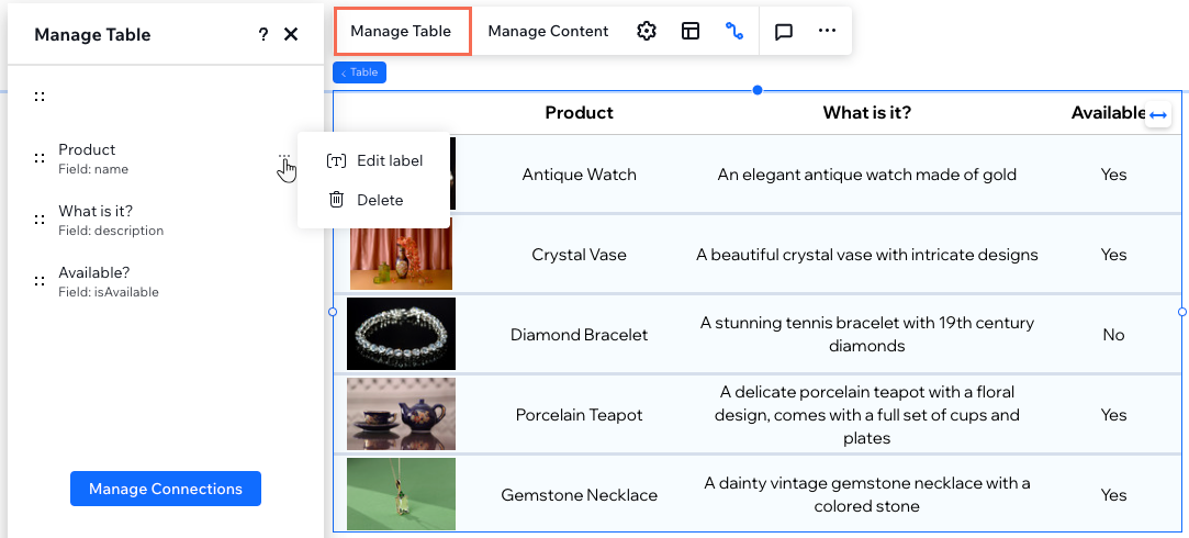
- Click Manage Table and set up the table columns:
- Reorder: Click the Reorder icon
 next to the relevant column and drag it up or down into place.
 - Change column name: Hover over the relevant column, click the More Actions icon
 , and select Edit label. Enter the new name and click Done.
 - Delete column: Hover over the relevant column, click the More Actions icon
 , and select Delete.
 - Manage Connections: Click Manage Connections to change any of the CMS connections. Then click the relevant drop-downs under Connections in the Inspector panel to edit the connections and links.
- Reorder: Click the Reorder icon

Customizing the table settings
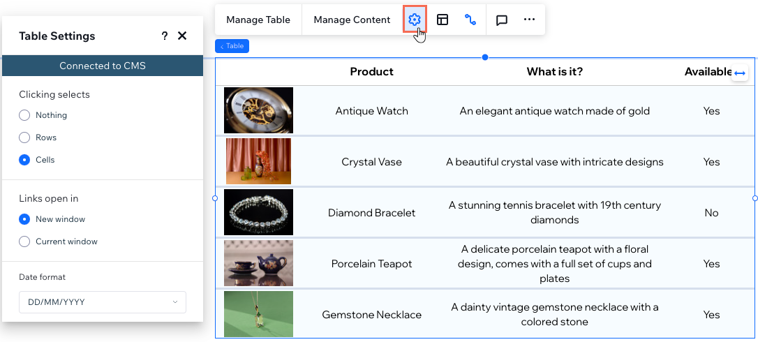
Optimize your table functionality from the Table Settings panel. Choose what gets selected when visitors click a table cell, decide how links open and set the date format to your needs.
To customize the table settings:
- Go to your editor.
- Select the table element.
- Click the Settings icon
 and choose from the following options:
- Clicking selects: Choose what gets selected in the table when visitors click a cell: Nothing, Rows, or Cells.
- Links open in: If you linked items, choose whether they open in a new window or in the current window.
- Date format: If you connected a Date field type, choose a format in which the dates display.
Working with breakpoints:
Your selections in the Settings panel apply to all breakpoints.

Designing a table
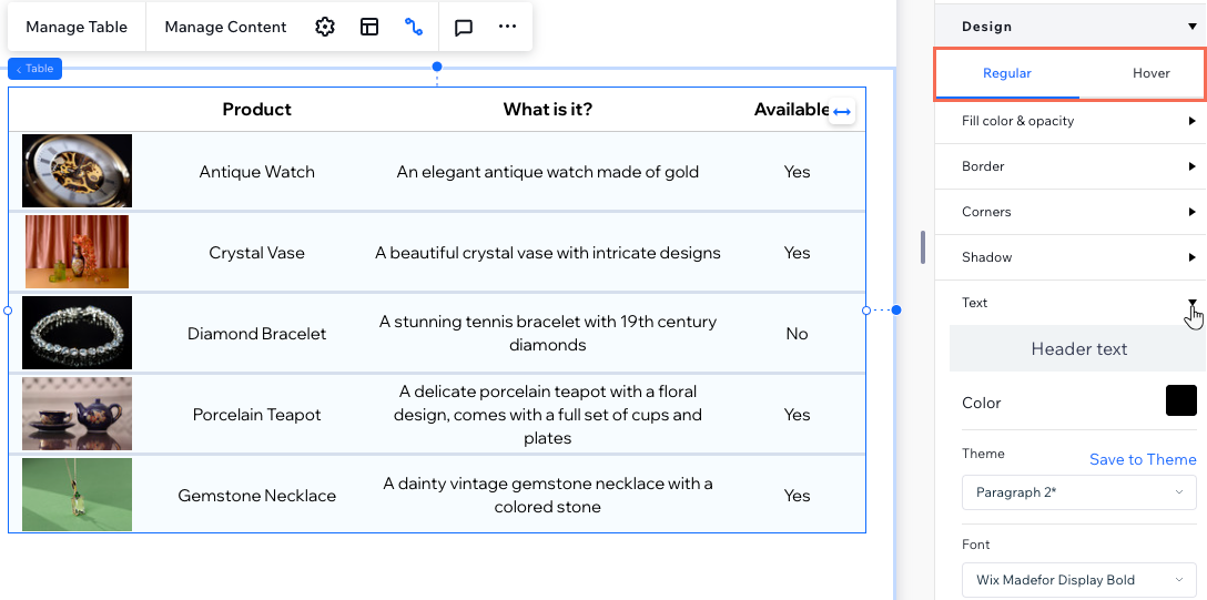
From adjusting fill colors and opacity to fine-tuning borders, corners, and shadows, you have full control over the visual presentation of your table. You can also personalize the text style and formatting for a polished appearance.
To design a table:
- Go to your editor.
- Select the relevant table.
- Click the Open Inspector icon
 at the top right of the editor.
 - Choose what you want to design:
- Fill color & opacity: Choose the background color and opacity of different parts of the table (e.g. header background, Row background, Table background).
- Border: Set the color, size and width of the table border, as well as the dividers.
- Corners: Make the table corners more round by setting the radius (in px).
- Shadow: Apply shadow in the color, angle and opacity of your choice.
- Text: Style and format every piece of text appearing on the table (e.g. Header text, Row text).
- (Optional) Set the links in the table to change color on hover:
- Click Hover under Design.
- Click the color box next to Link hover color.

Adjusting the table layout
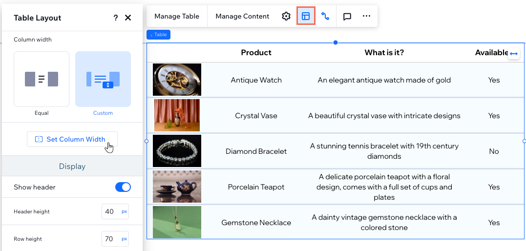
Taylor the layout of your table so it perfectly fits your content. Customize the table height, row height and column width to your exact needs. Additionally, you can choose to show or hide the table's header, adjust the column direction, and align text for optimal presentation.
To adjust the table layout:
- Go to your editor.
- Select the relevant table.
- Click the Layout icon
 .
. - Choose what you want to adjust:
- Table height: Decide whether the table should have a set custom height
- Column width: Set the width of the table columns:
- Equal: All columns take up the same width.
- Custom: Click Set Column Width to define the width for each column. You can use the px, percentage (%) or Auto measurements.
- Show header: Click the toggle to show or hide the table's header (showing the column titles). When it's enabled, you can also set the Header height.
- Row height: Set the row height in pixels.
- Direction: Choose whether to display the columns from left to right or right to left.
Tip: The column order is based on the way they're organized in the Manage Table panel. - Alignment: Align the table text to the left, center or right.
Working with breakpoints:
Your selections in the Table Layout panel apply to all breakpoints.


