Email Marketing: Tips for Planning Your Campaigns
4 min
In this article
- Identify your goal
- Have a clear Call-to-Action
- Plan your design
- Add eye-catching images
Are you looking to boost engagement and connect with your audience in a meaningful way? Look no further than Wix Email Marketing campaigns. By planning your email campaign, you can maximize its impact and ensure that your message resonates with your subscribers.
In this article, we'll share expert tips on how to plan a successful email campaign, from identifying your goals and designing eye-catching layouts to crafting compelling calls to action and choosing the right images.
Identify your goal
The very first thing you need to do before sending an email campaign is to identify its purpose. Ask yourself, "Why am I sending this email campaign?". Is it to promote an event, attract more users to your site, or send customers a reminder about the upcoming weekend sale at your store?
Your goal will determine the design, content, and elements of your email. For instance, if your goal is to attract more site visitors, make sure the link is visible and accompanied by clear instructions on how to click it.

Have a clear Call-to-Action
Once you have identified the goal of your email campaign, the next step is to have a clear Call-To-Action (CTA). A CTA is simply what you want your readers to do after they have read your email. This could be clicking a button, liking your Facebook page, or watching a video on YouTube. Generally, you want readers to take a specific action.
When crafting your email campaign's CTAs, keep the following points in mind:
- Avoid having too many CTAs as it can be distracting and prevent readers from focusing on your primary goal.
- If you do have multiple CTAs, limit them to three levels at most. Have a primary CTA that stands out, so it is obvious to your readers that it is the most important action. Then, include secondary CTAs, followed by the least important ones.
- Use buttons for the more important CTAs as they are more noticeable and attention-grabbing. Use links for the less important CTAs.
- If you have a lot of information to convey, it is better to link to a page on your site rather than including all of it in the email. Your email should act as a teaser or introduction.
Learn more about creating engaging email content to keep your subscribers interested.

Plan your design
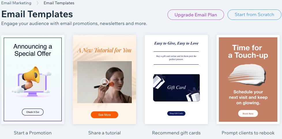
The design you choose for your campaign plays an important role in its success, as a visually pleasing email is more likely to be read thoroughly.
Here's how you can design your email campaign:
- Brand your email campaign: Your email campaign should have the same branded look as your site. Use your logo, images, colors, and font to create a cohesive look and feel.
- Plan your design using an information hierarchy: The most important information should be placed at the top, followed by the less important information at the bottom. If you can create a flow to your content, like a story, that's even better.
- Keep your newsletter short and sweet: (With the exception of specific cases such as blog posts.) Use the squint test - if you squint and look at a blurry version of your email, does it look good? If not, add more space and subheadings to separate different sections of your newsletter, and make sure your text and images are aligned properly.
Learn more about customizing your email marketing campaign.

Add eye-catching images
Images are powerful tools to grab attention and enhance the overall visual appeal of your email campaign. As humans, we are naturally drawn to pictures and visuals, so it's important to include stunning images in your emails and make your message more memorable.
Here are a few tips to help you choose the right images for your campaign:
- Use images to deliver your message: As they say, a picture is worth a thousand words. If you can convey your message with an image, it's often more effective than using text alone.
- Choose high-quality images: Blurry or low-quality images can detract from the overall look and feel of your email. Luckily, Wix provides hundreds of royalty-free images, and you can also access thousands more Shutterstock images to use in your email campaigns.
- Use images strategically: Don't overload your email with too many images. Instead, use them sparingly and in a way that enhances your message.

Ready to give it a go?
- View a step-by-step tutorial for creating and sending campaigns.
- Start your first email campaign.
- Grow your contact list with a subscribe form.


