Editor X: Working With Menus Across Breakpoints
2 min read
Editor X is transitioning to Wix Studio, our new platform for agencies and freelancers.Learn more about Wix Studio
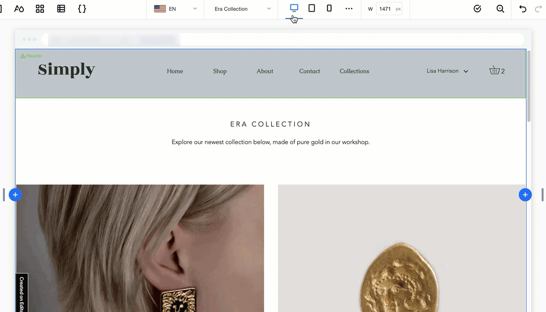
When designing a responsive site, always check that your menu appears as it should on all screen sizes. You may want to adjust the same menu for each viewport, or design unique menus that suit specific breakpoints.
In this article, learn how to work with menus on different breakpoints:
Adding a menu on a desktop breakpoint
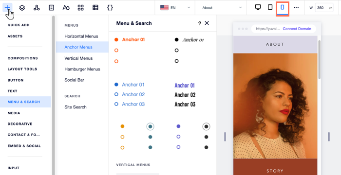
When adding a horizontal menu from the desktop breakpoint, it's automatically hidden from mobile. Instead, a hamburger menu is displayed as it takes up much less space.
In the example below, you can see how the horizontal menu turns into a hamburger menu icon when switching to the mobile breakpoint:
Tip:
You can still add a horizontal menu to your mobile site while working on that breakpoint.
Adding a menu on a mobile breakpoint
When adding a new menu to your mobile breakpoint, it's automatically hidden from larger breakpoints (e.g., tablet, desktop). This is useful in case you want to show a more minimal version that suits a smaller screen.
Showing a different menu on each breakpoint
Editor X allows you to show different menus on different screen sizes using the same Master section. However, this can cause unintentional changes to other breakpoints while working on a specific one.
There are two ways we recommend that only affect the breakpoint you're working on:
- Create a dedicated Master section for each breakpoint, showing the unique menu that you designed for that screen size.
- Create a new menu in a lightbox (pop-up) and add an element that links to the lightbox in the specific breakpoint.
Tip:
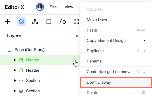
Use the Don't Display option to hide sections and elements from a breakpoint.
