Editor X: Adding and Customizing Buttons
10 min read
Editor X is transitioning to Wix Studio, our new platform for agencies and freelancers.Learn more about Wix Studio
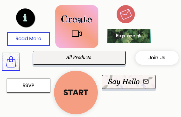
Buttons are a great way to encourage visitors to perform the actions you want. In Editor X, you can add buttons that show text, an icon or both if needed. You have full control of the design and layout so you can create the exact look you need.
In this article, learn how to:
Adding a Button
When adding a new button, you can choose a design from two categories:
- Basic Buttons: These buttons only display text and have a more "minimal" look.
- Styled Buttons: These buttons can display both text and icons, and offer advanced customization options (e.g., image backgrounds, color gradients and more).
To add a button:
- Click Add
 on the top left of Editor X.
 - Click Button.
- Scroll through the designs and drag a Basic Button or Styled Button onto your page.
Learn more about basic vs. styled buttons


Need some inspiration?
Check out these button tutorials:
Customizing Basic Buttons
After adding a basic button to your site, change its text to your needs and choose where it links to. Once that's set up, you can start customizing the design – select a different fill color, add shadow and adjust other settings like spacing and text formatting.
Click below to learn how to customize basic buttons:
Change the text
Link the button
 .
.Design the button
 on the top right of Editor X.
  .
.
Customizing Styled Buttons
Styled buttons offer tons of customization options so you can design them down to the last detail. Change the text and icon to match the desired action, choose how the two should be arranged, set a gradient or an image as the background and much more.
Click below to learn how to customize styled buttons:
Change the text and / or icon

Link the button
Design the button
 to customize them separately.
Adjust the button's layout
 .
.  .
.
Design Glossary
Option | Explanation | How to Use |
|---|---|---|
Background Fills | Add different fills such as colors, images, patterns and gradients to create stunning and colorful effects on your button. |
|
Borders | Customize the button's border to make it stand out. Customize all sides of the button together, or each side separately, by clicking the lock and unlock icon. |
|
Corners | Change the corners of your button to make them more rounded or square. Change the size of all the corners together, or customize each corner separately, by clicking the lock and unlock icon. | Click the pixel field on a corner and enter the number of pixels you want to apply to it. |
Shadows | Add layers of shadows to your button, and customize the color, size and more for each one. |
If using an Upload Button:
|
Layout | Change the layout of your button. |
|
Text Formatting Options
Option | Explanation | How to Use |
|---|---|---|
Show Text | Show or hide text on your button. | Click the toggle to show or hide text on your button. |
Theme | Select the theme for your button text. | Select a text theme from the drop-down menu. |
Fonts | Choose the font for your button text. | Click the drop-down menu and select a font. |
Font Size | Change the size of the text on your button. | Drag the slider to increase or decrease the font size, or enter a value. |
Text Formatting | Apply formatting to your text. |
|
Character Spacing | Change the spacing between the text characters. | Drag the slider to increase or decrease spacing, or enter a value. |
Shadows | Create shadows for your text. You can have more than one shadow. | Click Add a shadow to add a new one. Click the Customize Shadow icon to design it. |
Icon Design Options
Option | Explanation | How to Use |
|---|---|---|
Show icon | Show or hide an icon on your button. | Click the toggle to show or hide the icon on your button. |
Size | Change the size of your icon. | Drag the slider to increase or decrease the size of your icon, or enter a value. |
Color | Change the color of the icon. | Click the color box and select a color. |
Rotation | Adjust the rotation of the icon. | Drag the handle to customize the rotation of the icon, or enter the degrees in the text box. |
