

CMS: Connection Options and Supported Collection Fields for Each Element
3 min
In this article
- CMS connection options for each element
- User input elements and their connection fields
With the CMS (Content Management System), you can connect various parts of your site's elements to different types of collection fields. Review the tables in this article to learn which collection field types can connect to each part of your site's elements. Some element connections, such as button click actions, can also connect to dataset actions such as 'Load more' or 'Next item', or to dynamic pages.
CMS connection options for each element
Elements that can connect to your CMS each have their own types of connection options. Each option can connect to specific types of fields, dataset actions, or dynamic pages.
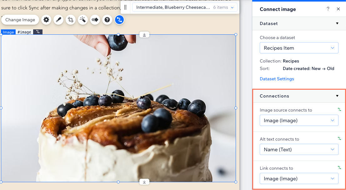
For example, an image element has several connection options. You can only connect the image source to an image field. However, you can connect the image alt text to the following types of collection fields: Text, Number, Date and Time, Address, or Tags. The image link can connect to various dataset actions, your dynamic pages, or the following field types: Document, URL, Image, or Video.
View the supported elements, their connection options, and the fields that can connect to each below:
Elements | Connection Options | Collection fields you can connect |
|---|---|---|
Rich Content | Content | Rich Content |
Section | Background | Image, Video |
Background alt text | Text, Number, Date and Time, Address, Tags, Email | |
Background color | Color | |
Strip / Strip column | Column background | Image, Video |
Background alt text | Text, Number, Date and Time, Address, Tags, Email | |
Text | Text | Text, Number, URL, Boolean, Date and Time, Time, Rich Text, Address, Tags, Item Count, Email |
Text color | Color | |
Image | Image source | Image |
Alt text | Text, Number, Date and Time, Address, Tags, Email | |
Link | Dataset actions, dynamic pages, Document, URL, Email, Image, Video | |
Button | Click action | Dataset actions, dynamic pages, Document, URL, Email, Image, Video, Audio |
Label | Text, Number, Date and Time, Address, Tags, Email | |
Accessible name | Text, Number, Date and Time, Address, Tags, Email | |
Text color, icon color, border color, background color | Color | |
Repeater item | Item background | Image |
Background alt text | Text, Number, Date and Time, Address, Tags, Email | |
Gallery | Image source | Image |
Titles | Text, Number, Date and Time, Address, Tags, Email | |
Descriptions | Text, Number, Date and Time, Address, Tags, Email | |
Alt text | Text, Number, Date and Time, Address, Tags, Email | |
Links | Dynamic pages, Image, Video, Document, URL, Email | |
Shapes / Vector Art | Image source | Image fields (vector art / shapes only) |
Link | Dataset actions, dynamic pages, Image | |
Alt text | Text, Number, Date and Time, Address, Tags, Email | |
Video Player | Video title | Text, Address, Tags, Email |
Video source | Video, URL | |
Video description | Text, Number, Date and Time, Address, Tags, Email | |
Music | Artist and track | Text, Address, Tags, Email |
Cover image | Image | |
Audio source | URL, Audio | |
Maps | Location | Address |
Title, Description, Text | Text, Address, Tags, Email | |
Link, Pin | URL | |
HTML widget | HTML | URL, Text (must have valid HTTPS URL) Note: Raw HTML code is not supported. |
Tip:
Learn more about connecting elements to collection fields through a dataset.
User input elements and their connection fields
The CMS works with a variety of user input elements that let you capture, store, display, and edit visitor content in a collection. Using these elements, you can create your own forms or allow visitors to filter the content on your site.
The following is a list of the user input elements compatible with the CMS, and the field types that the connection options can connect to.
Input element | Field types you can connect |
|---|---|
Text Input | Text, Number, URL, Email |
Text Box | Text, Number, URL, Email |
Rich Text | Rich Text |
Radio Buttons | Filter content by: Text, Number, Tags, Reference, Email Collect content: Text, Number, URL, Date and Time, Email |
Checkbox | Boolean |
Multi-checkboxes | Filter content by: Text, Number, Tags, Reference, Email Collect content: Tags |
Dropdown | Filter content by: Text, Number, Tags, Reference, Email Collect content value: Text, Number, Reference, Email Collect content list items: Text, Number, Email |
Selection Tags | Filter content by: Text, Number, Tags, Reference, Email Collect content value: Tags Collect content list items: Text, Number, Email |
Date Picker | Date and Time |
Time Picker | Time, Date and Time |
Slider | Number |
Range Slider | Number |
Upload Button | Image, Video, Audio, Media Gallery, Document, Multi-Document |
Ratings Input | Number |
Ratings Display | Number, Reference |
Address Input | Address |
Switch | Boolean |
Signature Input | Image |
Pagination Bar | n/a |
Progress Bar (Velo only) | Number, Reference |
reCAPTCHA (Velo only) | n/a |
Tip:
Learn more about the available user input elements.
