Wix Editor: What's New in the Editor
3 min
In this article
- The Site Design panel
- Adding gradients to elements
- The Add Elements panel
- The Layers panel
We're always striving to bring you the best and most advanced features to build your site, while keeping the process easy. In the past few months, we've updated the editor to improve your experience and help you to create a unique, functional site.
The Site Design panel
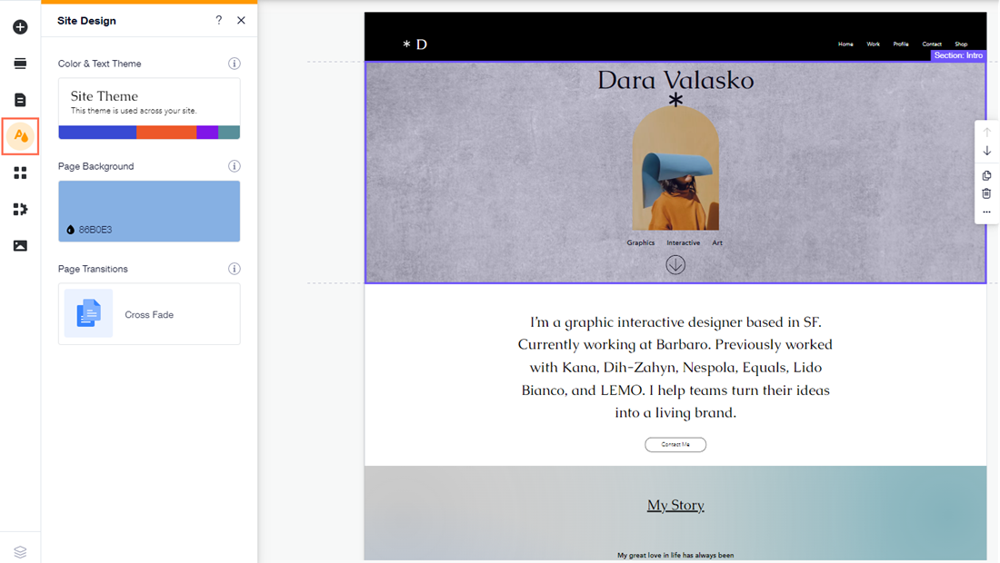
We've changed the Theme Manager on the left menu of the editor to Site Design.
The panel still includes your text and color themes, but you'll also find additional options related to the overall design of your site:
- Color & Text Theme: Choose a theme for your site, and customize the colors and text to personalize your pages, and match your brand's aesthetic.
- Page Background: Select a background for the page you're currently on. You can choose a color, image, or video, and adjust the settings to suit your needs.
- Page Transitions: Choose how your pages transition when your visitors navigate between them. There are four options available, and you can preview how they'll look on your live site by clicking them in the panel.
Ready to get started?
Click Site Design  on the left side of the Editor to begin customizing your site's look. Learn more about the panel
Adding gradients to elements
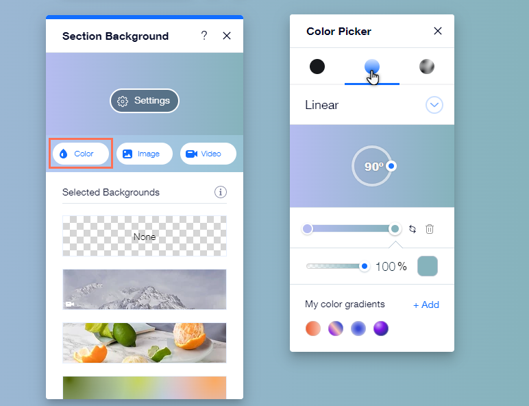
We've updated the color picker to include gradients as an option for some element backgrounds. There are three types of gradient available: linear, radial, and fluid. With gradients, you can choose the colors, and adjust their size and angle to create something truly unique for your site.
Ready to get started?
Open the Color Picker on the relevant element, and select either Gradient or Fluid Gradient from the top of the panel.
Note:
You can currently only add gradient backgrounds to the following elements:
- Strips and columns
- Sections
- Slideshows
- Repeaters
- Mobile menus
- Popups
The Add Elements panel
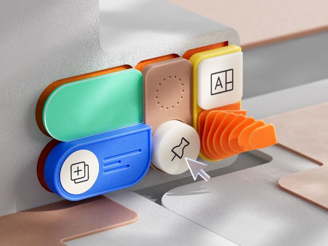
To keep our elements fresh and provide a range of designs, we occasionally update the presets shown in your Add Elements panel. We recently updated it to include new design options for elements such as hover boxes, strips, and slideshows.
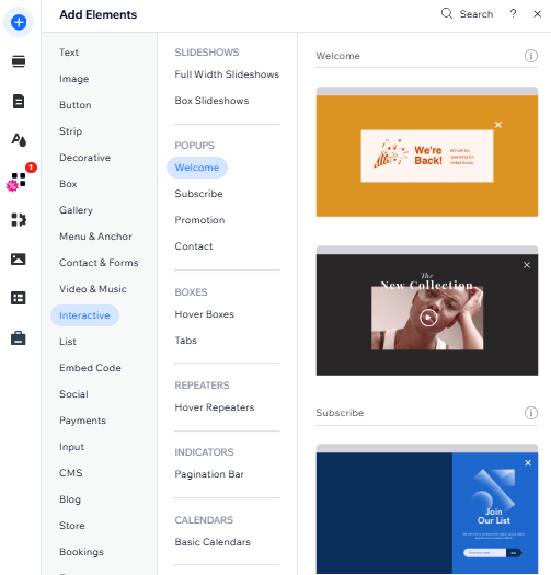
As well as presets, we also added extra options for elements on your site. For example, you can now apply hover interactions to repeaters, and add eye-catching image buttons to your pages.
The Layers panel
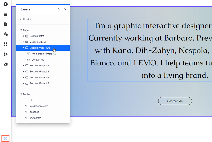
We've made it easier than ever to manage elements on your page. While it's still possible to open the Layers panel through the Editor tools, you can access it quicker by clicking the Layers icon  at the bottom left of your Editor.
 at the bottom left of your Editor.
 Use the Layers panel to locate elements on your page if they're hidden, or behind other elements. If you enabled Velo Dev Mode on your site, you can also use the panel to temporarily hide or focus on elements.
