Wix Editor: Customizing the Header and Footer on Your Mobile Site
4 min
In this article
- Adding or removing the header and footer
- Resizing the header and footer
- Changing the scroll effect of the header and footer
- FAQs
Customize the header and footer on your mobile site so they look ideal on smaller screens. Adjust the page layout and apply eye catching scroll effects to elevate your visitors mobile site experience.
Adding or removing the header and footer
Add or remove the header and footer elements at any time. For regular pages, we recommend keeping your header and footer visible, so visitors can easily explore and navigate your site.
To change the page layout on mobile:
- Open the mobile editor.
- Click Menus & Pages
on the left side of the mobile editor.
- Hover over a page name and click the More Actions icon
.
- Click Mobile Settings.
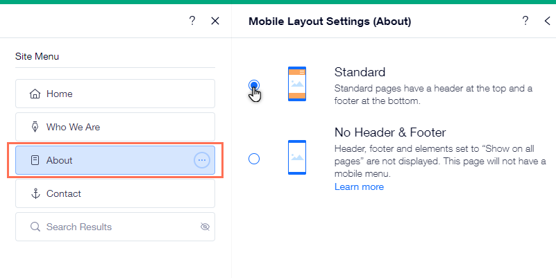
- Select a mobile page layout:
- Standard: Standard pages have a header and a footer.
- No Header & Footer: Headers, footers, and any elements that are set to "Show on all pages" are not displayed. This layout is suitable for a Coming Soon page, an Under Construction page or a landing page aimed at collecting leads.

Important:
- Keep in mind that if you choose a No Header & Footer in the mobile layout, the page does not display the menu in the header. Therefore, if you want your visitors to be able to navigate to the rest of your site, make sure to link a button to your site's main page.
- Certain apps do not appear on your live site if you have hidden the header and footer. Read more about apps and the No Header & Footer layout.
Resizing the header and footer
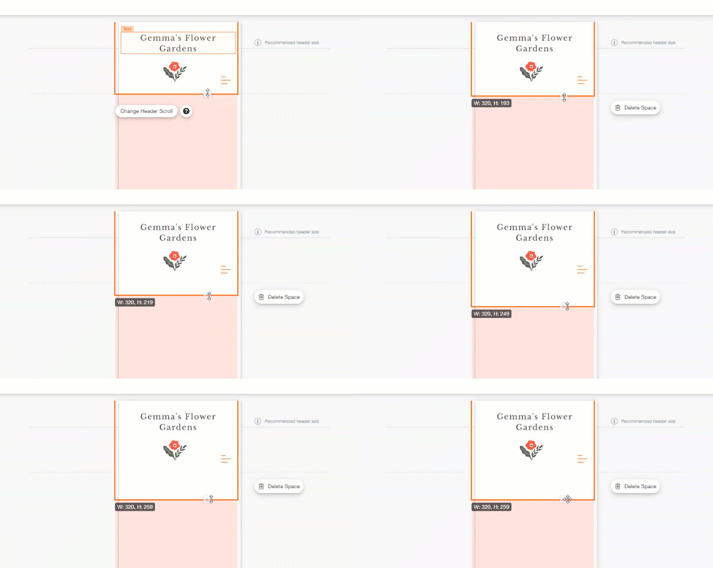
You can resize the header or footer by pulling the stretch handle up or down.
To change the size of your header or footer:
- Open the mobile editor.
- Click the header / footer.
- Click and drag the stretch handle at the bottom of the header / footer.

Changing the scroll effect of the header and footer
Choose what happens to your header on your mobile site when your visitors scroll down the page. For example, you can freeze the header so it always appears at the top or have it fade out as visitors scroll down the site.
To change the scroll effect:
- Click the header in the mobile editor.
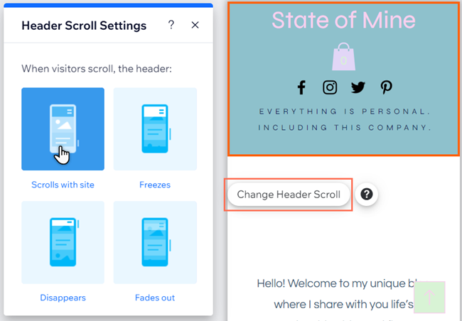
- Click Change Header Scroll.
- Select an option:
- Scrolls with site: The header is always at the top of the site and scrolls with it.
- Freezes: The header is always at the top of the mobile screen.
- Disappears: The header disappears when you scroll down the page, but is at the top of the screen when you scroll upward.
- Fades out: The header slowly disappears as you scroll down the page. It reappears as you scroll upward.
Important note about the freeze scroll effect:
If your header has too much content and is too big on mobile, the freeze scroll effect is disabled on the live mobile site. This is because when set to frozen, the header would cover the entire viewport of the mobile device and hide the rest of the site content as a result.

FAQs
Click a question below to learn more.
How can visitors zoom out on my site on mobile?
Why am I able to see my header, but I cannot select it?
Can I set different scroll settings for my desktop site?
If I change the layout of my mobile site to "No Header & Footer", will this reflect on my desktop site?


