Wix Stores: Customizing Your Customer's Journey to Checkout
4 min
In this article
- Choose the buttons for your Product page
- 'Add to Cart' button
- 'Buy Now' button
- Express payment buttons
- Set up the 'Add to Cart' button
- Set up the cart icon
- Choose the side cart buttons
- FAQs
Choose the path customers take from viewing your products to completing an order.
This article will walk you through the choices you can make that determine which paths your customers can take from browsing to checkout.
Choose the buttons for your Product page
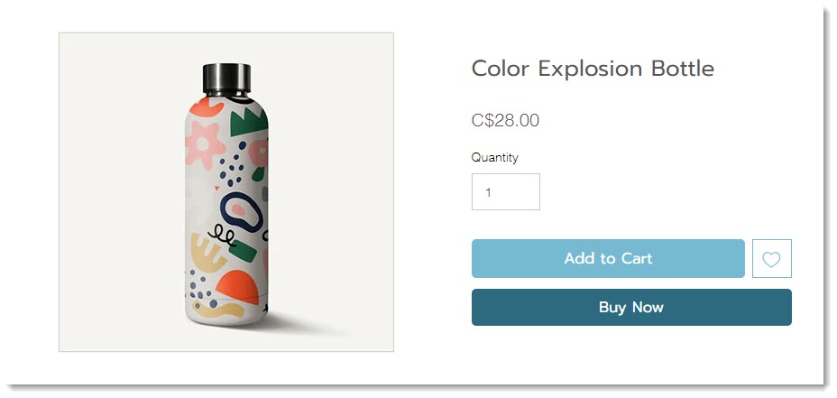
You can display an 'Add to Cart' button, a 'Buy Now' button, or both on your Product page.
Tip:
You can also add a wishlist option.
'Add to Cart' button
By default, your store's Product page comes with the 'Add to Cart' button enabled. After you add a product to the cart, you'll see the number of products on the cart icon.

Having an 'Add to Cart' button makes it easy for customers to continue shopping after adding a product to the cart.
'Buy Now' button
'Buy Now' takes your customer directly to checkout. It doesn't allow customers to add multiple products to their cart and pay for them all together. If your customers often buy just one product, then displaying this button might make sense for your business.
Express payment buttons
You can add a number of express payment options, such as PayPal, Apple Pay, or Google Pay. Clicking them takes your customers directly to payment.
Set up the 'Add to Cart' button
When a customer adds a product to their cart, they need some sort of indication the action was successful.
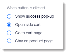
You can select any of the following options:
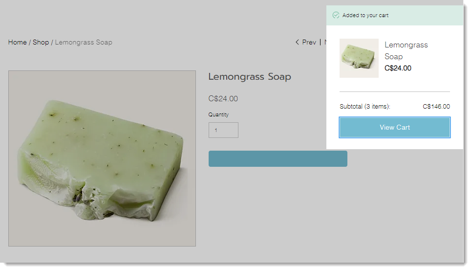
Show Success Pop-up
When customers click the "Add to Cart" button, a small popup appears with a message that the item was added to the cart. Only the one item appears in the Success Pop-up.
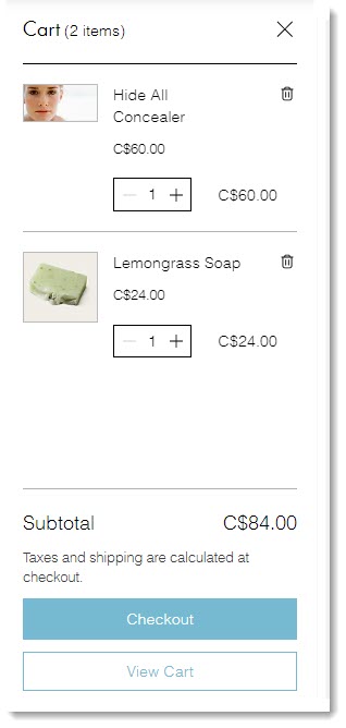
Open Side Cart
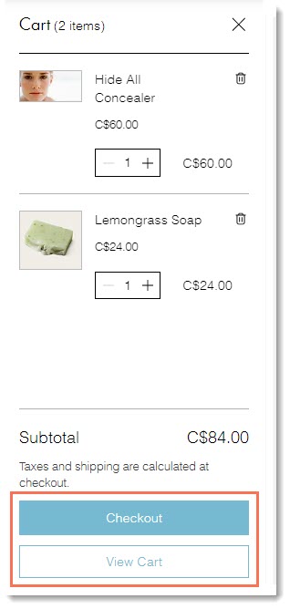
When clicked, the Side Cart opens at the side of the screen. You can choose which buttons you want to display at the bottom.
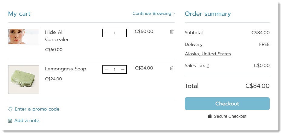
Go to Cart page
Your customer goes directly to the Cart page and sees all the items they added to the cart. From here, customers can continue shopping or proceed to checkout.
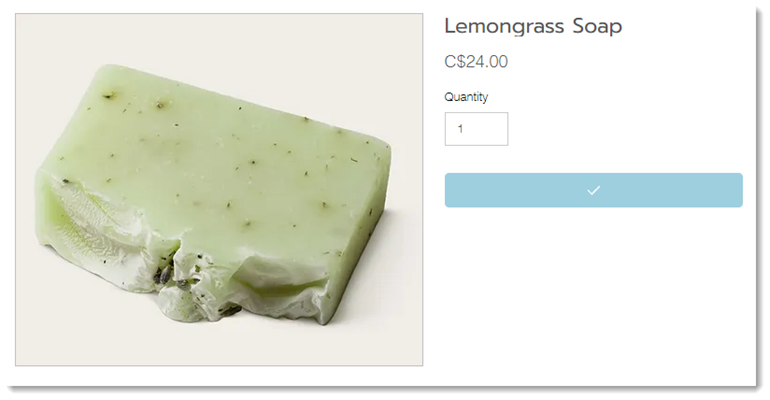
Stay on product page
When you select the 'Stay on product page' option, the 'Add to Cart' button texts briefly changes to a checkmark to indicate that the addition to the cart was successful.
This may be a good option for your business if customers often buy multiples of the same item with different product options.
Set up the cart icon
Customers may browse multiple pages on your site and add one or more items. When they're ready to complete their order, they'll click the cart icon.

You can select what happens when it's clicked. Choose between opening the side cart or direct customers straight to the cart page.
Choose the side cart buttons
In the side cart, you can display one or both of the following buttons:
- Checkout: Takes customers directly to the Checkout page to complete their order.
- View Cart: Directs customers to the Cart page. From there, they can make changes, keep shopping, or go to checkout.
FAQs
Click a question below to learn more about checkout.
Does the 'Add to Cart' button sometimes display other options?
How can I customize the success pop-up?
