Product galleries are a great way to showcase the products you offer. You can add a gallery to any site page and then decide what to display: All your products or one specific category.
Choose between a grid gallery (a gallery with multiple rows) or a slider gallery that customers can scroll through.
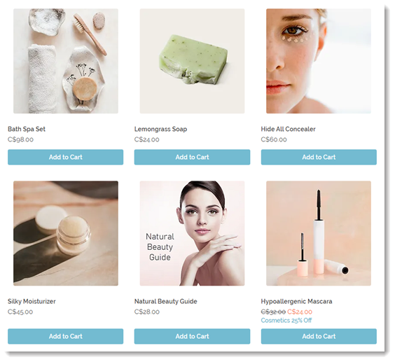
Customizing a Grid Gallery
Customize grid galleries to get the right look and feel for your store.
To customize a Grid Gallery:
- Go to the page in your editor containing the gallery you want to customize.
- Click the grid gallery.
- Click Settings or the Settings icon
 .
. - Choose which settings you want to customize:
Choose which products are shown
Click the Category tab to choose the product category you want to display.
Tip: By default, every gallery displays the 'All Products' category.
Choose what elements you want to display
Click the Display tab and then select or deselect checkboxes to show or hide gallery elements such as filters, ribbons, or product options.
Tip: When you display product options, only 2 are shown. For example, if your product has color, size, and shape options, only the first 2 you created are displayed.
Tip: After clicking the 'Add to Cart' button (if enabled), customers can be directed to either a Quick View window or an expandable drawer where they can make all the necessary selections. Learn more about
customizing the 'Add to Cart' button behavior.
Click the Settings tab and customize the available options.
- Product options: Select which product options are displayed.
Tip: This is relevant if you enabled product options and if some products have multiple options, such as color, size, and shape. - Scroll behavior:
- Select what happens when customers scroll to the bottom of the page. Learn more
- Enable the Sticky sidebar toggle to keep filters visible while scrolling. If enabled, customize the sidebar's distance from the top.
- Product image effects: Set what happens when a customer moves their mouse over a product.
Click the Layout tab and customize the gallery using the following options:
Tip: The options vary according to the elements you enabled.
- General: Click the toggle to stretch the gallery across the browser. If enabled, set margin size (relevant only for the Wix Editor - not the Studio or Harmony editors).
Note: If enabled, selecting Responsive under Grid behavior is recommended. - Product grid:
Tip: With the Fixed grid behavior setting, the settings stay the same no matter your visitor's screen size. With Responsive, the number of rows and columns adjust to the screen size, but this setting only works when the gallery is stretched to full width. - Product images: Select how the images are displayed. Learn more about displaying images
- Add to Cart button: Choose where the button is placed.
Note: If the button is placed on the image, the Quick View button won't be displayed. - Quick Add drawer: Align and customize the spacing of the quick add drawer.
- Product info: Choose a product card layout option and customize it.
- Product options: Click the toggles to display only color options or limit the color options and select how text choices are displayed.
- Quantity: Set the width of the product quantity selector.
- Ribbons: Select where the ribbon appears and adjust padding.
Click the Design tab and customize the gallery using the following options:
Tip: The options vary according to the elements you enabled.
- General: Select the background that appears behind the product cards.
- Filters & sorting: If you enabled filters or sorting, customize the background and text.
- Product cards: Add a card background, border, and customize the image corner radius.
- Product info: Customize the gallery text.
- Product options: Customize how color and text product options are displayed.
- Quantity: Customize the design of the product quantity selector.
- Ribbons: Select a ribbon shape, color, and font.
- Name & price divider: Customize the divider line between the product name and price.
- Quick View button: If Quick View is enabled, design the button.
Tip: To customize the Quick View itself, go to the Quick View tab. - Add to Cart Button: Select a design for each view - default, hover, and disabled (i.e. out of stock).
- Quick Add drawer: Customize the design of the quick add drawer.
- Load More/Previous buttons or Pagination: Customize the 'Load More Button' or 'Pagination' design.
Click the Text tab and customize any of the text that appears in your grid gallery.
Customize the 'Add to Cart' button behavior
If not already enabled, click Show Add to Cart to display the button in your gallery.
Finally, choose where customers are directed after clicking the button:
- Show success pop-up: A pop-up notification appears.
- Open side cart: Side cart opens on the side of the screen.
- Go to cart page: Customers are taken directly to the cart page.
- Stay on current page: Customers stay on the same page. The button displays a checkmark to indicate that the product was successfully added.
Click the
Sorting tab to enable and customize filters. Let customers sort your products by price, name, or by how new they are. Learn how to
add and set up sorting options.
Enable and customize 'Quick View'
Quick View allows customers to view product details in a pop-up without leaving your shop page.
Notes:
- If you placed the 'Add to Cart' button on the image, the Quick View button won't be displayed.
- To view the Quick View button in action, preview your site or view your live site.
To enable or disable Quick View:
- Click the Display tab.
- Select or deselect the checkbox next to Quick View button.
Next steps:
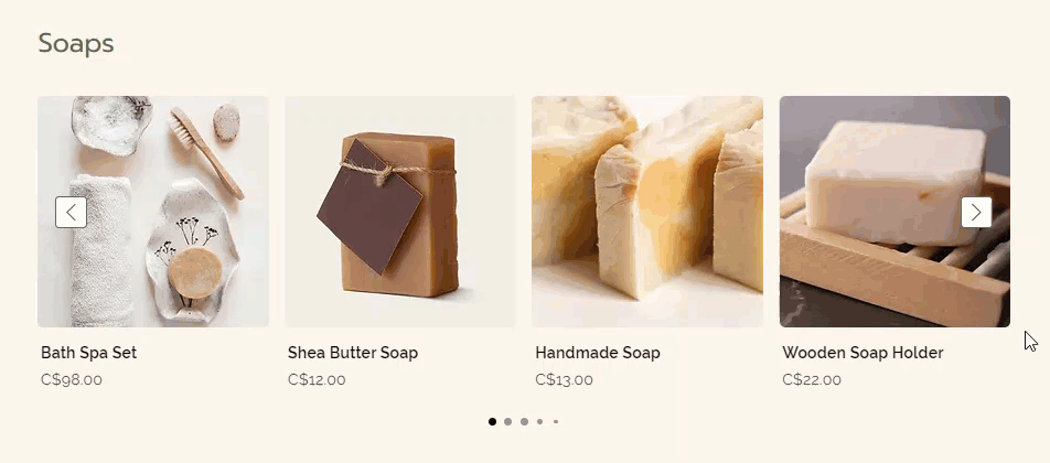
Customizing a Slider Gallery
Customize your slider product gallery to get the perfect look. You can personalize the gallery's text and design, choose what elements to display (e.g. an 'Add to Cart' button), and more.
To customize a slider gallery:
- Go to the page in your editor containing the gallery you want to customize.
- Click the slider product gallery.
- Click Settings or the Settings icon .
- Choose what you want to do:
Choose which products are shown
You can use this gallery in 3 ways:
- Display selected products:
Display a specific category, or your 'All Products' category.
For example, if you want to display your new arrivals, create a 'New Arrivals' category and put all your new products in it. Then, select that category from the drop-down. - Automatically display your best-selling products:
Choose this option to automatically display your best-selling items. Note that if you haven't yet had enough sales to calculate which products are best-sellers, related products or your All Products category is displayed. - Display related products:
Display products customers are interested in, based on what they're viewing. You can select the kind of related gallery you want to display.
- From similar categories: Works best when added to the product page, cart or thank you page.
- Frequently bought together: Works best when added to the product page.
- Frequently viewed together: Works best when added to the product page.
Choose what elements to display
Click the Display tab and then select or deselect checkboxes to show or hide gallery elements.
Tip: When you display product options, only 2 are shown. For example, if your product has color, size, and shape options, only the first 2 you created are displayed.
Tip: After clicking the 'Add to Cart' button (if enabled), customers can be directed to either a Quick View window or an expandable drawer where they can make all the necessary selections. Learn more about
customizing the 'Add to Cart' button behavior.
Click the Settings tab and customize the following options:
- Product options: Select which product options are displayed.
Tip: This is relevant if you enabled product options and if some products have multiple options, such as color, size, and shape. - Slider behavior: Enable the infinite loop to let customers keep scrolling through products.
- Product image effects: Set what happens when a customer moves their mouse over a product.
Click the Layout tab and customize the gallery using the following options:
- General: Click the toggle to stretch the gallery across the browser. If enabled, set margin size (relevant only for the Wix Editor - not the Studio or Harmony editors).
Note: If enabled, selecting Responsive under Grid behavior is recommended. - Gallery title: Edit the title alignment
- Product grid:
Tip: With the fixed grid behavior setting, the settings stay the same no matter your visitor's screen size. With Responsive, the number of columns adjust to the screen size, but this setting only works when the gallery is stretched to full width. - Product images: Select how the images are displayed. Learn more about displaying images
- Add to Cart button: Choose where the button is placed.
Note: If the button is placed on the image, the Quick View button won't be displayed. - Quick Add drawer: Align and customize the spacing of the quick add drawer.
- Product info: Select a layout and alignment for the product info.
- Product options: Click the toggles to display only color options or limit the color options and select how text choices are displayed.
- Quantity: Set the width of the product quantity selector.
- Ribbons: Select where the ribbon appears and adjust padding.
- Navigation arrows: Customize the placement of the arrows.
- Pagination dots: Select an alignment option and customize the distance from the gallery.
Click the Design tab and customize the gallery using the following options:
Tip: The options vary according to the features you enabled in the Settings and Quick View tabs.
- General: Select a background color for the gallery, choose a title font and color.
- Product Cards: Select a background color for the products, add a border, and customize the gallery text.
- Product info: Customize the fonts of the product info you display.
- Product options: Customize how color and text product options are displayed.
- Quantity: Customize the design of the product quantity selector.
- Ribbons: Select a ribbon shape, color, and font.
- Navigation arrows: Customize the design of the navigation arrows.
- Pagination dots: Customize the color and opacity of the pagination dots.
- Name & price divider: Customize the divider line between the product name and price.
- Quick View button: If Quick View is enabled, design the button.
Tip: To customize the Quick View itself, go to the Quick View tab. - Add to Cart button: Select a design for each view - default, hover, and disabled (i.e. out of stock).
- Quick Add drawer: Customize the design of the quick add drawer.
Click the Text tab and customize any of the text that appears in your slider gallery.
Customize the 'Add to Cart' button behavior
If not already enabled, click Show Add to Cart to display the button in your gallery.
Finally, choose where customers are directed after clicking the button:
- Show success pop-up: A pop-up notification appears.
- Open side cart: Side cart opens on the side of the screen.
- Go to cart page: Customers are taken directly to the cart page.
- Stay on current page: Customers stay on the same page. The button displays a checkmark to indicate that the product was successfully added.
Enable and customize 'Quick View'
Quick View allows customers to view product details in a pop-up without leaving your shop page.
Notes:
- If you placed the 'Add to Cart' button on the image, the Quick View button won't be displayed.
- To view the Quick View button in action, preview your site or view your live site.
To enable or disable Quick View:
- Click the Display tab.
- Select or deselect the checkbox next to Quick View button.
Next steps:
- To customize the Quick View button, go to the Design tab.
- To customize the Quick View popup, go to the Quick View tab. Learn more.
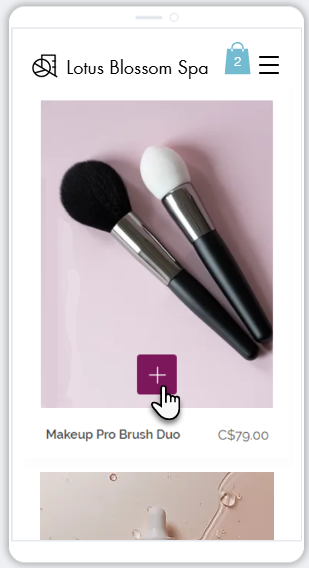
Customizing a gallery on mobile
Make sure your galleries look great when customers view them on a mobile device. You can adjust the design to match smaller screens and allow customers to quickly add products to the cart without navigating away from the gallery.
- Go to your editor.
- Click the Switch to Mobile icon
 at the top of the editor.
 - Go to the page with the Grid Gallery or Slider Gallery you want to customize.
- Click the gallery.
- Click Settings.
- Customize the gallery using the available options.