

Wix Stores: Adding and Setting Up Product Galleries
5 min
In this article
- Adding a grid gallery & selecting a category to display
- Adding a slider gallery & selecting a category to display
Add a product gallery to showcase the products you offer on any site page. You can decide what you want to display there - all your products or one specific category.
Adding a grid gallery & selecting a category to display
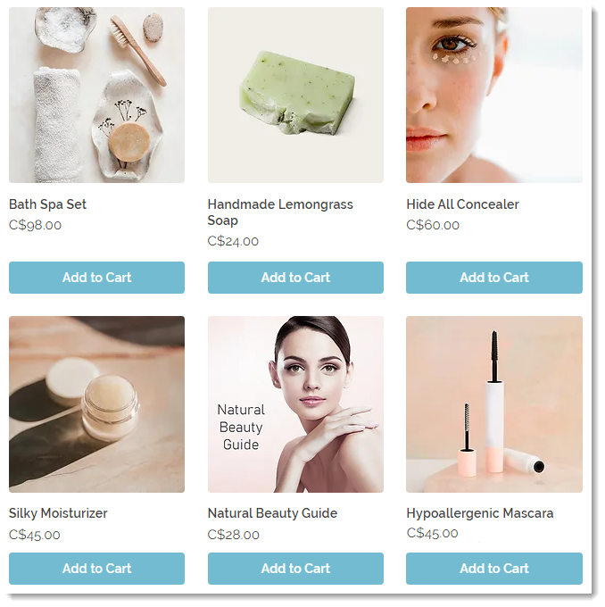
A grid product gallery is a great way to display a large number of products. When you add a gallery, it displays the "All Products" category by default. You have the option of selecting a different category to display.
To add a grid gallery and select a category to display:
Wix Editor
Studio Editor
Wix Harmony Editor
- Go to your editor.
- Go to the page to which you want to add a gallery.
- Click Add Elements
 on the left side of the editor.
 - Click Store.
- Drag the grid gallery to the relevant location on your site page.
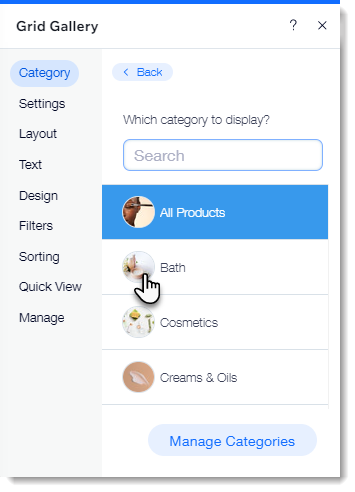
- Select the category you want to display:
- Click the gallery in the editor.
- Click Choose Category.
- Select an option:
- Display all your products: Click All Products.
- Display one category: Click to select a category.
Next steps:
Learn how to customize your grid gallery for desktop and for mobile.
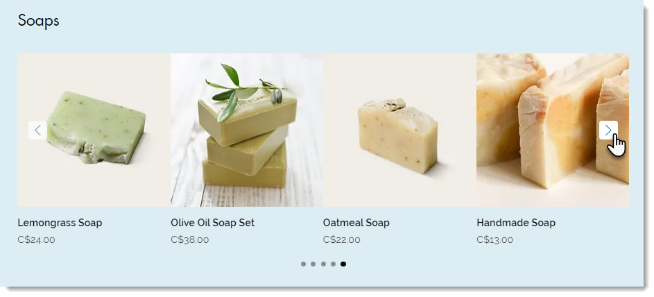
Adding a slider gallery & selecting a category to display
A slider gallery is the perfect way to show off your products. Customers can click the navigation arrows to view more products.
Notes:
- You can display up to 52 products in a slider gallery.
- You can customize the slider gallery to turn it into a related products or best sellers gallery.
To add a slider gallery and select a category to display:
Wix Editor
Studio Editor
Wix Harmony Editor
- Go to your editor.
- Go to the page to which you want to add a gallery.
- Click Add Elements on the left side of the editor.
- Click Store.
- Drag the slider gallery to the relevant location on your site page.
- Select the category you want to display:
- Click the gallery in the editor.
- Click Choose Category.
- Select an option:
- Display all your products: Click All Products.
- Display one category: Click to select a category.
Next steps:
Learn how to customize your slider gallery.
