

Wix Editor: Adjusting and Customizing Tabs for Your Mobile Site
11 min
In this article
- Hiding tabs from your mobile site
- Adjusting the layout of tabs on mobile
- Customizing the design of tabs on mobile
Tabs are an advanced way to organize and categorize your content. Tabs that you add on desktop automatically appear on your mobile site, and you can adjust them as needed to suit smaller screens.
Note:
Tabs are a desktop element, which means you can't add mobile-only tabs.
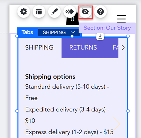
Hiding tabs from your mobile site
If you don't want to display tabs on your mobile site, you can easily hide them. After you hide a tab element, you can access and show it again from the Hidden on Mobile panel.
To hide tabs from your mobile site:
- Click the tab element in your mobile editor.
- Click the Hide Element icon
.
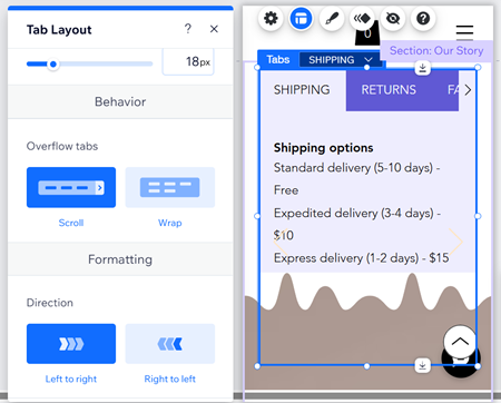
Adjusting the layout of tabs on mobile
Edit the layout of tabs on your mobile site so they suit smaller screens. You can change the spacing and direction to structure your tabs, and choose how mobile visitors view tabs that don't fit in the top menu.
To adjust the layout of tabs on your mobile site:
- Click the tab element in your mobile editor.
- Click the Layout icon
.
- Choose how you want to adjust your tab's layout:
- Tab distribution: Choose how much you want the tab menu to stretch:
- Default: The menu does not fit the width of the box.
- Stretch: The menu fits the width of the entire box.
- Spacing between tabs: Make the spacing between tab items bigger or smaller.
- Spacing between tabs and container: Make the space between the menu and the content boxes bigger or smaller.
- Horizontal padding: Adjust the padding on the left and right of the menu items.
- Vertical padding: Adjust the padding on the top and bottom of the items.
- Overflow tabs: Select how to display items that don't fit in the top menu:
- Scroll: Visitors can scroll through the menu to see all of the items.
- Wrap: Another line is added to fit all of the items. You can then use the slider to make the spacing between rows bigger or smaller.
- Tab direction: Display items in the top menu from left to right, or vice versa.
- Text alignment: Select an option to set whether the text is aligned to the Left, Center, or Right.
- Tab distribution: Choose how much you want the tab menu to stretch:
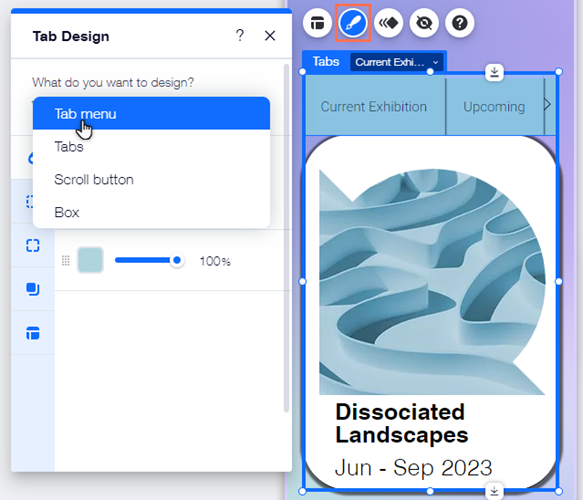
Customizing the design of tabs on mobile
Change the design of the tab element so it fits your mobile site's look. The changes you make don't affect the desktop site, so you can change options like the text and fill color to create a tailored experience for your mobile visitors.
To edit the design of tabs:
- Click the tab element in your mobile editor.
- Click the Design icon
.
- Select an option under What do you want to design? and customize it with the available options.
Tab container
 : Choose a menu background to suit your page, and adjust its visibility. You can add multiple layers and design each one separately to create unique, eye-catching backgrounds.
 : Add borders to the menu background to create a contrast against your site page. Choose a design and color, and set the width to make it as big or as small as you need.
 : Choose how you want to corners of your menu to look. You can adjust each corner differently, and make them rounder or more square.
 : Add shadows to your menu background for a cool 3D effect. You can set the size, visibility, angle, and more to give it more impact.
 : Adjust the padding around your tab menu to make it larger or smaller. You can enable or disable the Lock icon
  to adjust each side separately, or make them match.
Tabs
 : Customize your item text with settings such as font, size, and spacing. You can also add formatting like bold and italics, and choose the color.
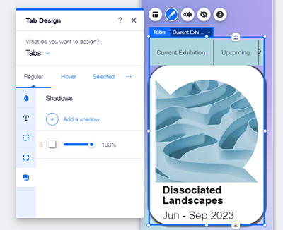
Scroll button
 : Design the scroll button's icon to make it stand out on the tabs menu, and encourage visitors to see what other content your site has to offer.
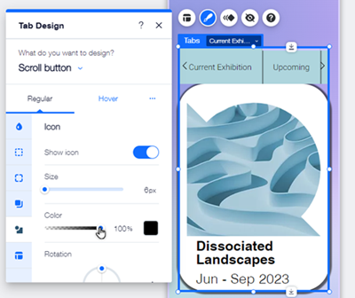
Containers