

Wix Editor: Troubleshooting Layout Issues on Your Mobile Site
3 min
In this article
- Elements appearing in the wrong location
- Gaps on the mobile site
- Elements hidden from the mobile site
Wix automatically creates a mobile-friendly site for you using the content and elements from your desktop site. They are not different sites, just different views of the same site.
As your mobile site gets automatically optimized to fit smaller screens, you may notice alignment or structural issues. This guide will help you resolve such problems.
Elements appearing in the wrong location
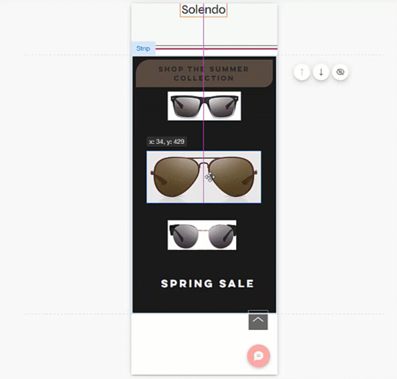
Elements you have added to your page in the desktop editor may be placed differently on the mobile version of your site. You can manually rearrange these elements by dragging them to your chosen location.
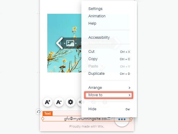
If an element appears on the menu, header, or footer of a mobile site, it is not possible to click and drag it around the page. However, you can use the right-click menu to move these elements between the menu, header and footer.
Tip:
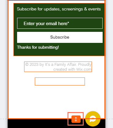
When placing an item in the gap between elements, you may need to adjust the spacing. Use the Auto Space on Drag tool to automatically create even spaces between the elements.
Gaps on the mobile site
You may notice gaps on your mobile site. Our mobile algorithm "translates" desktop content for mobile but it's not always perfect, and can sometimes lead to gaps on your mobile site.
Depending on where the gaps are, you may be able to remove them by make the element smaller, or by shortening the page length.
Tip:
The Spacing Guide tool shows you the existing gaps on your section (in pixels). It also shows an indication when these gaps are equal to one another.
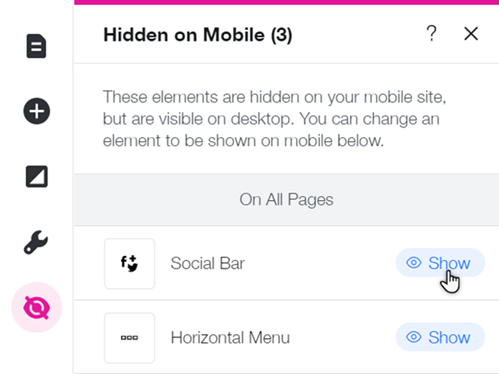
Elements hidden from the mobile site
When editing your mobile site, you may notice that you can't find some elements that appear on desktop. This is because some elements are automatically hidden from your mobile site in order to make it more suitable for mobile devices.
Check which elements have been hidden from your mobile site, and unhide if needed, from the Hidden on Mobile  panel.
panel.Did you know?
You can hide desktop elements from your mobile site, and replace them with mobile-only elements. Create a personalized experience that accurately reflects your brand or business on mobile.