

Wix Editor: Customizing Your Mobile Menu
10 min
In this article
- Customizing the menu icon
- Customizing the menu container
- Customizing the menu items
Customize your mobile menu to perfectly suit your site's design and layout. Your mobile menu consists of three elements; the menu icon, the menu container, and the menu items.
You can customize and adjust each of these individually to create a unique, eye-catching menu for you and your visitors on mobile.
Important:
This article refers to the mobile menu that was released at the beginning of 2019. You can update to the new one in just a few clicks. Learn how to update the mobile menu
Customizing the menu icon
The menu icon has two states; open and closed. You can select a preset icon, and customize both states to look however you'd like.
To customize the menu icon:
- Click the menu icon in your mobile editor.
- Click the Design icon
.
- Select a preset from the options available.
- Click Customize Design.
- Select which state you'd like to customize the icon for by clicking a tab (Closed or Open).
- Choose how you want to design the icon:
Customize the fill color and opacity
 and customize it with the options:
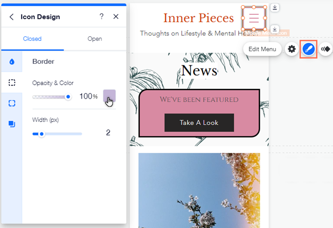
Add and customize a border around the icon
 tab to set the color, visibility and width:
Customize the icon's corners
 to make the icon corners rounder, or more square:
  to enable or disable the corners having the same radius.
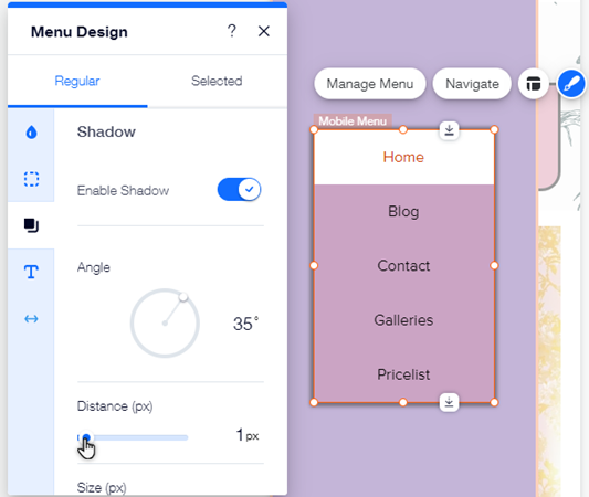
Add and adjust a shadow for the icon
 to add and adjust a shadow with the below options:
Customizing the menu container
The menu box contains your menu items. Using the layout, design, and background panels, you can adjust the position and look of your menu container to suit your site.
To customize the menu box:
- Click the menu icon in your mobile editor.
- Click Edit Menu.
- Click the menu container.
- Choose how you want to adjust the menu container with the options below:
Adjust the container's layout
 and select an alignment for your menu:
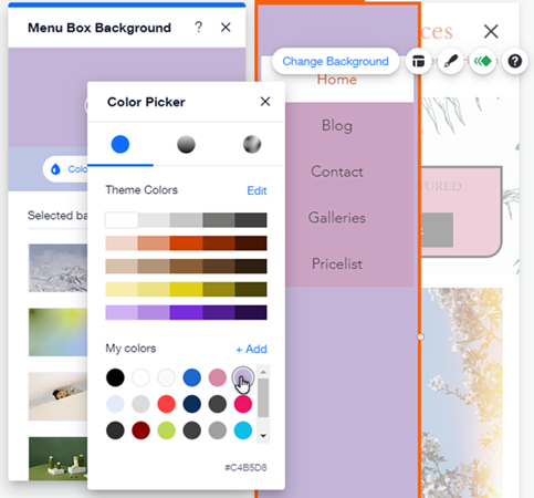
Change the container background

Customize the container's design

Menu items misplaced?
You may be experiencing one of our known issues, which we're working hard to resolve. Learn more about this issue and see workarounds
Customizing the menu items
Adjust the look and design of your menu items (the menu text). You can customize settings such as the font, color, and spacing.
Notes:
- If you want to add or remove elements from your menu, right-click the element and click Move To to move it between the menu box, header and footer.
- If you can't see your subpages in your mobile menu, click here.
To adjust the menu items:
- Click the menu icon in your mobile editor.
- Click Edit Menu.
- Click the mobile menu.
- Choose how you want to adjust the menu items with the options below:
Menu items layout
 and use the below options:
Menu items design
 icon, and select either the Regular or Selected tab to customize the states:
 : Use the below options to customize both the menu, and the submenu items:
 : Drag the sliders to increase or decrease the offset of the menu and submenu items.
Want to make your site more accessible?
Click Settings, then add an Accessible name in the field provided. Accessible names are short titles (usually 1-3 words) that describe an element's function and content. These names are 'read' by screen readers and other assistive technologies, making them an important part of site accessibility.
