Wix Editor: Managing Sections on Your Mobile Site
5 min
In this article
- Hiding sections from your mobile site
- Rearranging sections on your mobile site
- Adding scroll effects to sections
- Customizing your section's shape divider
Your site is divided into sections so that your content is displayed in a neat, organized way. They also allow you to easily arrange your pages and elements.
Manage the sections on your mobile site to ensure a neat layout, and a smooth experience for mobile visitors.
Hiding sections from your mobile site
You can easily hide sections from the mobile version of your site in order to tailor it to your visitors. This doesn't affect your desktop site, and you can always show the section again if you change your mind.
To hide a section:
- Click the section in the mobile editor.
- Click the Hide icon
.
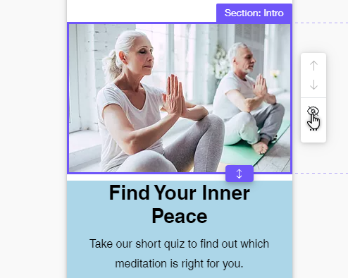
To show a hidden section:
- Click the Hidden on Mobile icon
on the left side of the mobile editor.
- Click Show next to the relevant section.
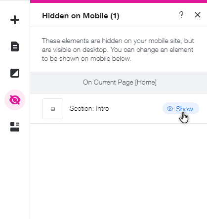
Rearranging sections on your mobile site
Move the sections around to streamline the order in which information is displayed on your mobile site. This is especially useful if you'd like to highlight different content on the mobile version of your site, such as a map, or your business phone number.
To rearrange sections:
- Click the Zoom Out icon
on the top toolbar of the editor.
- Click the section, then click one of the arrows:
- Move section down
: Move the selected section below the section underneath it.
- Move section up
: Move the selection section above the section on top of it.
- Move section down
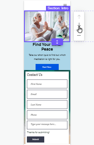
- (Optional): You can also click and drag the bottom of a section to create a gap between sections, or move a section and its elements together.

Tip:
Use the gridlines when repositioning elements within a section to help with even spacing.
Adding scroll effects to sections
Add a cool scroll effect to your section background create an eye-catching experience for mobile visitors on your site. Depending on the background type (color, image, or video), you can choose from a range of effects to give your mobile site an extra touch.
To add a scroll effect to a section background:
- Click the section in your mobile editor.
- Click the Animation icon
.
- Select your chosen scroll effect.
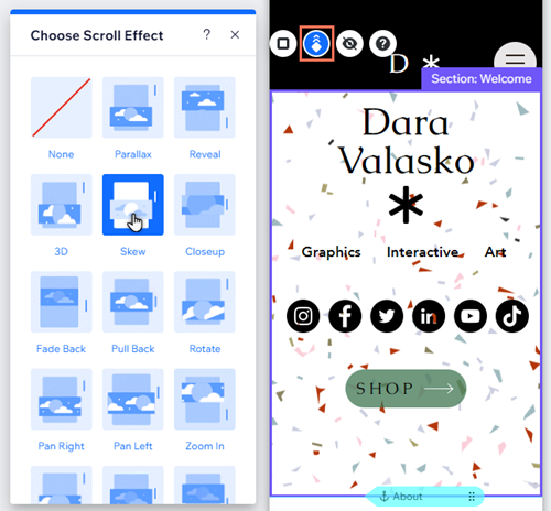
You should know:
Effect options displayed depend on the section's background type. Learn more about scroll effects on your mobile site
Customizing your section's shape divider
Shape dividers are graphic shapes that you use to organize your section content. When you add a shape divider to a section on the desktop Editor, it's automatically carried over to your mobile site.
Depending on your needs, you can adjust and customize the divider, or hide it from your mobile site. This doesn't affect your desktop site, so you can create layouts that best suit the needs of your mobile visitors.
To adjust a shape divider on mobile:
- Double-click the section in your mobile editor.
- Click the Shape Dividers icon
.
- Select either the Top or Bottom tab (depending on where you've added the divider).
- Choose how you want to adjust the shape divider for your mobile site:
- Change the shape: Choose a new shape for your section:
- Media from Wix: Select a new option in the panel, or click More shapes to browse and select an option from the Wix catalog.
- Use your own: Click More shapes to open the Media Manager, then select Upload Media to upload and apply your own shape to the section.
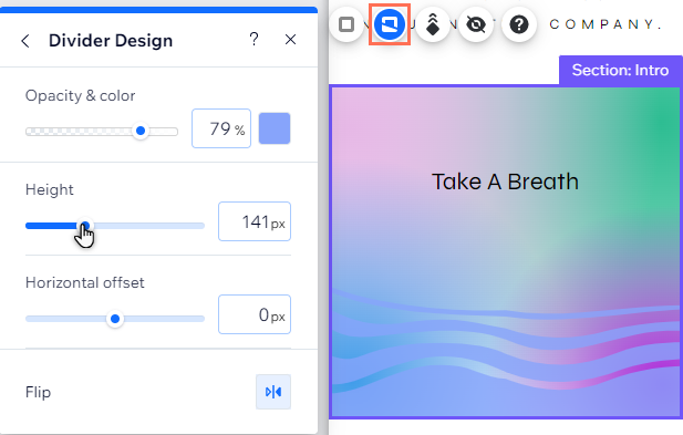
- Customize the design: Click Customize Design to change the look of your divider on your mobile site. Learn more about customizing a shape divider for mobile
- Remove the divider: Click None in the panel to remove a divider from the section on your mobile site.
- Change the shape: Choose a new shape for your section:
Note:
It is not possible to add a mobile-only shape divider to a section from the Add to Mobile panel. You can only change or adjust shape dividers you have added from the desktop editor. Learn how to add a shape divider on desktop


