
Accessibility: Preparing Your Text and Graphics
9 min
In this article
- Our recommendations
- Finding color codes
- Adjusting color contrast
- Manually reviewing color contrast
Visitors with visual conditions or difficulties may find it difficult to tell the difference between the foreground and background of a site's pages. Therefore, we suggest checking and adjusting the color contrast on your site as needed.
Our recommendations
In order to increase accessibility for visitors with different vision needs, we recommend the following:
- Changing the text color and background color contrast to a ratio of 4.5:1 for normal text and 3:1 for large text.
- A contrast ratio of at least 3:1 for graphics and user interface components (such as form input borders, placeholders etc).
- Level AAA requires a higher contrast ratio of at least 7:1 for normal text and 4.5:1 for large text.
Good to know:
Large text is defined as above 14 points (approximately 18px) and bold, or 18 points (approximately 24px).
Finding color codes
You can find the color codes in whichever site builder you're using (Wix Editor, Studio Editor, or the Harmony Editor).
Wix Editor
Studio Editor
Wix Harmony Editor
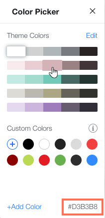
- Select the relevant element (text, strip background, container box, etc.) and access the Color Picker.
- Hover over any of the colors to see the color code.
Testing color contrasts:
There are numerous sites and browser plugins such as Contrast Checker that tests the color contrast by comparing the foreground and background colors (using the colors codes). For checking the color contrast for text over a background image, we recommend using Colour Contrast Analyser which enables you to pick the background color and then test.
Adjusting color contrast
You can use the Accessibility Wizard in your editor to find and adjust any low color contrast on a site - no matter which site builder you're using. The wizard scans your site for potential accessibility issues, and highlights ways to improve the site's accessibility.
With most elements, you can make changes within the wizard itself. However, some elements (e.g. app elements) are not currently fully integrated with the wizard, and need to be manually reviewed or adjusted.
Wix Editor
Studio Editor
Wix Harmony Editor
- Go to your editor.
- Click Settings at the top of your editor.
- Select Accessibility Wizard.
- Select Scan Site.
- Click the Detected issues tab.
- Select a page from the list.
- Click Improve color contrast.
- Select the relevant element and adjust it as needed:
Adjust the contrast in the wizard

Manually adjust the contrast
 next to the color you want.
Manually reviewing color contrast
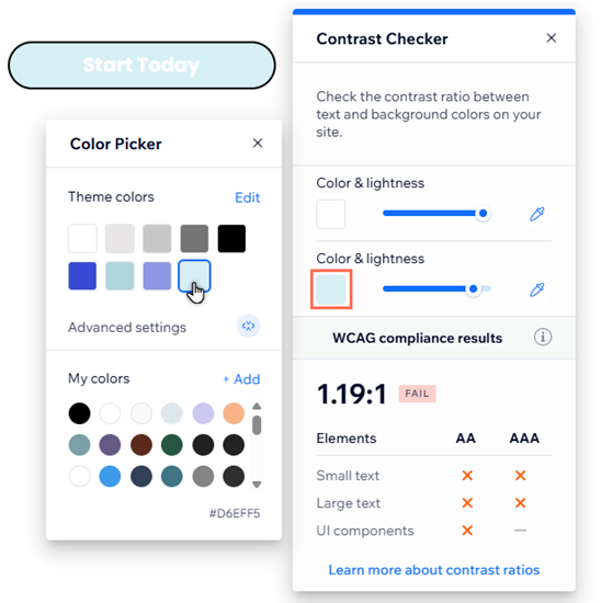
There may be color contrast on the site that the Accessibility Wizard does not identify. We recommend manually reviewing site content with the Wix Contrast Checker, and adjusting the contrast as needed.
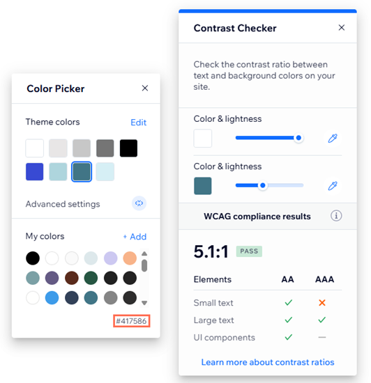
You can install and use the Contrast Checker from your site builder (Wix Editor, or Studio Editor). If the elements don't meet the requirements, you can also test new ratios with the picker.
Wix Editor
Studio Editor
To check the contrast:
- (First time only) Install the add-on to your editor.
- Click Tools
 on the top right of your editor.
 - Click Editor Add-ons.
- Click Contrast Checker.
- Use the color boxes to select the color of the element and background in the checker, or paste in the relevant color codes.
To adjust the contrast:
- Adjust the foreground and background colors in the Contrast Checker to the recommended ratio.
- Copy the colors' codes from the bottom-right of the picker.
- Select the relevant element in your editor.
- Open the color picker from the element's design settings.
- Click Add next to My colors.
- Paste the copied code into the field.
Tip:
How you open the design settings depends on the element, but you can usually find them by selecting the element, then clicking the Design icon  .
.
.Displaying graphs or data on your site?
High contrast color is a great way to display data on your site. However, we also recommend using other indicators (such as textures and patterns) to differentiate between information.
Next step:
Go back to the Accessibility Checklist to continue improving your site for accessibility.